Feature Wiki
Tabs
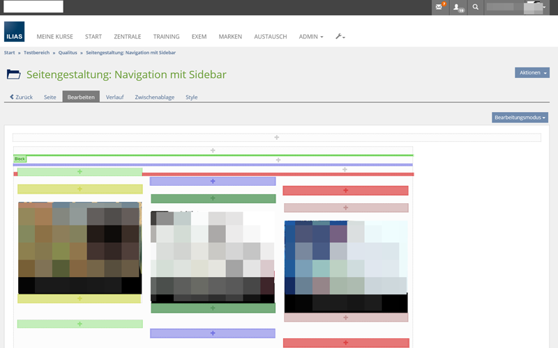
colored blocks in editing mode
1 Requirements
with every item added to a page, designed with the page editor, the design gets harder and even more confusing.
It would be some easier if the author could see which add-buttons (+) belongs to which block at first sight.
A good example is the design process of an responsive table described in the ILIAS Blog:
http://www.ilias.de/docu/goto_docu_blog_3439_347.html?lang=de
This is not really clearly arranged.
To make this easier, i suggest to change the color of every block and his add-buttons on every reload/save process by random.

2 Additional Information
- Idea / concept: Hesse, Joel [Joel_Hesse] Parfümerie Douglas GmbH
- Interest in funding: (please indicate if you are interested/able to fund this feature)
- Maintainer: (will be set by Jour Fixe / maintainer)
- Implementation of the feature is done by (will be set by Jour Fixe / maintainer)
- Testcases by: (please add your name if you want to create the testcases for this feature)
3 Discussion
The majority of the members of the SIG Corporate which voted at the 7th of September 2016 in Utrecht appreciate this feature request and ask the maintainer and the ProductOwner to consider the trunk-integration of this feature in reasonable way as soon there is a funding available.
4 Implementation
{please give a description of the final implementation and add screenshots if possible}
Test Cases
- {Test case number linked to Testrail} : {test case title}
Approval
Approved at {date} by {user}.
Last edited: 9. Sep 2016, 22:35, Hesse, Joel [Joel_Hesse]