Feature Wiki
Tabs
KS-Entry: Vertical Timeline
Page Overview
[Hide]1 Guideline
- DOM, LESS, JS / Screenshot*:

- PHP Class:
- PHP Example:
- External Library:
- Status of Entry: To be revised
- Status of Implementation: to be implemented
- Description*:
- Purpose: The Timeline is used to emphasize the chronological sequence of content items.
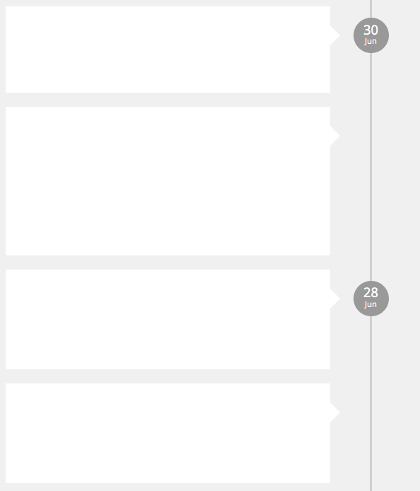
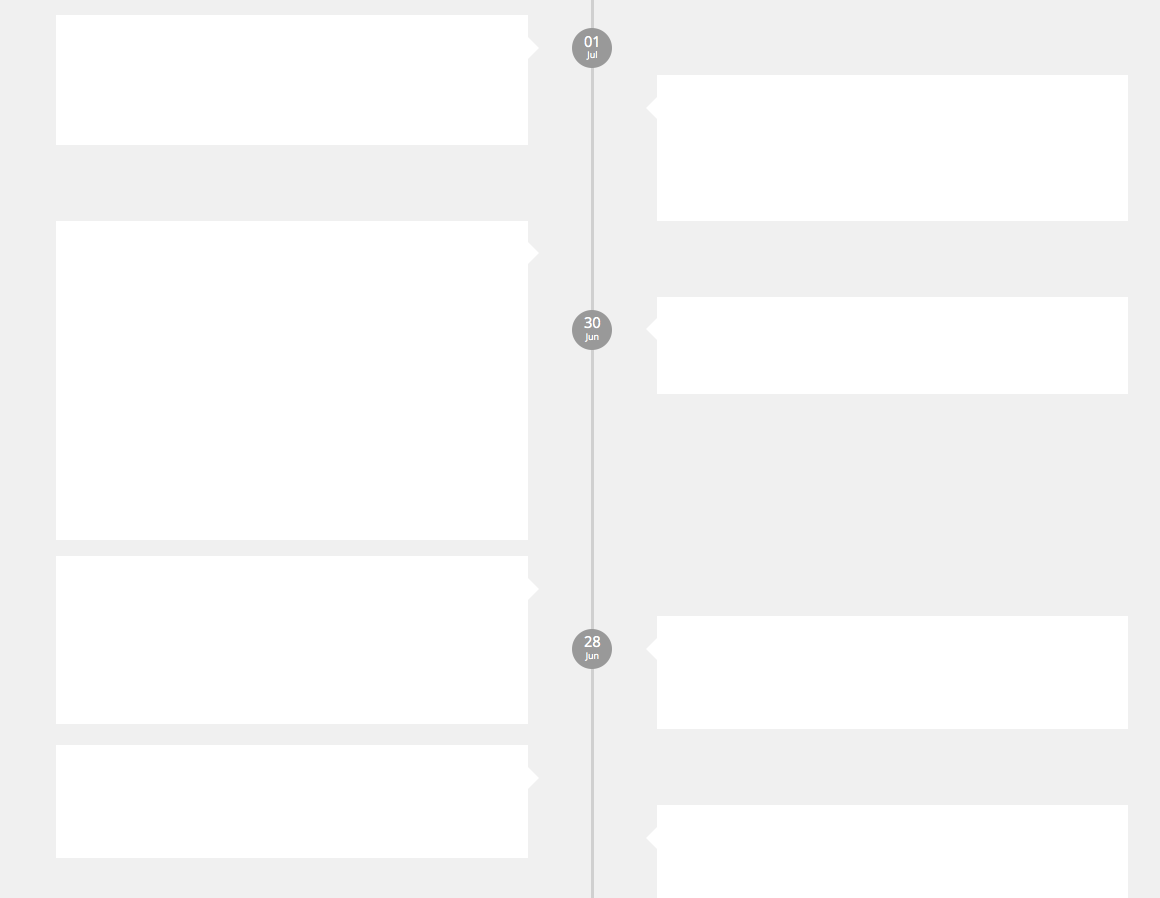
- Composition: A timeline consists of a vertical line withdate markers and a set of content items that are displayed next to the timeline. Date Markers are only displayed each time a content item relates to a new day. Each content item points to a position on the line that reflects its occurence in time. On wide screens items are rendered in a two-column layout (left and right of the timeline). On narrow screens the presentation falls back to a one-column layout.Each content item in the timeline is rendered by a Panel item with a Popover-like pointer.
- Effect: The Timeline is a mere scaffolding element, it has no effect.
- Rival Elements:
- Tables: Tables can be used to chronologically order data, too, but without the visually emphasize the time.
- Deck of Cards: Deck of Cards are used to represent content items equally, but als lack a visual representation of the time.
- Background: Facebook made this representation of events very popular (but does not use it anymore).
- Feature Wiki Reference:
- http://www.ilias.de/docu/goto_docu_wiki_wpage_3992_1357.html
- Context*: News Presentation (other candidates: comments presentation)
- Rules:
- Usage: The timeline CAN be used, if a list of items is presented in chronological order. Each item MUST be related to a date, optionally to a date and a time.
- Interaction:
- Wording:
- Style:
- Content items of the timeline MUST point to a place on the center line that reflects its occurence in time. New days MUST start with a data marker.
- Ordering:
- Responsiveness:
- Narrow screens MUST fallback to the one-column layout.
- Accessibility:
- If content items contain actions or links they MUST be accessible by keyboard.
- Relations:
- Is A: Container List
- Must Use:
- May Use:
- Todo in ILIAS 5.2:
2 Status
- Effective from release: { not approved yet | x.y }
- Approved by Jour Fixe at: { link to Jour Fixe agenda }
- Implementation status: { implemented completely | partly implemented | needs implementation }
- Funding for streamlining existing features: { name of organisation }
- Implementation of guideline: { all developers | name of responsible developer }
3 Components that are not compliant with the Guideline
- …
4 Discussion
Killing, Alexander [alex], 24 Aug 2016: @Matthias & @Timon: When I wrote this proposal the rules for handing in and implementing KS / UI elements have been different. Now, a few weeks ago we introduced the new UI service for ILIAS and the rule is to hand in KS entries as implemented pull requests. As I cannot do this up to beta for 5.2, but the corresponding feature (timeline in groups and courses) has been approved, I ask you for an agreement to have this element in 5.2 as part of the news service only, to schedule it for 5.3 (if ok) and to hand in the pull request with 5.3. Funding would be needed, but I will check if Leifos can do this.
Kunkel, Matthias [mkunkel], August 24, 2016: This UI element is highly appreciated and scheduled for 5.3 as a generic UI KS element. It will already be used for the news service in 5.2 but become generic with 5.3.
Last edited: 24. Aug 2016, 16:26, Kunkel, Matthias [mkunkel]

