


Feature Wiki
Information about planned and released features
Tabs
KS-Entry: Instructional Overlay
1 Guideline
- Mockup:

- Description*:
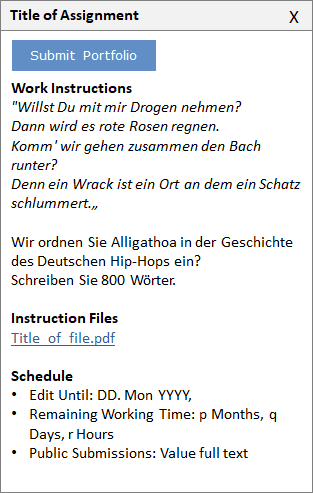
- Purpose: Instructional Overlay keep didactical instructions available to users while they carry out workflows presented by this instruction that spread over several screens. Instructional information and actions are made available at the very screen the user is working on.
- Composition: The Instructional Overlay is comprised of
- Title and a glyphed close-button
- Assignment description (as shown in the info-tab of e.g. the exercise) namely
- Textual work instructions
- Accompanying files as links or inline media
- Schedule information if applicable
- Submission-Button to carry out action the single most important action of the workflow
- Effect: Initially the Instructional Overlay is positioned upon the screen on the right-hand side of the screen.
- The Instructional Overlay is called upon by clicking a Button eliciting the respective hand-in workflow in the Submission section of an Assignment
- Instructional Overlays will persist while users navigate through the system.
- It is closed by clicking the Close glyph in the Instructional Overlay or completing the hand-in action.
- The Instructional Overlays can be moved around on the screen and positioned at will: Like the on-screen chat the Overlay users can grab and drag it around by grabbing the outer, upper frame.
- Composition: The Instructional Overlay is comprised of
- Context*: Exercise
Rules:
- Composition:
- It MUST be only one button in an Instructional Overlay.
- Interaction:
- The Instructional Overlay MUST only be closed by handing-in or clicking the close-button and not by navigating ILIAS.
- Completing the workflow by clicking the button MUST take the user back to the location that the Instructional Overlay was called upon.
- Accessibility:
- If the Instructional Overlay is displayed, it MUST be accessible by keyboard.
- Effective from release: { not approved yet | x.y }
- Approved by Jour Fixe at: { link to Jour Fixe agenda }
- Implementation status: { implemented completely | partly implemented | needs implementation }
- Funding for streamlining existing features: { name of organisation }
- Implementation of guideline: { all developers | name of responsible developer }
2 Discussion
Comments on Former Version of the Article
Killing, Alexander [alex], 15.11.2016: If we push content aside, the general layout needs space for four columns, currently we have a max. of three (content + 2 side block columns like in the personald desktop or left handed tree plus right side column blocks in the repository). I think we need at least a prototype that would show us how the general screens in ILIAS behave. We also may need to change the column behaviour at certain breakpoints. Another open issue would be the "hamburger" menu for the open off-canva contents. How exactly should this look/work?
Last edited: 14. Jul 2017, 11:00, Tödt, Alexandra [atoedt]