Feature Wiki
Information about planned and released features
Tabs
KS-Entry: Preview Popover
Page Overview
[Hide]1 Guideline
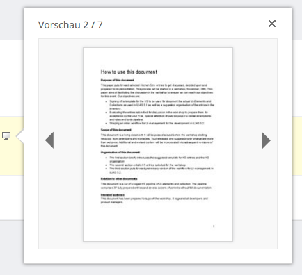
- DOM, LESS, JS / Screenshot*:

This screenshot does not represent an intended implementation of the Preview Popover since it is not implemented by using a Bootstrap Popover.
- PHP Class:
- PHP Example:
- External Library: Bootstrap Popover
- Status of Entry: To be revised
- Status of Implementation: to be implemented
- Description*:
- Purpose: Preview Popovers are used to allow looking at a reduced version of the object without opening it. This allows to skim lists of objects quickly to identify the object looked for. Preview Popovers might also be used to display sub-items of objects within the content of another object, i.e. glossary terms in SCORM-Learning Modules.
- Composition: The Preview Popover displays a miniature view of some large or complex part of data such as documents, images or a movie as a preview. If multiple pages or images are to be displayed in one Preview Popover, they might be flicked through. The Preview Popover has a Close Button in the top right corner.
- Effect: Preview Popovers are activated by clicking the Preview Glyph.
- Rival elements:
- Lightbox Modals: Preview Popovers only display parts or a reduced level of detail of the data to be previewed while Lightbox Modals display a complete view. The Lightbox Modal uses the complete viewport and therefore hides all other content. If the content needs to stay visible, use a Preview Popover.
- Thumbnails: Thumbnails are genuine previews but do not have to be triggered. They can be used if space is not scarce and items need to be visible persistently.
- Background:
- Context*: Preview Popovers are currently used to preview uploaded files. They are not using the bootstrap popover yet though.
- Rules:
- Usage:
- If files are previewed Preview Popovers MUST be used.
- Preview Popovers MAY be used to display sub-items of objects within the content of another object, i.e. glossary terms in SCORM- Learning Modules.
- Preview Popovers MUST NOT be used to display messages concerning the workflow such as warnings, failure or success messages.
- Style:
- The Preview Popover MUST contain a Close Button on it’s top right corner.
- Preview Popovers MUST NOT contain any interactive elements except the Close Button on the right side of the header, the arrows controlling to navigate between pages or a Trigger to open a full view in a Lightbox Modal.
- Usage:
- Relations
- Is A: KS-Entry: Popover
2 Status
- Effective from release: { not approved yet | x.y }
- Approved by Jour Fixe at: { link to Jour Fixe agenda }
- Implementation status: { implemented completely | partly implemented | needs implementation }
- Funding for streamlining existing features: { name of organisation }
- Implementation of guideline: { all developers | name of responsible developer }
3 Components that are not compliant with the Guideline
- Todo in ILIAS 5.2:
- Previews of file uploads should be displayed as Preview Popover, currently they are previewed by some YUI overlay.
- Preview Glyph should be agreed upon: there are different preview glyphs in use.
4 Discussion
Note to KS: How are the two requirements "pointer points to trigger" and "display of preview is sized correctly for current screen" consolidated?
- On small screens the preview should be displayed below the list entry. On wide screens the preview should be displayed in direction of reading next to list entry.
- Preview Popovers should come with intended behavior for placing itself on screens.
Note to KS: Design Revision pages have to be revised> DR 5.1 - Issue 02: Keep Drop-Downs in Viewport / Overlay handling
Please add KS terminology on this page.
MK to schedule page for 5.2.
Last edited: 10. Feb 2016, 15:29, Amstutz, Timon [amstutz]