


Feature Wiki
Information about planned and released features
Tabs
KS-Entry: Popover
Page Overview
[Hide]1 Guideline
- DOM, LESS, JS / Screenshot*: Abstract
- PHP Class: Todo
- PHP Example:
- External Library: Bootstrap Popover
- Status of Entry: To be revised
- Status of Implementation: to be implemented
- Description*:
- Purpose: Popovers are only used if the space is scarce. Popovers capture limited user input or preview objects. Popovers provide functionality that is directly related to the current context.
- Composition: Popovers consist of a layer displayed above all other content. The exact layout of the popover heavily depends on the functionality it performs. However all Popovers contain a pointer pointing from the Popover body to the Trigger of the Popover or the respective representation of the Input Element in question.
- Effect: Popovers appear by clicking an Interaction Trigger, usually a Glyph. The contexts persists, stays visible and accessible. Popovers disappear once completed or by clicking anywhere outside the Popover.
- Rival Elements:
- Tooltips: Tooltips are opened automatically by hovering a Tab, Sub-tab or Dropdown entry. Tooltips do not allow any user interaction.
- Dropdowns: Dropdowns are constituted of a list of entries. They always close once an item is selected. Their content is not changeable by user interaction.
- Modals: Modals are obtrusive and hide all other content while Popovers do not prevent interaction with other parts of the context.
- Background:
- Context*: Abstract
- Feature Wiki References:
- http://www.ilias.de/docu/goto_docu_wiki_wpage_3690_1357.html
- Rules:
- Style:
- Popovers MUST NOT contain an scrollbar of their own. If they stick out the screen vertically, they MUST be scrolled along with the regular screen content through the existing scrollbar: If a Popover protrudes the page content vertically, the whole page height MUST be increased to make the Popover fit.
- If Popovers do not point to content in the Main Header, they MUST be displayed behind the Main Header if the page is scrolled upwards.
- Popovers MUST always relate to the Trigger Element or the respective Input Element by a little pointer.
- Wording:
- Popovers SHOULD contain a title which names the interaction to be performed in the Popover.
- Interaction:
- A Popover MUST only be displayed if the Trigger Element is clicked. This behaviour is different from Tooltips that appear on hovering.
- Popovers MAY contain shortcuts to other services.
- Accessability:
- There MUST be a way to open the Popover by only using the keyboard. Exceptions are acceptable for input that can be entered by only using the keyboard without activating the Popover. In this case the Input Element MUST indicate the format of the input by setting the placeholder of the Input Element accordingly.
- The focus MUST be inside the Popover, once it is open if it contains at least one interactive item. Otherwise to focus MUST remain on the trigger.
- The focus MUST NOT leave the Popover for as long as it is open.
- There MUST be a way to reach every control in the Popover by only using the keyboard. Exception are acceptable for controls that are only there for convenience (e.g. elements used to reduce the number of clicks to achieve a certain input such as the switch form the month-view to the year-view in the Date/Time Picker).
- The Popover MUST be closable by pressing the ESC key.
- Once the Popover is closed, the focus MUST return to the element triggering the opening of the Popover or the element being clicked if closed by click.
- Style:
- Relations
- Is A: KS-Entry: Overlay
- Children: KS-Entry: Preview Popover, KS-Entry: Interaction Popover
2 Status
- Effective from release: { not approved yet | x.y }
- Approved by Jour Fixe at: { link to Jour Fixe agenda }
- Implementation status: { implemented completely | partly implemented | needs implementation }
- Funding for streamlining existing features: { name of organisation }
- Implementation of guideline: { all developers | name of responsible developer }
3 Components that are not compliant with the Guideline
- Todo in ILIAS 5.2:
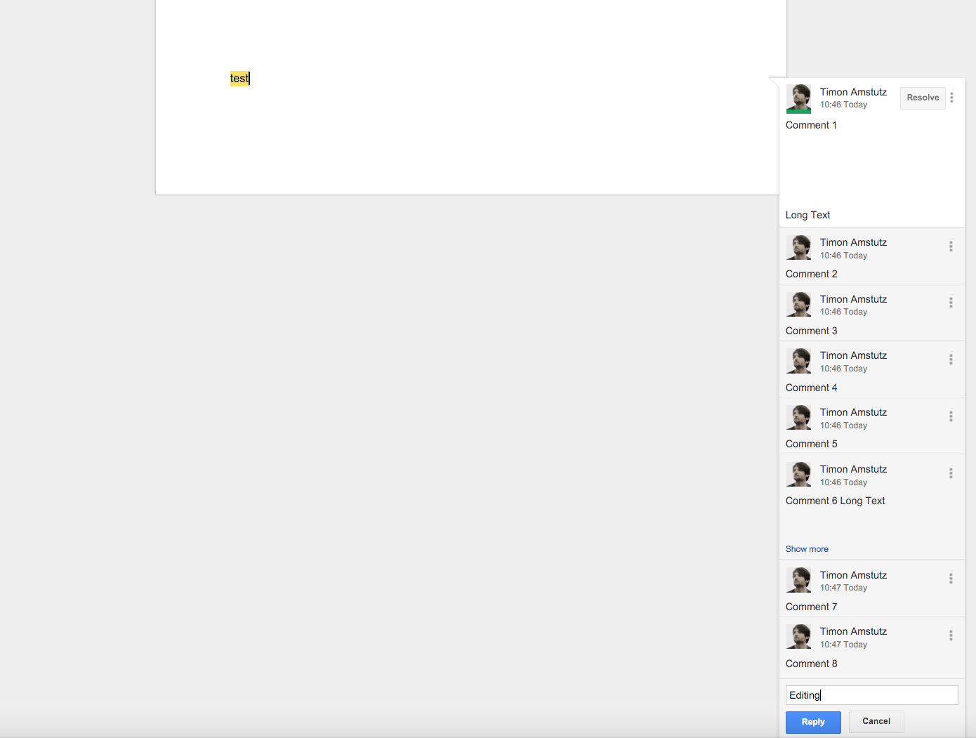
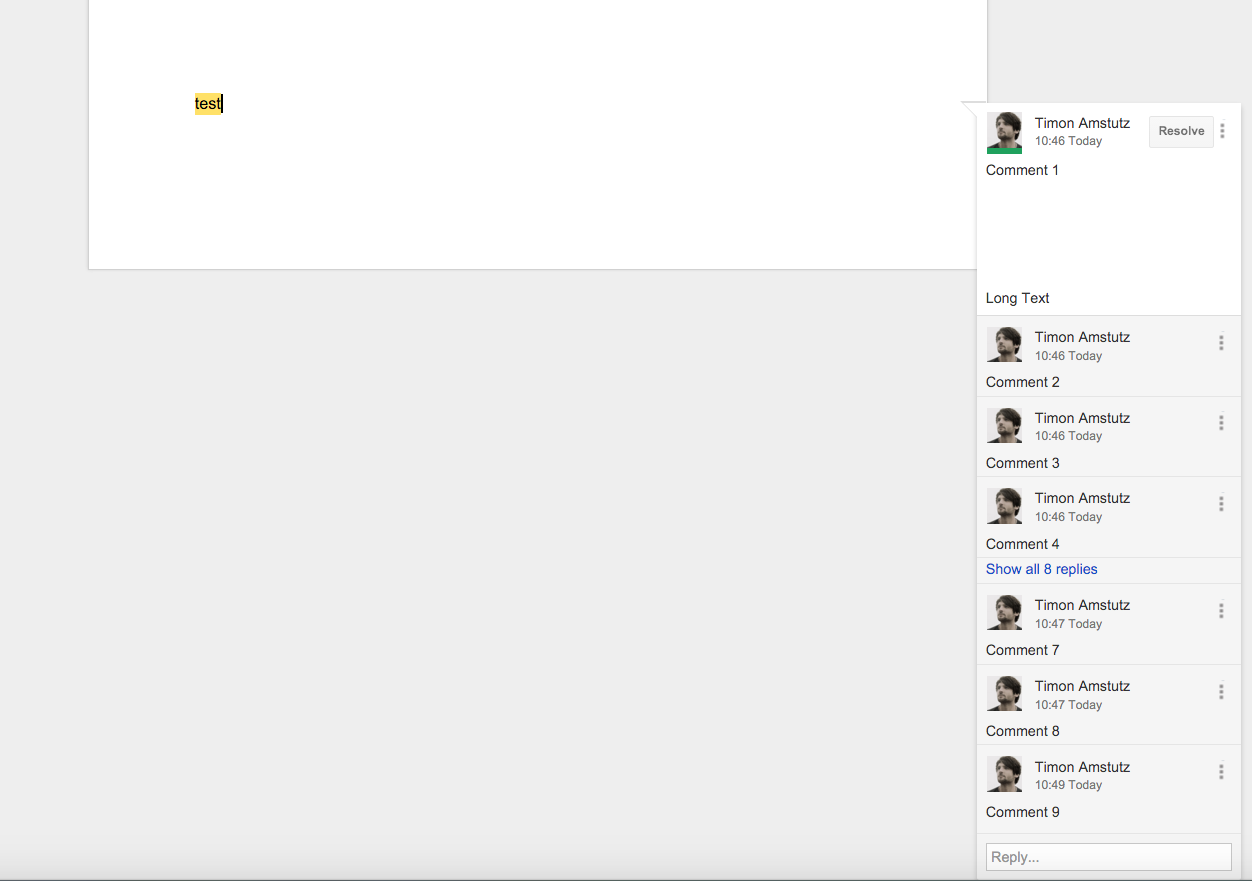
- A base class for Popovers using the bootstrap library needs to be implemented. Screenshot to examplify vertical page fitting in Google Docs.
4 Discussion
...
Last edited: 16. Feb 2016, 16:50, Tödt, Alexandra [atoedt]