Feature Wiki
Tabs
Progress status for learning modules
1 Description
f.e.:
- red icon - unread
- orange icon - read but test not passed ( if existing)
- green icon - read and test passed
Update:
This feature is a neccessary feature for courses in the field of continuing education. Learners usally work full-time and thus have little time to lose: they have to be able to find out as quickly as possible where they left off in a learning module (for example after a timeout, etc.).
About the icons: I think a new and more telling set of icons might be a good idea.
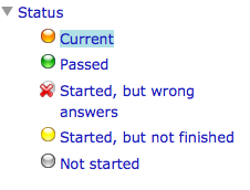
Description of SCORM Icons and Meaning
Alexander Killing, 21 May 2014, for ILIAS 4.4:
This is the status icon meaning within the SCORM implementation. We definitely must make this consistent for ILIAS LM and SCORM:

2 Status
- Scheduled for Release: ILIAS 5.0
- Funding: Universität Freiburg
- Maintainer: Alexander Killing, LEIFOS
- Development: Implementation of the feature is done by Alexander Killing, LEIFOS
- Contract settled: Yes
- Testing done by:
3 Additional Information
- If you want to know more about this feature, its implementation or funding, please contact: Marko Glaubitz marko.glaubitz@rz.uni-freiburg.de
4 Discussion
Brownie, 8 Jan 2010
An alternative (or adition?) would be a percentage which is displayed on every screen. (The number of screens already read divided by the total number of screens in the LM). This would not show WHICH screens you did not read yet. However, my personal experience with the "traffic light marking" is that it looks more like "still so much work to do" and it also might become quite colourful.
Two remarks:
- Do you know about the SCORM 2004 editor available since ILIAS 4? The feature you describe sounds like what is usually a function of a SCORM module. Up to now, it's not available in this editor but we already worked a list out containing desirable additional SCORM features.
- What is the criterion of a page being "read"? Do you rather think of a manual confirmation by the learner or an automatism? In the second case, the page would switch to the "read" status if the learner only once calls it, even if that only occurs accidentally.
Marko Glaubitz, 19.03.2014
I think having a feature that resembles the behaviour of SCORM LM would be a great frist step. We would like to use ILIAS LM instead of SCORM modules, but this feature has been the show stopper for us up to now.
Alex Killing 13 Apr 2014: I support the request in general. The icons would appear in the table of content explorer, like in scorm, right? I think we should use the same icons as in the scorm presentation. The feature can not be supported in the HTML export of learning modules (without making a major revision of the way HTML exports are created).
Matthias Kunkel, 13 Apr 2014: I support this request, too. Based on the recommendations by the maintainer and the head of development I schedule the feature for 4.5.
JF 14 Apr 2014: Alex should write a detailed description on the status icon behaviour and reschedule this topic before final implementation.
Alex Killing 21 May 2014: I added a screenshot describing the behaviour of the status icons in SCORM and re-scheduled the topic for the next JF.
Marko Glaubitz, 21 May 2014: We support the principle of consistency and support the idea of using the same button. However, this solution is graphically definitely not state of the art. Could this be reformed along with the update of the iconset?
JF 26 May 2014: We support the general behaviour of the icons as outlined by AK above and schedule the feature for 4.5.
5 Implementation
…
Last edited: 17. Apr 2025, 14:47, Kunkel, Matthias [mkunkel]