Feature Wiki
Tabs
Responsive Table Filters
Page Overview
[Hide]1 Initial Problem
Copied from Design Revision Part 2
Usability
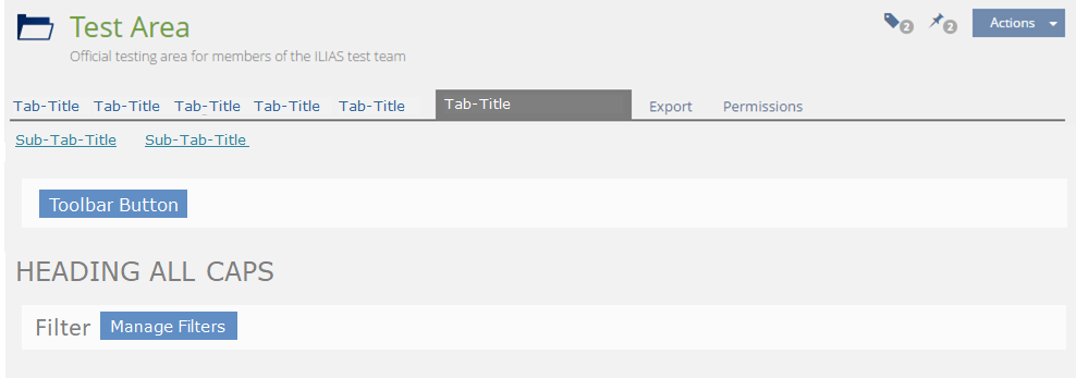
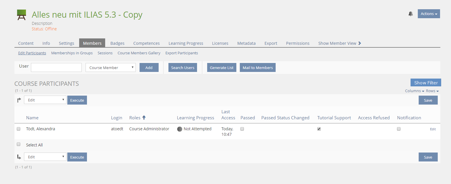
- Possibility to activate filters is easily overlooked / missed.
- Links „Show Filter“ and „Hide Filter work like buttons
- These Links jump around
2 Conceptual Summary
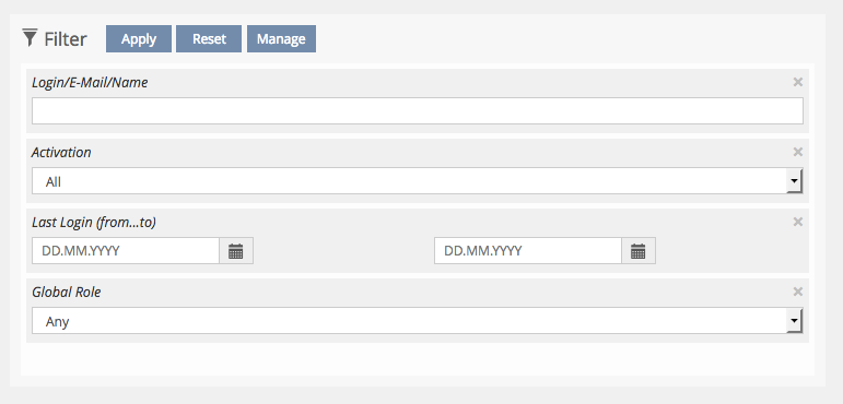
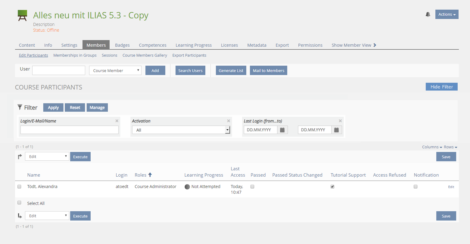
- Filters are responsively horizontally stacked
- Filter are gridded with a fixed width of all individual filter elements
- Filters can be used to filter list-GUI entries
- No more Checkboxes! All Checkboxes become three-entries Drop-Downs
- Multi-select in Drop-Downs
- Activating
- Filters are applied to the list instantaneously once the Filter is shown
- All Filter Items are initially set to their „neutral state“
- Filters that are not shown have no effect, there is no longer a filter exercising contol over lists while it is not displayed
- Selected options in filter elements disappear after the filters wer deactivated and then reactivated
- When the filters are activated initially, the default filter items will be displayed.
- Users can self-directedly add / remove filter items from the filter. Administrators cannot govern this.
- ILIAS will remember filter status (shown / off and which filter elements to show) per user and across sessions
- What Filters are shown should be configurable with sensible defaults
- An actually empty table would still be visible. Filters are applied and the result is empty > Message on top of table „This filter setting does not deliver a result “.
- An actually empty category features a textual hint like “This category is empty and contains no objects. The filter will not operate.“
- An empty text field in a filter item has no effect. This represents the neutral state and all items are displayed.
- We have an implict wildcard that is attached before and after each entry into a text field. It is not shown and will find all words containing that letter combination at some point.
- Filters and search are two different things: Search searches a universe, filter limit the display of a subtree.
- Openissue: "Time spent" control in Learning Progress
3 User Interface Modifications
3.1 List of Affected Views
- Booking Tool > Resevations
- Booking Tool > Booking Objects
- Category > Local User Administration
- Course > Members > Edit Participants
- Course > Members > Membership in Groups
- Data Collection > Content
- Exercise > Submission and Grades
- Glossary > Terms
- Groups > Members
- Media Pool > All Media Objects
- SCORM LM > Tracking Data > By User
- SCORM LM > Tracking Data > By Chapter
- SCORM LM > Tracking Data > Modify Data
- Test > Participants
- Test > Manual Scoring > Scoring by Participant
- Test > Manual Scoring > Scoring by Question
- Test > Statistics > Evaluation for All Users
- Testpool and Survey Pools
- Permission > Object Settings
- Permission > Log
- Learning Progress > Users
- Learning Progress > Matrix View
- Learning Progress > Summary
- Mail > Folder
- Personal Desktop > News
- Search
- Administration > Badges > Badges
- Administration > Badges > Users
- Administration > Languages > Title > Edit
- Administration > Organisational Units > Local User Administration
- Administration > Statistics > Statsistics
- Administration > User Management
3.2 User Interface Details
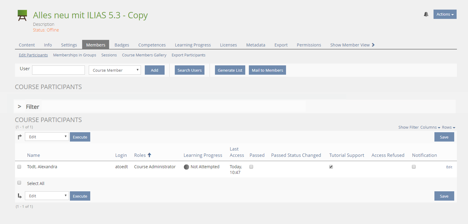
Activation of Filter Bar
Responsive behaviour
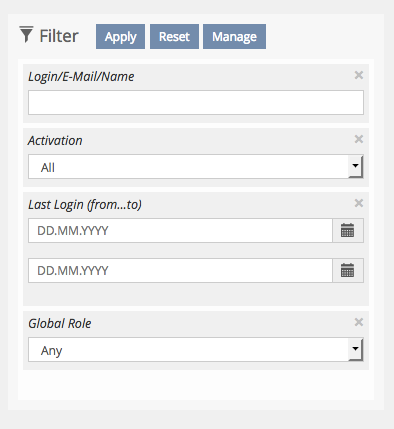
3.3 New User Interface Concepts
- Use filter of Mac OS as example:

To implement use bootstrap collapse [in] classes to reduce additional JS to a bare minimum. LESS/JS code from the following examples are available from Amstutz, Timon [amstutz]:

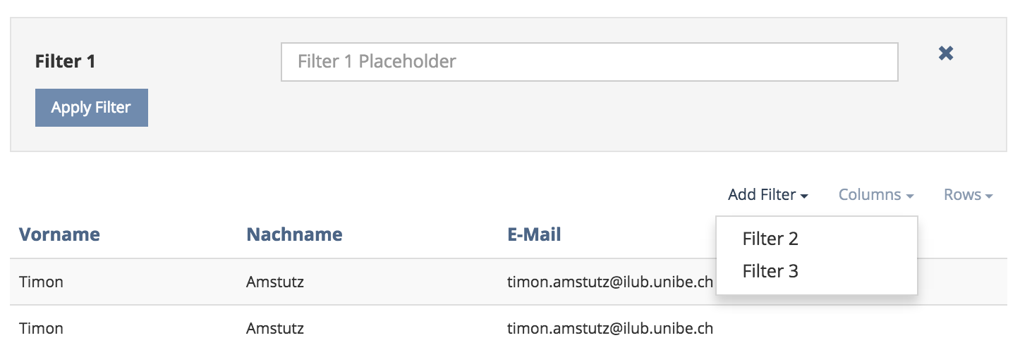
Proposal Alex Killing, 12 Okt 2016
This is just the UI behaviour I suggest, implementation details should go to the UI framework request. The "Manage" button opens a modal to select additional filter items (if supported). This would be just a list with checkboxes for each filter item.
Proposal Yvonne Seiler
3.4 Proposal from CaT, 2018-06-15
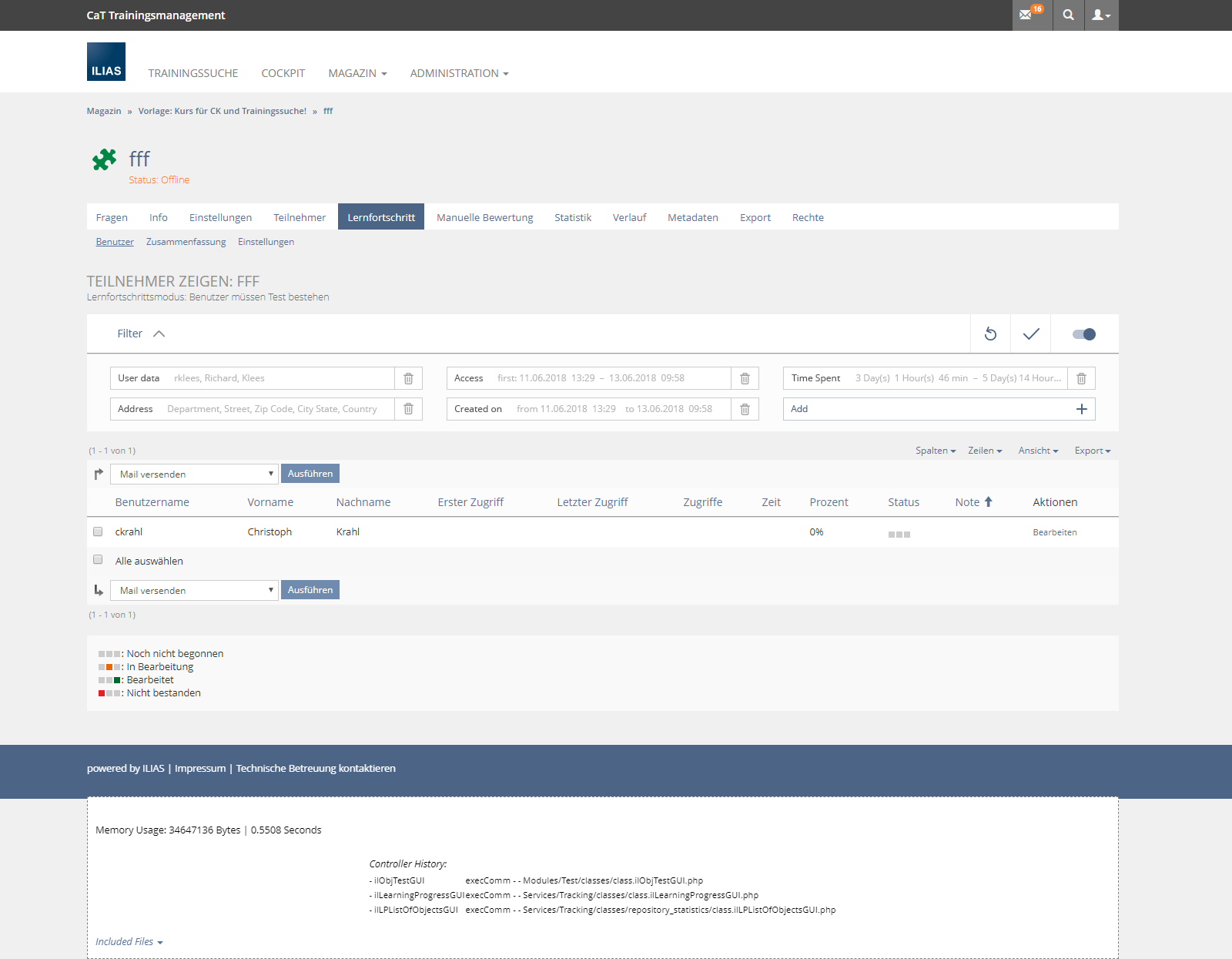
When the user first visits a page, the filter is represented by a collapsed bar and also is deactivated (toggle on the right side of the bar). On subsequent visits, the user finds the filter as she has left it on her last visit.
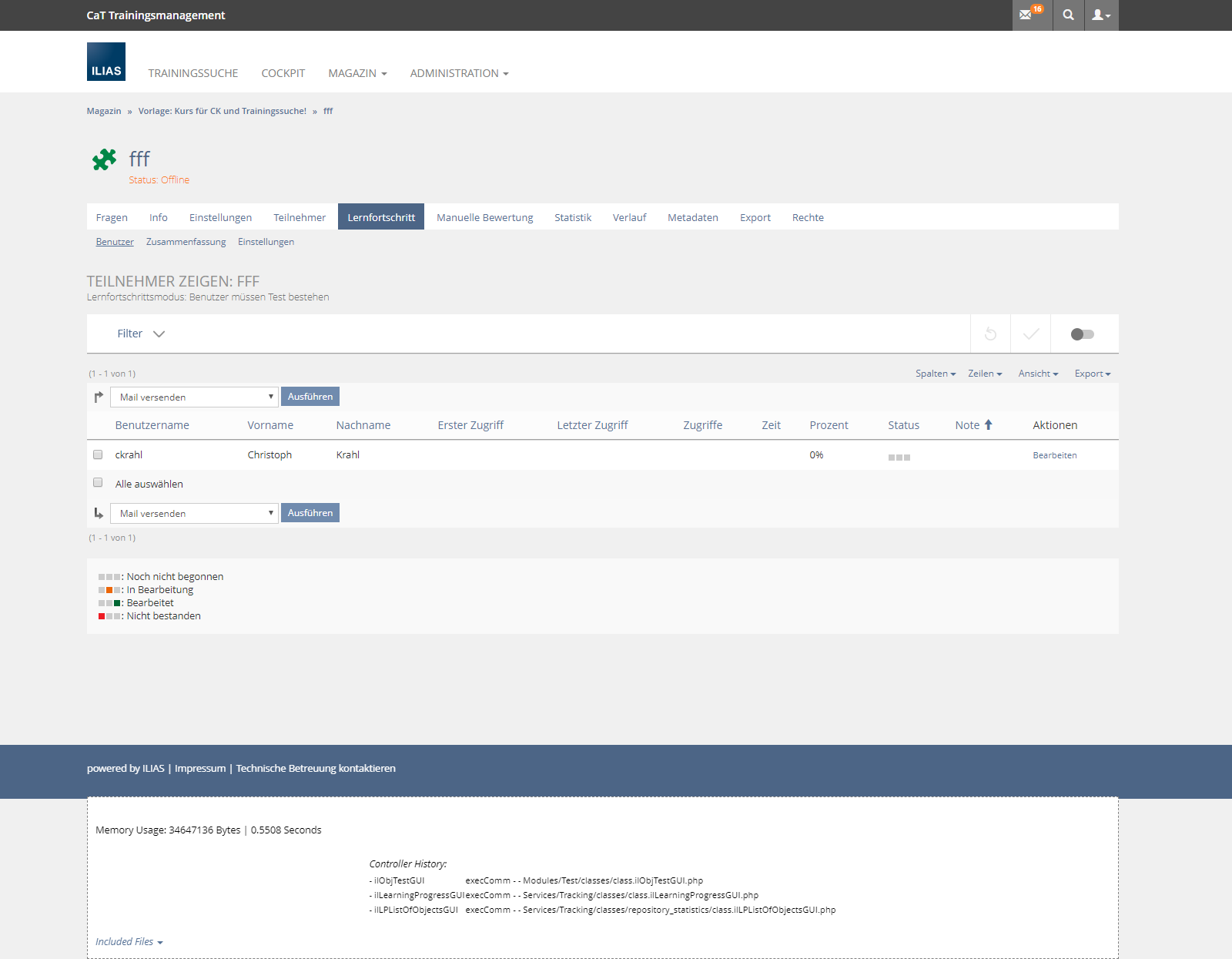
The user may then expand the bar to see the filter items and their default values. The greyed-out filter items, as well as the grey toggle, visually indicate that the filter is not active. The expanding of the full view of the filter is decoupled from the general activation of the filter. This saves spaces and allows the user to view the filter items before she actually activates the filter. By always showing the bar, the filter is never completely hidden. The bar then is a natural carrier for controls and provides visual cues to the user whether the filter is active or not.
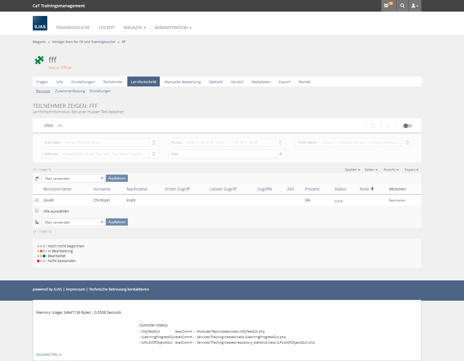
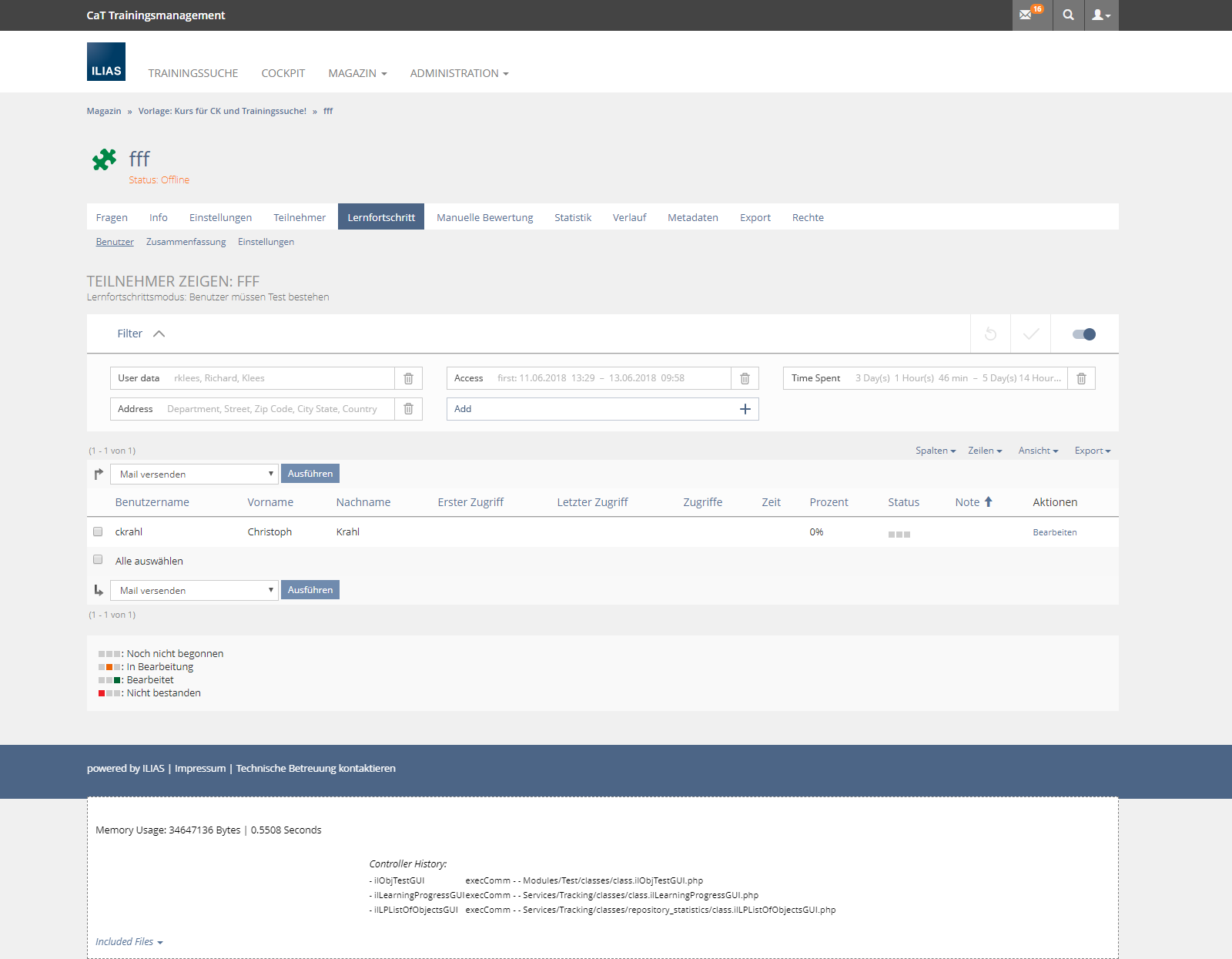
The user may then activate the filter by operating the toggle on the right side of the filter. The set filter values are thenapplied to the content by reloading the page immediately. The toggle and the items then visually indicate that the filter is active.
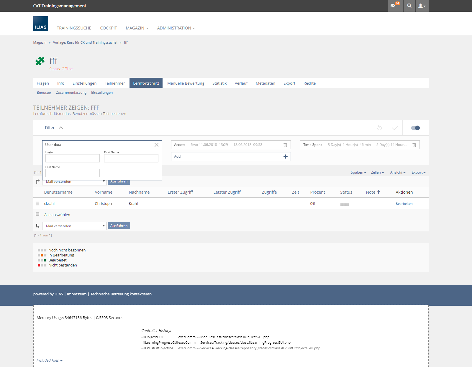
By clicking on the filter item the user opens a popover that contains the input elements to change the filter values. One filter item can contain a single field as well as a group of fields. This is usefull to group fields that are most often used together (like some filter item for a time period) or that are often used optionally (like login, firstname, lastname), where most of the time only one of the fields will be used. Note that even the filter items that do not show inputs to change the items indeed give an indication of the values that are currently set. Grouping fields and moving the inputs in a popover is a major space-saving compared to the current filter implementation.
After changing the items, the symbols for "reset" and "apply" on the right side of the bar become active. Clicking "apply" actually applies the filter, i.e. changes the content of the filtered table. Clicking "reset" will restore the filters default settings.
To add an item, the user clicks on the "Add"-control, which is always the last filter item. She is provide with a list of available (and not yet added) filter items.
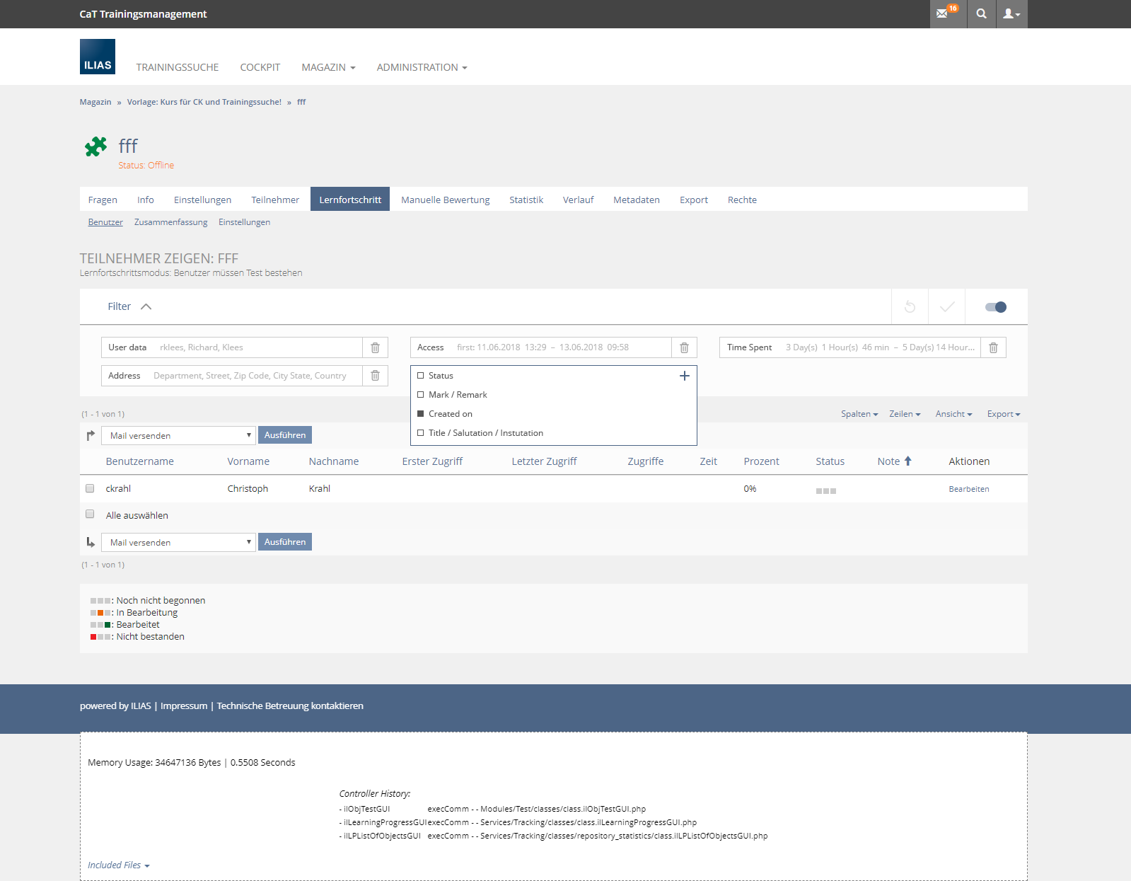
After selecting the required filter, the new filter item is added in place of the add and opened for setting the desired values. Clicking on the Plus-Sign in the upper right corner of the popover finishes the process.

The new item is then part of the bar just like the other item and the "Add"-control is advanced one position.
Existing items may be removed by using the "trash bin" icon on the right side of the items.
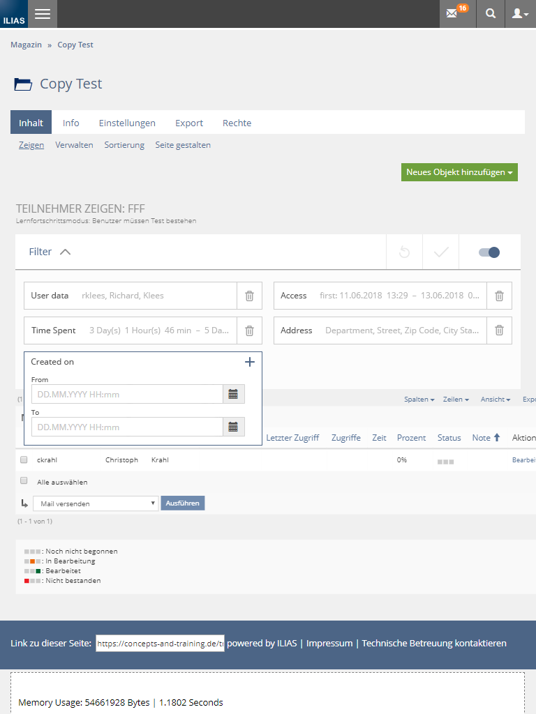
The filter bar works very similar on iPad-sized devices, where only two items are displayed per row in the filter.
The height of the items is raised to 40px to make them operable by touch. We might use the same height for desktop as well even if won't be required to operate them by mouse.
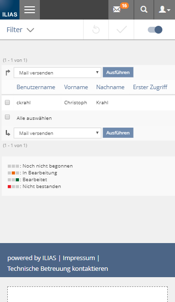
On mobile devices a similar bar is displayed on top of the screen. Again, the bar indicates that the filter is active. This effect might need to be more aggressive than in the provided mockups to make it less likely that users miss the fact that the filter is active. This might be achieved by a extended usage of grayed-out sections in the filter when it is inactive. Another possibility would be to display the set filter values in the filter bar itself when the filter is activated, similar to how the items display the values when the popover with the inputs is hidden.
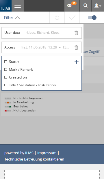
The filter bar can then be expanded in a popover that partially covers the background. This allows users to keep their current focus (i.e. the table) even when operating the filter, but also clearly highlights the task at hand (operating the filter).
The items again are operated by using popovers. If the necessary popover in popover is rejected for some reason, the content currently shown in the popover can easily be placed in an accordion below the operated filter item.
3.5 Proposal from leifos, 2018-08-27
- Only the first defined Filter Item will be shown in the Filter. Every other Item must be added through the "Add" Field.
- When creating the Filter with the Filter Items, there will be an additional parameter which decides if the Filter Item is immediately shown in the Filter or if the Filter Item can be added through the "Add" field later.
In the Proposal from CaT the role of the Reset Glyph does not become clear enough. It could be understand as an "Undo" function or as a function to restore the Filter to the initial state, like the actual Filters do.
The recently introduced Reset Glyph would work more like an "Undo". ("Upon clicking the related control is reloaded immediately and goes back to state before the user has started to make changes.").
Anyway, both functions would be very useful. In this case, a new Undo Glyph would have to be introduced with the description of the actual Reset Glyph, and the description of the Reset Glyph would have to be changed.
When the user has not made changes yet, only the Reset Glyph is active:

After making changes, the Apply and Undo Glyphs become active, too:

It would be also possible to leave it at two Glyphs. Depending on how the Filter will look like at the first visit, a Reset Glyph which restore the inital state would be more useful than an Undo Glyph or vice versa. Nevertheless, the description of the Reset Glyph would have to be changed.
Before making changes (here: Reset Glyph which restore the inital state):

After making changes:

- What is the specific reason to use Text? When it is used for comprehension reasons, why there is no need for a Label for the Toggle Button?
- Does it make sense to show the Text only for desktops? Mobile users will never see this. But due to missing place, Text cannot be used for the mobile view.
- It does not look nice and lead the user to lose attetion on the Glyphs and their state (activated/deactivated).

How the Labels of the Filter Items should look like? How should the Labels behave when they are very long? There are a few different options (option 1 is preferred by us):
1. The Labels have a fixed width, no matter how long they are. Overflowed content will display an ellipsis.

2. The Labels have a dynamic width in combination with a maximum width. Overflowed content will display an ellipsis.

3. The Labels are shown as a placeholder within the Filter Items. Overflowed content will display an ellipsis. When the Filter Item is set with a value, the Label disappears.

4. The Labels show up above the Filter Items and not as an Input Group. Overflowed content will display an ellipsis (not in the screenshot).

The workflow for adding Filter Items should be improved and shortened:
1. To add an Filter Item, the user clicks on the "Add"-Button, which is always on the last position. The user is provided with a list of available (and not yet added) Filter Items in a Popover.

2. The user selects the required Filter Item by clicking on it.

3. The Filter Item will be added in place of the "Add"-Button and a Popover will be opened for setting the desired values. There is no clicking on an additional "Plus"-Sign in the Popover for finishing the process anymore, the new Filter Item behaves like clicking on an already existing Filter Item. The "Add"-Button is advanced one position. The Filter can now be applied with the Apply Glyph.

4 Technical Information
{The maintainer has to provide necessary technical information, e.g. dependencies on other ILIAS components, necessary modifications in general services/architecture, potential security or performance issues.}
5 Contact
- Author of the Request: Amstutz, Timon [amstutz]
- Maintainer: {Please add your name before applying for an initial workshop or a Jour Fixe meeting.}
- Implementation of the feature is done by: {The maintainer must add the name of the implementing developer.}
6 Funding
- University of Stuttgart
7 Discussion
JourFixe, ILIAS [jourfixe], 6 July 2015: We support the general concept. The filter implementation should be extracted from the table component to be reused in other contexts. Clicking the "x" icon should not update the table. The "Apply Filter" should be always visible until all filters have been removed and the "Apply Filter" button has been pressed.
HJL., 16.9.15: We should replace the three filter in the Search-UI by responsive table-filters, too.:
- Area: Select Search Area / Reset
- Filter by Type: Off/On // Select All/Deselect All
- Filter by Creation Date Off/On / Choose date
Killing, Alexander [alex], 10 Nov 2015: Relevant bug for a refactoring is #16099.
- In your proposal I do not see any option to completely hide the filter if not needed. Is this intendet?
- Why would you use a modal and not a popover to activate/deactivate filters as Yvonne proposed in one of the mockups discussed with alexandra? What would you do/see in this modal?
- Note that you are currently using a glyph as non-interactive item, just to clarify the purpose of this section. Is this intendent behauviour? Is there any interaction I am missing if clicked on the glyph? Currently glyphs in ILIAS have an interactive character and are used if the space is to scarce for text to be displayed. We would have to modify the purpose of glyphs if this is really an intended use case (I am not sure if we should really do it however).
- Position of the Buttons: I am not sure if they are at the correct place. What about an alignment to the right?
Lauener, Hansjörg [lauener] 12 Okt 2016: From my perspective, a Hide/Show filter-switch is necessary. Such a switch should not jump to another place (as the Hide/Show-link does actually in 5.2).
AT 2018-05-18
@Jour Fixe:
- Can we start writing the Pull Request based on this concept?
- What is the preference about triggering the Filters? Toggle in Toolbar or Persisting Filter Bar?
- In chap 3.2 one screenshot shows how filter shall be presented on a wide screen. There are three filters in a row and a fourth one goes to the next row. This looks to me as a waste of space if I think of wide screens. At the time being, we already have five filters in a row without using the full available width. And even if filter boxes will get a fixed width that make them wider than they are now, we should allow as much filters in a row as there is place for them. If I reduce the width of the screen, they float. This is my understanding of responsivness. BTW: what is the suggested fixed width of a filter item?
- Checkboxes in filters shall be abandoned by "three-entries Drop-Downs". Can you give a description about how these three choices are composed, for example for the currently existing filter "No courses assigned"? What is the third option? And how do they look like?
- And have you thought about immediate filtering in the background without the need to click on the 'Apply' button? IMHO this would improve the user experience.
Kunkel, Matthias [mkunkel], 29 MAY 2018 : I think we can get rid of the hint to the design revision in 5.1 and change the title of this request form "DR 5.1 - Issue 04: Responsive Table Filters" to "Responsive Table Filters".
Klees, Richard [rklees], 2018-05-29: We (i.e. CaT) are not happy with this proposal and willing to invest time and ressources in an improvement of the current proposal.
Our main painpoint is, that the responsive version will hide the the important stuff (i.e. the content that is filtered) when a user opens the page. We think that this could easily be solved with an accordion-like filter bar or a popover.
We also see possibilities to save space in the single filter entries. This could be accomplished by showing a collapsed version of the entry that only shows the currently selected value of that entry (if any) and only expands to the according input when focussed. This could also be used in the wide screen view of the filters. In both cases this would make it more likely that the content gets a more important place since the filters take less screen real estate. This also is technique used by other pages on mobile e.g. amazon. This will be especially usefull when the input item for the filter value takes a lot of space, e.g. for date-time-periods or when a tag input will be used.
Finally, we see the possibility to enhance the style of the currently proposed filterbar, e.g. by using glyphs instead of buttons for "apply", "reset" and "manage".
We could contribute mockups for the enhancements proposed here for the 18.06.
As a personal remark: My memories of the state of the discussion 2 years ago is a little different than stated in the header of this page. I can not remember that the workshops we had lead to a final and agreed upon solution but rather faded out without a conclusive result. Even if my memory is wrong in that point I see that, with the additional experience and insights gained in the meantime, we could get to a better result for this widely used and important UI-component.
Amstutz, Timon [amstutz], Seiler, Yvonne [yvseiler] (University of Bern), 2018-05-30: We are grateful for the initiative to revive and tackle the filter issue. Filters are also an important UI element for us at the University of Bern, which should have the goal of being used as sensibly as possible. From our point of view it is a very powerful tool and due to the current display (hardly visible) and the current handling (somewhat sluggish behaviour) it is not used enough for the benefit it can bring.
From our point of view, the 2 options set out in Chapter 2 reflect more or less the state of discussion at the filter workshops at the time. As we remember, we got stuck with the two options (toggle in toolbar vs. persisting filters in filter bar) and did not make a final decision as to which of these variants is more suitable now.
We support Richard Klee's comments that the filter is (or should become) a central tool, that the filter must be clearly visible and "stand out" from the other content and, if possible, can be operated in such a way that the filtered content and thus the filtered results remain clearly visible. We would therefore like to look at CaT's proposal to see what else might be possible.
We therefore propose that a 90-minute virtual workshop be held to build on the previous workshop and discuss the solutions that have now matured in people's minds. We think that the presentation and discussion would go beyond the scope of the JourFixe. After this workshop and the discussed advantages and disadvantages of the individual solutions, we believe it will be easier for the JF to decide in which direction the filters should go. We at the University of Berne are happy to participate in this VC meeting.
Killing, Alexander [alex], 30 May 2018: We need a decision by the JF if the 2015 decision is obsolete (we are offering implementations on this decision to customers since three years). I understand the new ideas, but for me these are not just slight modifications of the current concept, thus our offers may become obsolete, too. This is why I ask for a JF decision on the proceeding.
Seeland, Per Pascal [PerPascalSeeland],03 Jun 2018, We (Uni Stuttgart) discussed the two choice and clearly wish to move forward with option 2, as the pages where we envision the usage would not work at all without filtering first. So losing screen space would not be an issue. What I can see pages like amazon is that they only use hiding the search is used on mobile, but we do not see this a primary goal.
AT 2018-06-04: Another suggestion supplementing the two options developed in the workshops
- Option 1 : Filters can be switched off/on by Bootstrap Toggle in tool bar
- Option 2 : Persisting filters (no switch-off)
- Option 3 : Filters can be switched off/on by standard button outside tool bar (see posting by Alexandra)
Kunkel, Matthias [mkunkel], 04 JUN 2018 : We postpone the decision about this request to June 18 to have some more time for an alternative suggestion by CaT. Alex will check if more than three filter blocks can be presented in the wide view.
Klees, Richard [rklees], 2018-06-15: I added our suggestion here. Feel free to ask questions, I will try to enhance the descriptions accordingly.
Seiler, Yvonne [yvseiler] 2018-06-18: Both thumbs up! I find CaT's proposal very appealing. Makes a coherent and visually logical and attractive impression on me! And gives the filter a visual importance and behaviour which can be adapt in a common easy way how filters are used in other web applications. Thanks for your suggestion.
Notes for Page Layout Revision: We need definitely a way to shorten the breadcrumb on mobile screens, if it should also be displayed as sticky (current suggestion goes in this direction). Because the page layout revision stops the header, breadcrumb and filter while scrolling. Or some kind of "it scrolls away, but comes back when I scroll back a bit" behavior.
Amstutz, Timon [amstutz] 2018-06-18: I completely agree with Yvonne. The proposal of CaT is a big leap quality wise. I love every aspect of it.
- "Show filter items screen": Show vs. Activate Filter seems to be confusing. After showing the filter the inputs are rendered in an inactive style. Can users click on them to add values or not? If not (what I assume) this makes the use of filters a long process:
- 1: Show the filter.
- 2: Activate the filter (and wait for the default server response)
- 3. Click a field to add a value (make overlay appear).
- 4. Enter the value.
- 5. Click "X" to make overlay disappear.
- 6. Apply the filter.
- Old behaviour:
- 1. Show the filter
- 2. Enter value
- 3. Apply the filter.
- Label and Value use the same space. Long labels make values "dissappear".
- Trash Can Icon is not defined yet (same as "-" sign)?
- Mobile: Having a filter active without showing the values is confusing imo.
- Mobile: This version uses "background > overlay > overlay" which in the past resulted in scroll behaviour issues and looks strange to the user since two of the layers seem to offer inputs at the same time.
- The preference for the persisting filterbar is fine for the University of Stuttgart.
- In the former discussion the need for using up as little space as possible was not a known requirement. This is new need for “as little space as possible” is not important to the University of Stuttgart. “Takeing up as little space as possible” however comes at a cost: The value entered into the filter is oftentimes no longer shown fully i.e. dates with exact points in time are not shown fully but only the date and “half a time”. This is not considered helpful and a more spacious layout allowing displaying at least a bit more of the input is desired by University of Stuttgart. This would require the identifier to be on top of the input control.
- What considerations lead to dropping the concept of “Filters are applied to the list instantaneously once the Filter is shown. All Filter Items are initially set to their ‘neutral state’ ”.? What is gained by introducing a new, extra step (1. Show filter, 2. Activate filter 3. Apply filter) and respective controls? This is not fine with University of Stuttgart, they would like to keep the original concept only two steps (1. Show filter, 2. Apply filter).
- What is the rationale for using popovers instead of directly entering the values? How can a repository picker be used with the popover?
- Glyphs on buttons do not have the same clarity as text on buttons. University of Stuttgart would like to have text on buttons and the buttons should be placed underneath the battery of filter items which will be applied and in line with the direction of reading and not on top of it.
- Configuring filter items using an overlay showing a list of all possible filter items is nice. All displayed filter items should be listed as checked, all filters not shown should be unchecked. Checking filter items should govern whether a filter item is shown or not. Using an add-glyph with out the remove-glyp however is not appreciated. At least the trash should be be replaced with the remove-glyph, if the add-glphy is used. Another option would be the close button as in the original suggestion.
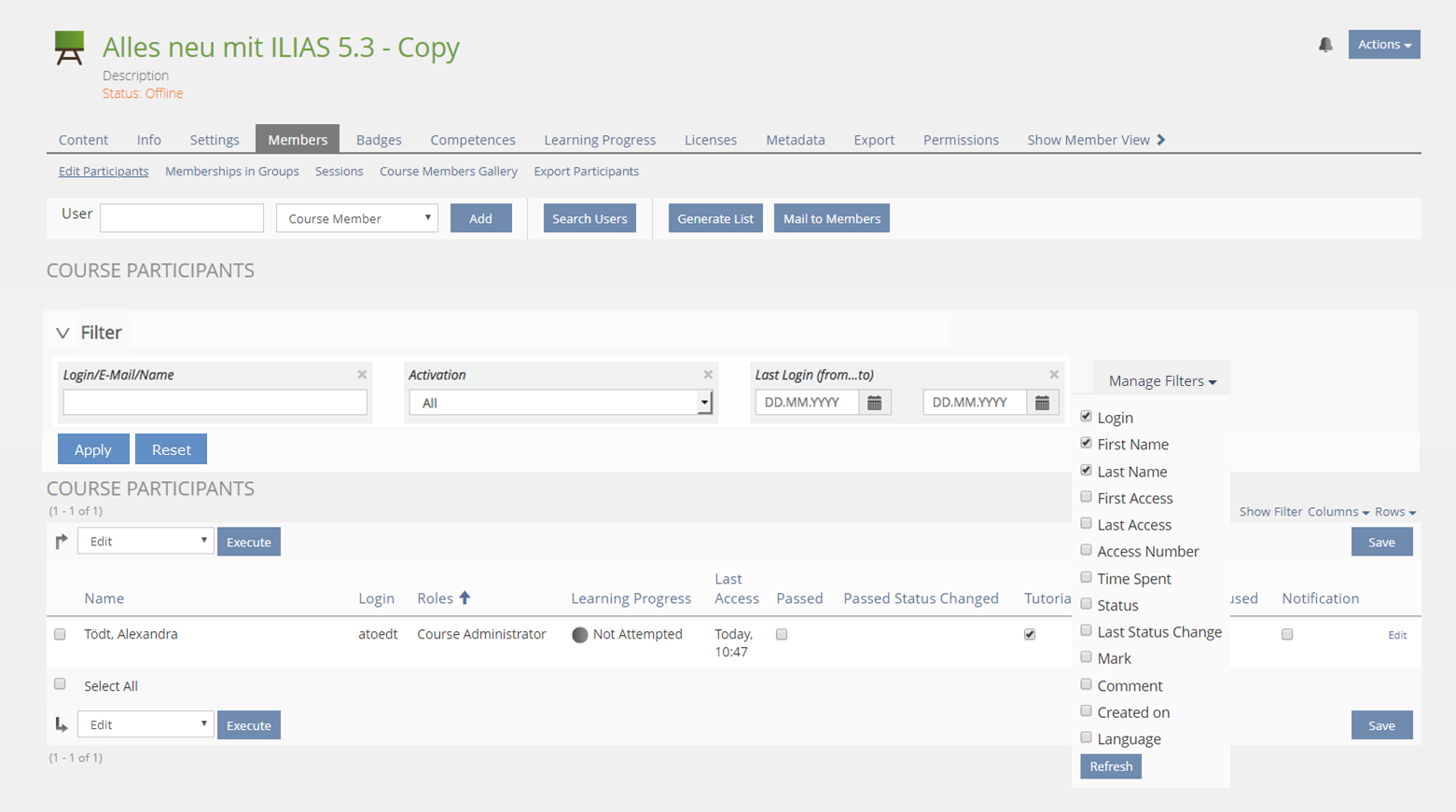
Klees, Richard [rklees], 2018-06-18:
@Alex:
"Show filter items screen": Show vs. Activate Filter seems to be confusing. After showing the filter the inputs are rendered in an inactive style. Can users click on them to add values or not? If not (what I assume) this makes the use of filters a long process. [...]
It would be fine for me, if the adding of values is possible even if the filter currently is not activated. Also, the popover imo should also disappear if i just click somewhere outside it, so no need to explicitely close it.
Label and Value use the same space. Long labels make values "dissappear".
Correct. We could have the labels above the inputs, that would use up more horizontal space. Would be fine for me too.
Trash Can Icon is not defined yet (same as "-" sign)?
Yes, this should be the "remove"-glyph.
Mobile: Having a filter active without showing the values is confusing imo.
As for the filter items we could use the bar to show some of the values. IMO we should not display all items, this is was causes the space problem on mobile.
Mobile: This version uses "background > overlay > overlay" which in the past resulted in scroll behaviour issues and looks strange to the user since two of the layers seem to offer inputs at the same time.
We also suggested to use an accordion behaviour here to alleviate that problem.
@other Alex:
In the former discussion the need for using up as little space as possible was not a known requirement. This is new need for “as little space as possible” is not important to the University of Stuttgart. “Takeing up as little space as possible” however comes at a cost: The value entered into the filter is oftentimes no longer shown fully i.e. dates with exact points in time are not shown fully but only the date and “half a time”. This is not considered helpful and a more spacious layout allowing displaying at least a bit more of the input is desired by University of Stuttgart. This would require the identifier to be on top of the input control.
Would be fine for me too, this just trades horizontal vs. vertical space.
What considerations lead to dropping the concept of “Filters are applied to the list instantaneously once the Filter is shown. All Filter Items are initially set to their ‘neutral state’ ”.? What is gained by introducing a new, extra step (1. Show filter, 2. Activate filter 3. Apply filter) and respective controls? This is not fine with University of Stuttgart, they would like to keep the original concept only two steps (1. Show filter, 2. Apply filter).
The reason is to spare space, especially on mobile devices. Also this allows to activate the filter without showing it, which imo is usefull (especially on mobile) considering that filter settings are persisted. We do not propose to activate and then apply the filter, activating the filter should directly apply it.
What is the rationale for using popovers instead of directly entering the values? How can a repository picker be used with the popover?
Inputelements use more space than simply displaying a value. Also this allows to group several inputs into one field without using space for all of them. These are some of the measures to save space. Repository-Picker is operated in a modal, right? How is that a problem with the popover.
Glyphs on buttons do not have the same clarity as text on buttons. University of Stuttgart would like to have text on buttons and the buttons should be placed underneath the battery of filter items which will be applied and in line with the direction of reading and not on top of it.
Please consider that we propose that the glyphs react on the actions of the user, i.e. when some value of a filter item checks, the glyph e.g. turns from grey to blue.
Configuring filter items using an overlay showing a list of all possible filter items is nice. All displayed filter items should be listed as checked, all filters not shown should be unchecked. Checking filter items should govern whether a filter item is shown or not. Using an add-glyph with out the remove-glyp however is not appreciated. At least the trash should be be replaced with the remove-glyph, if the add-glphy is used. Another option would be the close button as in the original suggestion.
I agree regarding the "remove" glyph. Please note, that we do not propose a "Manage Filter"-Item in the bar, but an "Add"-Item. I do not see, why we would want to use this to also remove filters, thus our proposal to show the filters that can be added without showing the one that have been added.
- We suggest to merge the two steps 'Activate' and 'Show' for the desktop. If a user activates the filter, the filter elements should be shown, too. This improves usability.
- Instead of using overlays in the mobile view we prefer to use accordeons.
- If a filter is activated and the accordeon is closed, the filter settings (key-values) should be presented in the filter top bar (at least shortenend with ...).
- We prefer to have a combined icon + text implementation for 'Reset' and 'Apply' in the desktop implementation.
- Open issue is adding and editing filters - keeping the current suggestion or introducing a new menu with settings glyph similar to current 'edit filters'.
Please provide a pull request for trunk based on these decisions.
- First appearance of the Filter
- Role of Reset Glyph
- Glyph + Text
- Width of Filter Item Labels
- Improved Workflow for adding Filter Items
- First appearance of the Filter : we prefer option 2. Each component should decide about default filters
- Role of Reset Glyph : we only want one Glyph to return to initial state (description in FR should adapted accordingdly to clarify that this reset does not go back to the last personal filter setting but to the initial state of the component. Additionally, we should try to find another glyph that shows an arrow counter-clockwise. And if technically possible and implementable with reasonable resources, we would like to have a reset glyph greyed-out when no personal changes compared to the initial state has been made (but this should not be a show-stopper).
- Glyph + Text : We prefer bulky buttons with a leading glyph followed by text. There is no majority for abandoning the text labels and just to rely on glyphs.
- Width of Filter Item Labels : We prefer solution 1.
- Improved Workflow for adding Filter Items : We accept Thomas' suggestion of a reduced workflow (one step less).
JourFixe, ILIAS [jourfixe], 15 OCT 2018 : Responsive table filters has been implemented through corresponding pull request that all have been accepted. Therefore, we schedule this UI element for 5.4.
Killing, Alexander [alex], 29 Oct 2018: Feature approved, but KS element has not been accepted, see Timons comment. Will not ship with 5.4.
Amstutz, Timon [amstutz], 14. March 2019: Note that we needed to clarify the statement of the JF: "We suggest to merge the two steps 'Activate' and 'Show' for the desktop. If a user activates the filter, the filter elements should be shown, too. This improves usability.“ We plublished our output as comment in: PR 1253.
Killing, Alexander [alex], 3 June 2019: Since this went throught the KS PR process and is not considered a feature, I just set this old page to release 6.0 and published in trunk to reflect its current status.
8 Implementation
This feature was not implemented for tables for ILIAS 5.4. It has been implemented for categories. This is why we present the categogry related screens and test cases.
Test Cases
This feature was not implemented for tables for ILIAS 5.4. It has been implemented for categories. This is why we present the categogry related screens and test cases.
- 24945 : Standardfilter für Kategorie MIT "Anzeige bei leerem Filter" aktivieren
- 24943 : Standardfilter für Kategorie OHNE "Anzeige bei leerem Filter" aktivieren
- 24944 : Massenkategorie mit Standardfilter filtern
- 24948 : Benutzerdefinierte Metadatensätze anlegen
- 24949 : Datenfelder anlegen für benutzerdefinierte Metadatensätze anlegen
- 24950 : Datenfeld Auswahlliste (Einfachauswahl) anlegen
- 24951 : Benutzerdefiniertes Metadatum als Filterelement für Kategorie hinzufügen
- 24953 : Massenkategorie mit Benutzerdefinierten Meatadaten Filtern filtern
Approval
Approved at 2018-10-29 by Seeland, Per Pascal [PerPascalSeeland].
Approved at 2019-11-17 by Seeland, Per Pascal [PerPascalSeeland].
Last edited: 17. Nov 2019, 16:41, Seeland, Per Pascal [PerPascalSeeland]


