Feature Wiki
Tabs
DR 5.1 - Issue 07: File Input on smartphones and tablets
1 Requirements
The presentation of file inputs is not tackled by the standard bootstrap implementation. This leads to issues where file input fields needs lots of horizontal space (e.g. mc question editing or toolbars). Styling, responsiveness and general functionality on smartphones and tables should be improved, see also JL comment on UI: Form.

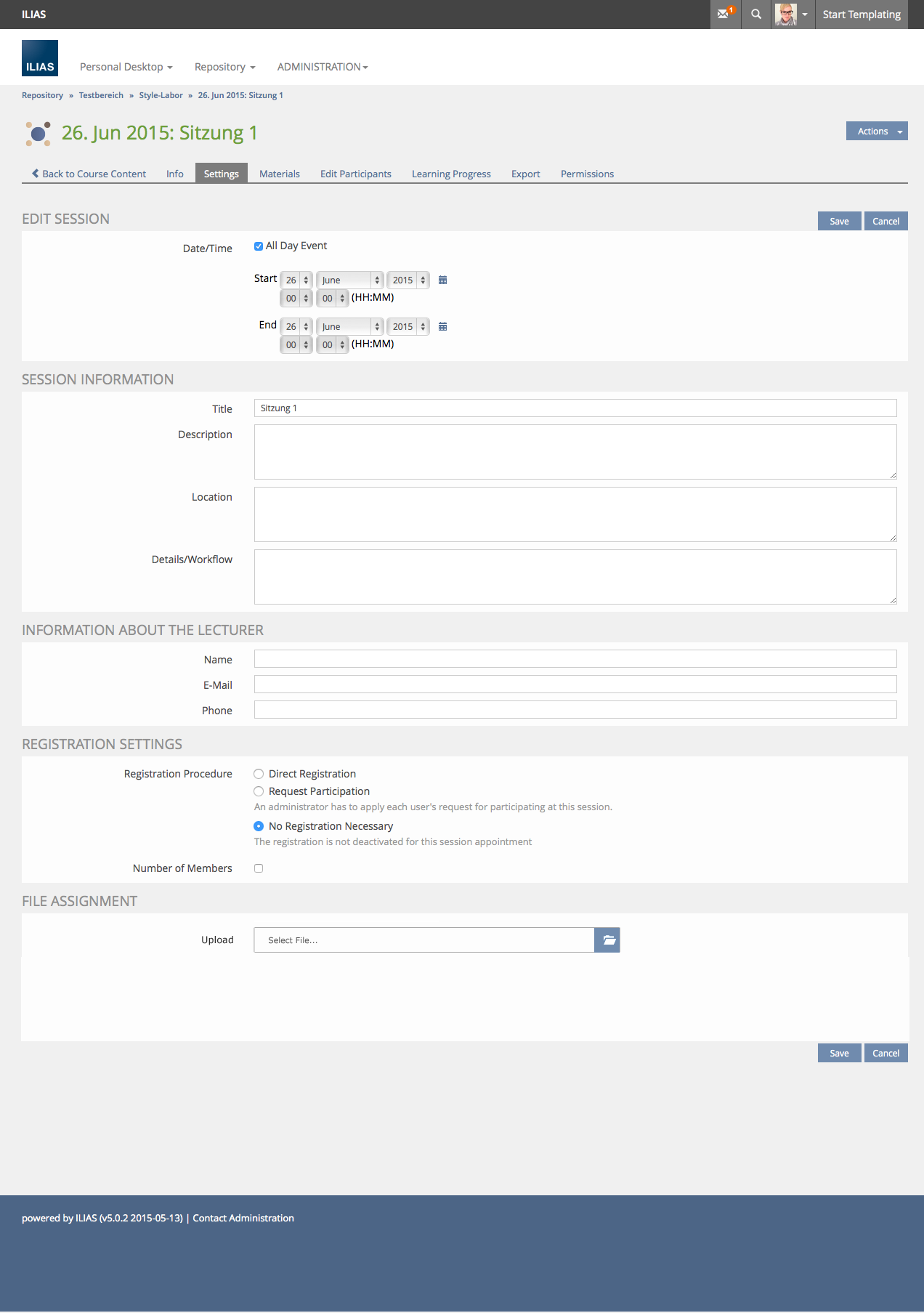
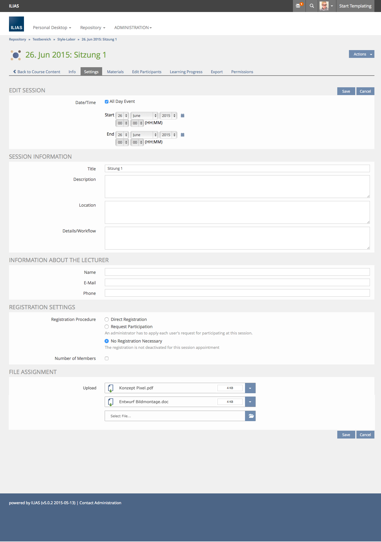
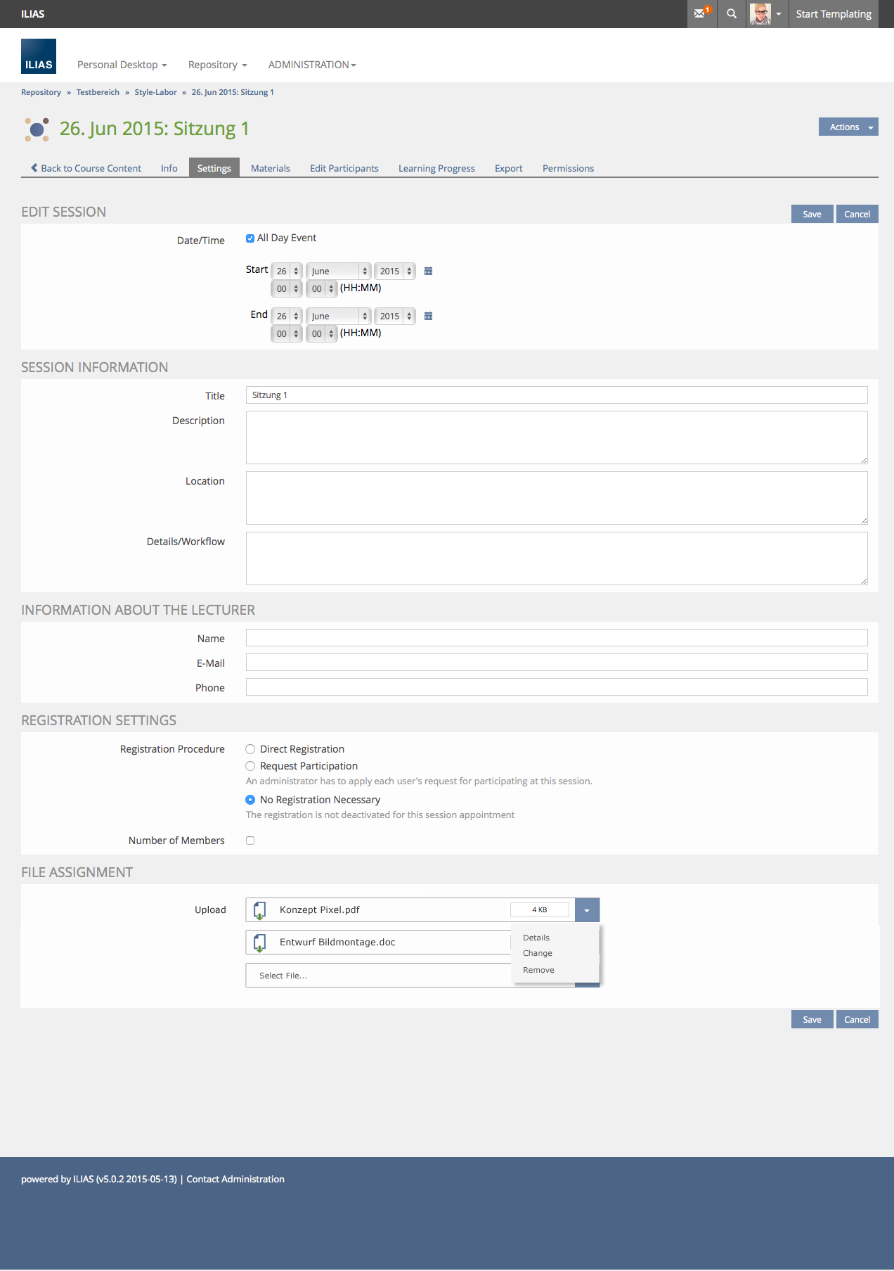
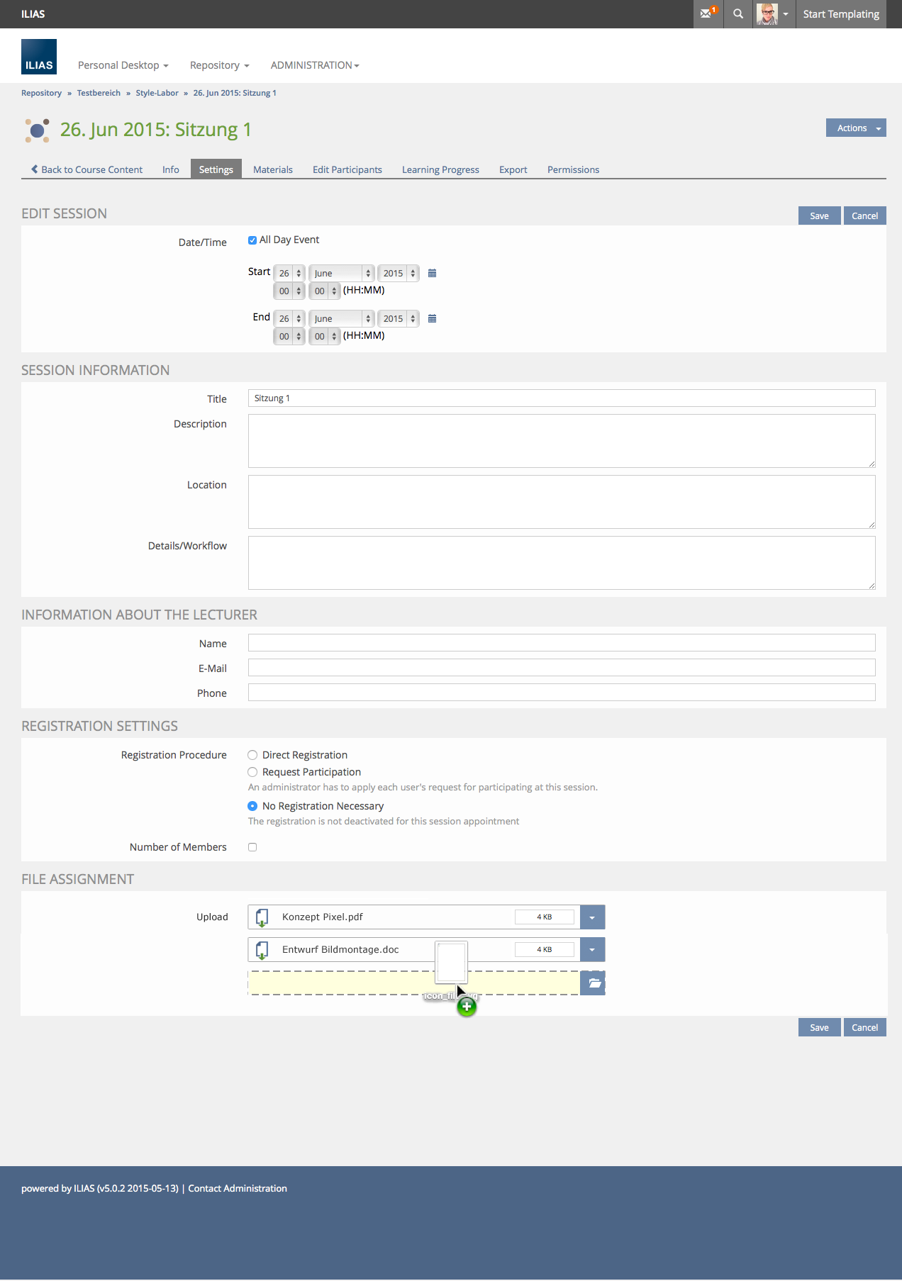
- Change the current ilFileUpload to be usable in any form. The File Uploud sould acccept from 1 to n files. To save space in forms, the fileupload must be redesigned (see attached images).
- The same file Upload should be used by the ilFile Module.


...
2 Additional Information
- Idea / concept: Amstutz, Timon [amstutz]
- Interest in funding: part of Design Revision 2
- Maintainer: Killing, Alexander [alex]
- Implementation of the feature is done by tbd
- Testcases by: tbd
3 Discussion
JourFixe, ILIAS [jourfixe], 6 July 2015: We support the general concept and ask everyone to give feedback. The use of https://github.com/blueimp/jQuery-File-Upload would be still feasible.
, 28 Jan 2016: Currently only a simple solution regarding responsiveness and bootstrap-like styling is planned for 5.2. The more complex proposal which is about making the file object creation screen widget available in forms is not part of this.
, 8 Aug 2016: The simple solution has been implemented - see UI: Form.
Schmid, Fabian [fschmid] 31.03.2017: I support the final development of the D&D-Fileupload as suggested above. The Upload will use the new File Upload Service.
- Use Collapse/Expand-Glyph for Metadata-Toggle
- A File-Upload/Folder-Glyph as displayed above does not exist in ILIAS currently, therefore use a text (also to reduce buttuns in Forms)
- Since a form should only have button at the top and at to bottom, the [v]-Menu as displayed above should be avoided
- The Standard-Dropzone should be reduced in the height

This results in the following suggestion:

For cases where the e.g. WrapperDropzone is used outside the Form-Context (such as uploading files in Repo) and custom metadata "Title" and "Description" are activated, the toggle and the subform will be available:


4 Implementation
{please give a descripiton of the final implementation and add screenshots if possible}
Test Cases
- {Test case numberlinked to Testrail} : {test case title}
Approval
Tested successfully and approved at {date} by {user}.
Last edited: 9. Aug 2017, 08:03, Schmid, Fabian [fschmid]