Feature Wiki
Tabs
DR 5.1 - Issue 05: Better presentation of responsive toolbars
Page Overview
[Hide]1 Requirements
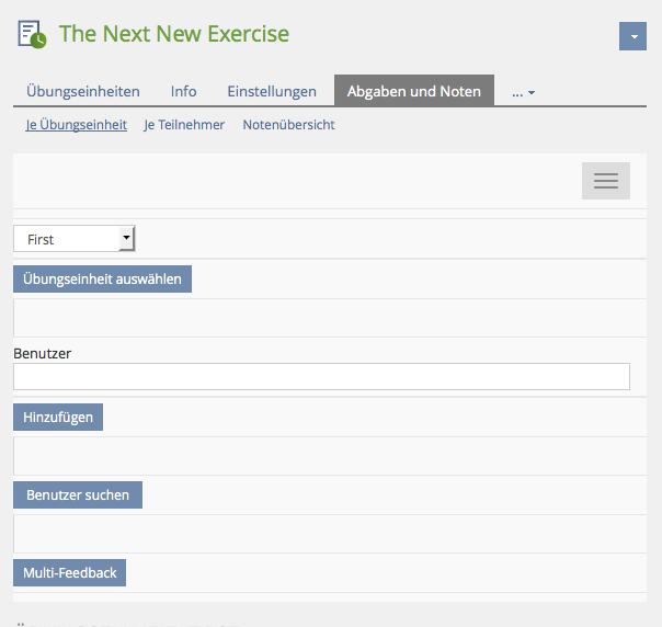
The presentation of toolbars and its UI compoments does not work very well if bootstrap switches to the small media screen presentation.
Description / requirement has been copied from page Design Revision Part 2:

1.1 Proposed Solutions
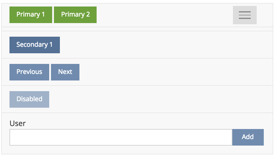
- Have primary and secondary buttons. Primary stay visible in mobile view, secondary go into the dropdown.
- JS completely done by bootstrap
- Less available from Amstutz, Timon [amstutz]


1.2 Recommended Behaviour of Responsive Toolbars
- ‘Sticky’ buttons (or UI elements) are always shown in a toolbar in mobile view (and never embedded in dropdown).
- ‘Primary’ buttons are always 'sticky' and therefore displayed in mobile view.
- Toolbar elements separated by separators in desktop view are presented in new rows in mobile view when dropdown is expanded (separator => new line).
- Toolbar elements within separators are considered as a group and presented in a row when dropdown is expanded.
- Toolbar elements without any separators are also considered as a group and presented in a row.
- A single button in a toolbar is also considered as sticky (and no additional dropdown is shown).
1.3 Related Usability and design Issues
Due to the introduction of responsive toolbars in ILIAS, we also get rid of the issues mentioned in DR 5.1 : Issue 14 - Download a file, Start a test, Start a survey.
1.4 Modules / Screens Where Sticky Definitions Are Missing
In the following list we should collect screens of modules / services where selected buttons or UI elements within the toolbar have to be defined as 'sticky' to present them always in the mobile view.
Kunkel, Matthias [mkunkel]: Does every toolbar always have to show at least one button (before opening dropdown)? Or do we accept also toolbars in mobile view that show just the dropdown icon?
- …
- Blog » Content : combined UI element for adding new posting
- Glossary » Terms (read): quick navigation element
- Mail » Compose: button "Search Recipient"
- Media pool » Folders: button "Create Media Object"
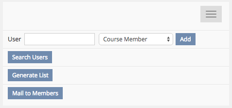
- Course » Members : which button / toolbar element should become sticky?
- Glossary » Terms (edit): buttons "Show Taxonomy" | "Hide Taxonomy" has no effect in mobile view because there is not enough space for taxonomy tree. So why not hiding these buttons in mobile view. ¿New button class?
2 Additional Information
- Idea / concept: Amstutz, Timon [amstutz]
- Funding: Part of Design Revision Part 2
- Implementation of the feature is done by , sr.solutions
- Testcases: ILIAS-Verein
3 Discussion
JourFixe, ILIAS [jourfixe], 6 July 2015: We support the idea of distinguishing primary/sticky toolbar elements and elements that will be hidden in the drop down. Please also take care of the "grouping multiple toolbar elements" issue (e.g. add members elements in the member list view). These elements are currently separated in multiple rows.
- Toolbars that should get a sticky button should be reported in Mantis "Suggestion for sticky" in the related component category and handled as bugfixes.
- We accept empty toolbars on mobile screen. Buttons should only become sticky when they trigger an important user activity.
- Additionally, Labels in front of input fields should not be presented above the input on mobile screens.
- And combined UI elements should be presented in one row as long as there is sufficient space to display them.
- Input field dimensions should be responsive using CSS but not JS (see MC Question edit form).
4 Implementation
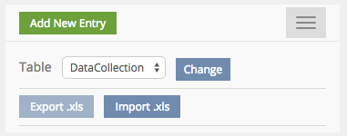
Items separated by the separator ar considered to be a group. Items of a group are displayed in a single row if the toolbar is collapsed (mobile view). Sticky items are always visible in the toolbar header, also if the toolbar is not collapsed. Sticky items are added via the method
ilToolbarGUI::addStickyItem().Other than that, the rules defined in the section "Recommended behaviour of responsvie toolbars" are applied.
The following LESS variables are introduced allowing to style the toolbar differently:
il-toolbar-margin// Margin between toolbar itemsil-toolbar-bgil-toolbar-heightil-toolbar-border// Border used by separator


Test Cases
- http://testrail.ilias.de/index.php?/cases/view/6476: C6476 - Sticky-Button wird in mobiler Ansicht immer angezeigt
- http://testrail.ilias.de/index.php?/cases/view/6477: C6477 - Primary-Button wird immer als sticky behandelt
- http://testrail.ilias.de/index.php?/cases/view/6478: C6478 - Button-Gruppe wird in einer Reihe angezeigt
- http://testrail.ilias.de/index.php?/cases/view/6479: C6479 - Per Separator abgeteilte Buttons werden in neuer Zeile angezeigt
- http://testrail.ilias.de/index.php?/cases/view/6480: C6480 - Einziger Button in einer Toolbar wird als sticky behandelt
Approval
Approved at August 25, 2016 by Kunkel, Matthias [mkunkel].
Last edited: 19. Apr 2023, 12:27, Kunkel, Matthias [mkunkel]