


Feature Wiki
Tabs
Nice Presentation of Test Results
Page Overview
[Hide]- 1 Requirements
- 1.1 Status in 5.0
- 1.1.1 Status Screens
- 1.1.2 Status in PDFs
- 1.2 Underlying User Requirements
- 1.3 Suggested Solution
- 1.1 Status in 5.0
- 2 Additional Information
- 3 Discussion
- 4 Implementation
1 Requirements
1.1 Status in 5.0
The Test Result presentation is ugly both on screen and in PDF.
On screen, it contains information doubles on the one-hand and on the other hand some relevant information is missing.
In PDF, the presentation is taking up a lot of space, while the information density isn’t al that high.
Both should be improved.
1.1.1 Status Screens
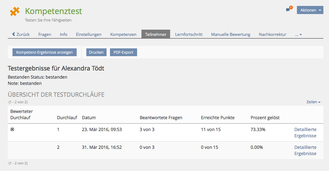
Redundant and incorrect information on screen 1: Test Results Overview (#15210)
The result screen presented to a participant has redundant as well as incorrect information.
- A: Page header "Testergebnisse für Elias Dario" does already include the name of the test participant. So there is no need to present it additionally in a dedicated row below ("Name: Elias Dario"). This is clutter and can be removed.
- B: "Datum des Tests: 13. Jan 2015, 15:11" is simply to be removed, because this information belongs to the scored pass, but is also shown in the pass overview table below.
- C: The notification about the own test result (e.g. "Herzlichen Glückwunsch ... erzielt.") should be presented like a success / failure message. The two sentences can be presented without line breaks. For screens showing the results of selected participant(s) for administartors the passed status as well as the granted mark can be shown in a list style.
- D: The title "Übersicht der Testdurchläufe" should not be a simple h2 header but an ilTableHeaderTitle (like on the detailed table view).

Redundant and incorrect information on screen 2: Test Result Details (#15211)
The detailed screen presented to a participant has redundant as well as incorrect information. Both should be fixed / improved for 5.0.0:

- E: Page header "Ergebnisse von Testdurchlauf 1 für Elias Dario" does already include the name of the test participant. So there is no need to present it additionally in a dedicated row below ("Name: Elias Dario"). This is clutter and can be removed.
- F: Instead of "Datum des Tests: 13. Jan 2015, 15:11" ILIAS should say: "Testdurchlauf beendet am: 13. Jan 2015, 15:11". The test run could be started much earlier. And the test itself has no date, only test run have one.
- G: The title "Testergebnisse" is clutter and can be removed. We had already a similar header above - and there is another below - related to the following table.
1.1.2 Status in PDFs
Two Bug-reports discuss the PDF-output:
- http://www.ilias.de/mantis/view.php?id=15660
- http://www.ilias.de/mantis/view.php?id=15536
The PDF-view must be improved: Density, Removing Clutter, Hiding interface elements, avoid overlay of elements
See also comment of JF: http://www.ilias.de/mantis/view.php?id=15657
I suggest the following procedure:
a) Implementing a pool with all relevant question types, with and without pictures. Try to use real questions. Create a test with the questions in this pool.
b) Write the solution in the questions, so testers can decide without the specific knowledge.
c) Start the tests
d) Post the pdfs here
e) In a workshop, we`ll improve the screens and make suggestions.
1.2 Underlying User Requirements
Students may not in all cases wholeheartedly care for managing their learning process but they very certainly care about their test results.
1.3 Suggested Solution
…
2 Additional Information
- Concept: Björn Heyser, bheyser@databay.de - Fabian Kruse, fabian@ilias.de - Alexandra Tödt, toedt@leifos.com
- Funding: Universität Münster
- Maintainer: Björn Heyser
- Implementation of the feature is done by Databay AG
- Tested by / status: (name, e-mail), (status information set after implementation)
3 Discussion
Fabian Kruse, 30.03.2015: Dicussing this feature with Hansjörg Lauener at DevConf, we both agreed that the PDF issue is just as important as the on-screen presentation. I hence amended that part slightly in the "problem" section of this bug.
In my opinion, a main issue to tackle here would be to increase information density in the PDF. Right now, the presentation takes up a lot of space. As people actually print this out, it would be good to reduce the amount of paper needed. Cosmetical issues are also plentiful, even though I don’t know in how far we could improve this without complicating the issue too much?
Further input would be appreciated!
BH 13 April 2015: The maintainer fully supports all aspects of this request, but we should deal with the pdf stuff in a seperate wiki page, since it is a big topic itself and it should not steel the focus for the genereal presentation. The general presentation needs to get consistent first in my opinion.
JourFixe, ILIAS [jourfixe], 20 July 2015: We highly appreciate this improvements and schedule it for 5.1.
Kunkel, Matthias [mkunkel], August 31, 2015: We accept this feature as usability fix for 5.1.
4 Implementation
This feature (improvement of existing user interface elements) was implemented as a usability fix for 5.1.x.
Test results of a user - tutor view
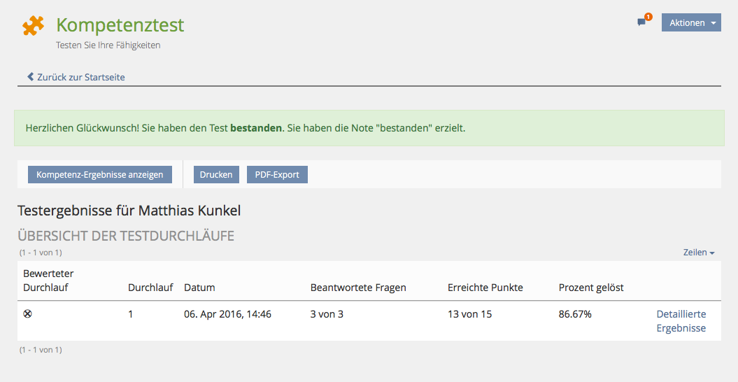
Test results of a user - personal view incl. success (or failure) message
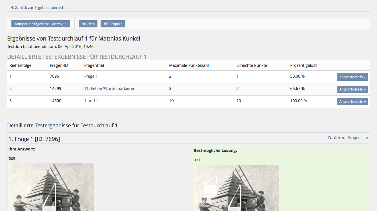
Detailed results view for selected test run
Test Cases
Test cases do already exist in http://testrail.ilias.de/
Approval
Approved at 11th Dec. 2015 by Volker Reuschenbach.
Last edited: 20. Mar 2023, 09:16, Samoila, Oliver [oliver.samoila]