Feature Wiki
Tabs
UI: Form
Page Overview
[Hide]1 Description
1.1 ILIAS 4.4
1.2 ILIAS 5.0.0 beta 2
1.3 Proposals Release 5.1
- http://www.abeautifulsite.net/whipping-file-inputs-into-shape-with-bootstrap-3/
- http://geniuscarrier.com/how-to-style-a-html-file-upload-button-in-pure-css/
Maybe a solution / enhancement can be found for 5.1+.
2 Requirements
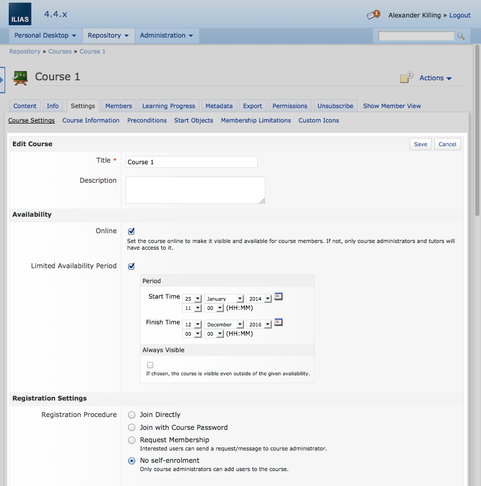
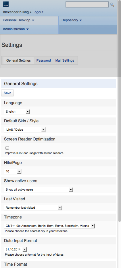
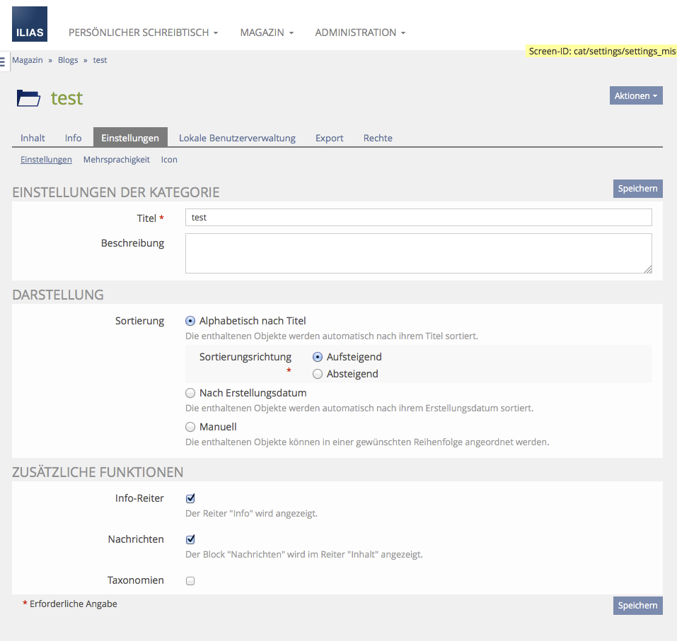
The current background-color of "ilFormHeader" is #f3f3f3. This is too close to the default background grey #f0f0f0. The effect is that the header of a form is not recognized as a distinct element. Therefore, the "Save" button doesn't look well placed, see screenshot below.
I strongly recommend to use a darker grey for "ilFormHeader". Screenshot 2 shows how it looks like with #e3e4e5.
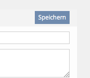 Grey of form header is too close to background |
3 Additional Information
- Idea / concept: Alexander Killing
- Funding: ILIAS-Verein as part of Design Revision Part 2
- Maintainer: Alexander Killing
- Implementation of the feature is done by Leifos
- Tested by / status: (name, e-mail), (status information set after implementation)
4 Discussion
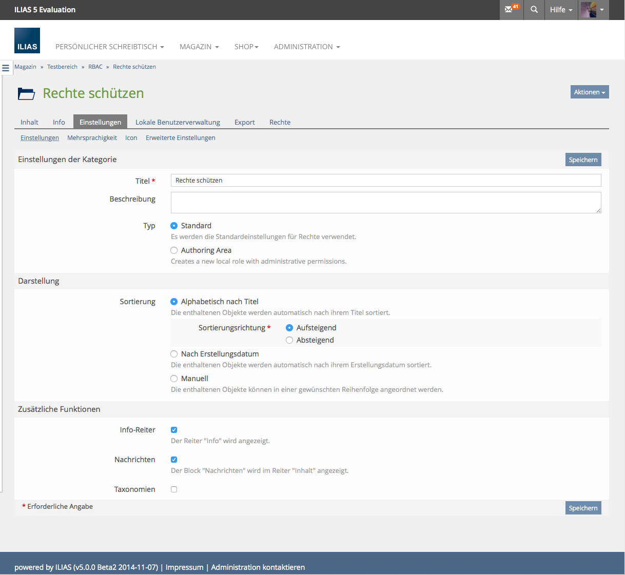
Alex Killing, 07 Jan 2015: Afaik the latest idea was to give the forms the look of the info screen. This would mean no background color.
Matthias Kunkel, 07 Jan 2015: Using the same layout for Info and Form UI could be a good solution. In this case the button in the form header has to fit to the right end of the form background.
Alex Killing, 07 Jan 2015: I have committed a Info Screen like look.
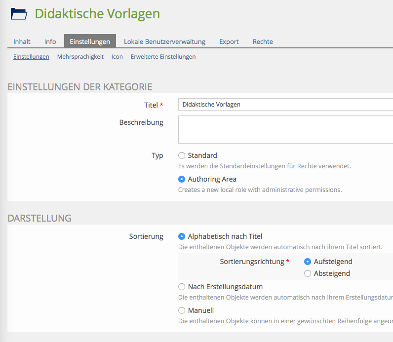
Matthias Kunkel, 07 Jan 2015: Much better now. Just add more padding-top to ilFormHeader. It needs some space inbetween the blocks. I have tried 25px for padding-top and it looks good!
JL 05 Feb 2015: The file input GUIs are difficult to style and currently (5.0) are presented differently to all other buttons (this also depends on the client's operating system). There seem to be ways to enhance the presentation and we should check if there are any drawbacks:
http://www.abeautifulsite.net/whipping-file-inputs-into-shape-with-bootstrap-3/
http://geniuscarrier.com/how-to-style-a-html-file-upload-button-in-pure-css/
There is also the "FileUpload"-Service which basically does the same but is really complex.
Maybe a solution / enhancement can be found for 5.1+.
JF 2 Mar 2015: We agree with Jörg lasts comment and suggest to improve file upload elements with 5.1.
5 Implementation
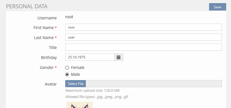
, 8 Aug 2016: The upload form fields now have "bootstrap-styling".
Test Cases
- 7307: Persönliche Daten komplett eingeben
Approval
Approved at August 08, 2016 by Kunkel, Matthias [mkunkel]
Last edited: 19. Apr 2023, 12:27, Kunkel, Matthias [mkunkel]
