Feature Wiki
Information about planned and released features
Tabs
UI: Object List in Container
Page Overview
[Hide]- 1 Description
- 1.1 ILIAS 4.4
- 1.2 ILIAS 5.0.0 beta2
- 2 Requirements
- 3 Additional Information
- 4 Discussion
- 5 Implementation
1 Description
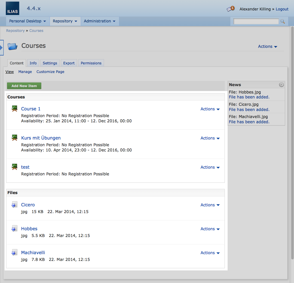
1.1 ILIAS 4.4
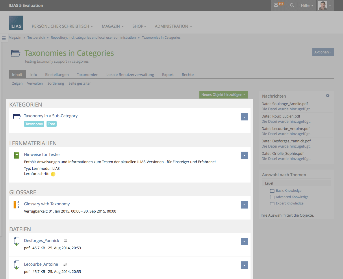
1.2 ILIAS 5.0.0 beta2
2 Requirements
Revising the visual design of object lists. A good example is a list of items in the repository that make use of features like advanced metadata, preconditions, rating, preview (files) and more. When should get rid of borders, we can present the single items in a more prominent way. E.g. popular mooc platforms provide a more visual attractive presentations of course lists, than most of the LMS do.
One single style for presenting objects in a list might not be satisfying all. Having an option on how a list is presented would be desirable. ILIAS could offer at least two modes for the presentation of object lists:
- Simple List: it consists of the default object icon, followed by title and description, additional information - as already known.
- Advanced List: it comes with a bigger image or icon, a title in bigger font-size and additonal information below.
There are already other feature wiki pages covering the same topic:
- More Visual design for container objects
- Improving ListGUI
- ListGUI Guideline (effective from 5.0)
3 Additional Information
- Idea / concept:
- Funding: Required
- Maintainer: (will be set by Jour Fixe)
- Implementation of the feature is done by (company, developer)
- Tested by / status: (name, e-mail), (status information set after implementation)
4 Discussion
Zenzen, Enrico [ezenzen], 03 AUG 2022: This request no longer fulfills the requirements of the Feature Wiki. In consultation with the maintainer I change the status of the feature request to "Redundant / outdated". If the request is still relevant, please update template and mockups.
5 Implementation
...
Last edited: 3. Aug 2022, 11:02, Zenzen, Enrico [ezenzen]


