Feature Wiki
Tabs
Who is online? tool for awareness
Page Overview
[Hide]- 1 Requirements
- 1.1 Where will the Awareness Tool be displayed?
- 1.2 What can be done with the Awareness Tool?
- 1.2.1 Collapsed Awareness Tool
- 1.2.2 Expanded Awareness Tool
- 1.2.3 Entry selected
- 1.3 Organising the List of entries and navigational controls
- 1.4 Who will be listed in the Awareness Tool?
- 1.5 Heritage: What happens to the existing Who-is-online?
- 1.6 Awareness Tool in the Administration Panel
- 1.7 Complementary Requirements
- 2 Additional Information
- 3 Discussion
- 4 Implementation
- 4.1 Configuration
- 4.2 Presentation
- 4.3 User Settings
1 Requirements
The Awareness Tool increases the visibility of users throughout ILIAS: The Awareness Tool displays other users presently online. It will display users relevant to you ("contacts").
The Awareness Tool offers access to the Chat but is not the same thing as the chat. The Awareness Tool offers access to other functionality beside the chat.
1.1 Where will the Awareness Tool be displayed?
- Improved awareness is accomplished by providing the Awareness Tool on every screen throughout ILIAS.
- It is fixed on the top right of every screen. By default it should be closed.
- The Awareness Tool must not cover functionality available in the main screen. Specifically the Help is supposed to open on top of the Awareness Tool when opened.
- Tags and Notes are supposed to remain operationable. This requires a little more thinking on part of the Jour Fixe.
- The implementation needs to take care of the performance issues that are to be expected from such a tool.
1.2 What can be done with the Awareness Tool?
- Collapsed
- Expanded
- Entry selected
1.2.1 Collapsed Awareness Tool
A click on the collapsed entry expands the full entry. How one should get back to the full list is up to discussion.
1.2.2 Expanded Awareness Tool
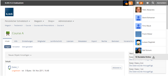
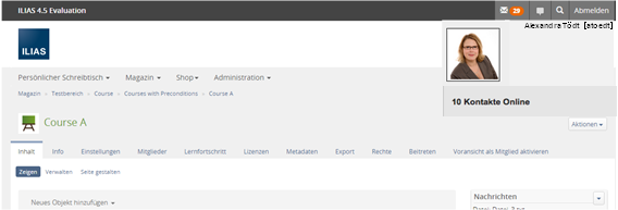
On click on the "x contacts online" the Awaress Tool expands. Another click will collapse it again.
1.2.3 Entry selected
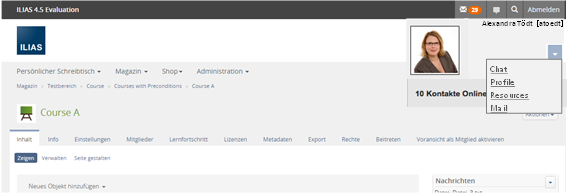
- Variant: comprising more functionality
- Variant: lean „Facebook“-style
- Accessing a Profile:On click an overlay opens showing the Personal Profile.
- No Profile: The silhouette with name and given name is displayed.
- Profile: The Profile is displayed.
- Portfolio used as Profile: The Profile will be displayed with a prominent link to the Portfolio.
- Accessing a shared resource: On click a screen is shown listing the shared ressources of that user.
- No shared ressources: A message is displayed with the information that this user has not shared any ressources with you.
- Shared Ressources: The list of ressources is displayed and you can access them.
- Writing a mail: On click a full screen mail form opens and you can directly write to that person.
- Initiating and having a chat conversation: On click a conversation with that user in the chat beginns.
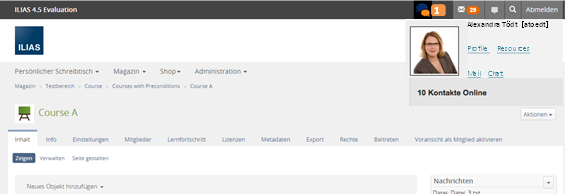
- Accessing a Profile: On click on the user's name the Profile will be shown in an overlay.
- No Profile: The silhouette with name and given name is displayed.
- Profile: The Profile is displayed.
- Portfolio used as Profile: The Profile will be displayed with a prominent link to the Portfolio.
- Initiating and having a chat conversation: Clicking on anything but the user's name will open a conversation with that user in the chat.
- Administrator: Activate / Deactivate Awareness Tool globally
- User: expand Awareness Tool
- User: using an entry in the Awareness Tool > accessing a Profile
- User: using an entry in the Awareness Tool > accessing a shared resource (only in variant A)
- User: using an entry in the Awareness Tool > writing a mail (only in variant A)
- User: using an entry in the Awareness Tool > initiating and having a chat conversation
- User: collapse Awareness Tool
1.3 Organising the List of entries and navigational controls
The order of the entres should be helpful. Skype sorts alphabetically but commands more screen estate, too. Facebook does not in any discernable way and has comparably litte screen estate. We could sort alphabetically or by last chat date or by some kind of activity index. Any suggestions?
The answer to the question of ordering should be found with regard to performance issues.
No matter how we sort, there should be NO option to change sorting because everything is so crowded anyway.
In the administration panel there might be an option to include offline contacts into the list of entries. If this option is activated the online contacts should be shown high in the list and the entries of offline contacts should be low on the list.
Notification about contacts going online
The implementation has to ensure that a notfication is given as soon as one of the user's approved contacts goes online. Users should be made aware of a that change. Skype may be a model in this respect.
Filters for navigation
Underneath the Awarenes List there is a line for filtering. The entries in the list are filtered according to what is entered there. Three letters should be enough to filter for all contacts whose first or last name start with those letters.
Do not scroll
If the list of entries is long it can not be displayed as a whole. There already is a scrolling control on the screen of the ILIAS page. We should not add another one for the awareness tool. Facebook does not allow to scroll the list of friends.
To move on to the next part of the list users should "flip" to it by hitting a little link "more" on the bottom of the list.
Alternatively the list could be paginated (a-z). But that would make the controls so tiny that many users will be unable to operate them. We are not sure whether this is a valid option.
Tabs
The awareness tool features two tabs, if the support feature was activated and a support person is currently online. If the support option is not activate or no support person is online there will be no tabs.
- Tab "Contacts" contains entries of approved contacts
- Tab "Support" contains entries of support persons (either technical support or subject-specific support)
1.4 Who will be listed in the Awareness Tool?
Only approved contacts and supporters are listed in the Awareness Tool.
1.5 Heritage: What happens to the existing Who-is-online?

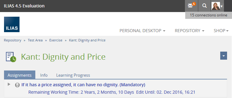
We do endorse the issues brought up in Who-is-online Revision. We would like to reduce the current Who-is-online to an information reading "n users are online". "n" is indicating only the number of open sessions, disregarding any selection about hiding one persons online status, since this information is aggregated and not listing people anymore.
This reduced "Who is online" can be switched on and off independently from the Awareness Tool.
1.6 Awareness Tool in the Administration Panel
The Chat can be used in the Repository only. So the Awareness Tool can be switched of and the chat will still be available as an repository object.
Activation of Awareness Tool
Again, there are to variants to be discussed:
- Global activation: The Awareness Tool can be switched on / off globally in the administration for all users. Users cannot switch it off individually. Users can only turn shown all requests for contact and never pose a request for contact themselves. Thus their Awareness Tool will remain empty, they will not be displayed in anybody else's Awareness Tool. This variant is very simple and straight forward: Users cannot miss switching it on it will be ready to use. But: The organisations privacy officer may not approve of this implicit "opt-out"-strategy and require to switch it off globally. Before deciding for this variant we have to consult a privacy officer for his / her opinion on this.
- Global activation plus individual activation: The Awareness Tool can be switched on / off in the administration AND users must decide upon activating it individually, too. In the "Settings" of the Personal Desktop the option "Hide My Online Status" is replaced by an Awareness Tool setting to activate / deactivate it. The default value would be "Awareness Tool off". The individual activation means actively giving consent which should be ok with the privacy officer. But: The successful use of this variant the project Prompting to Personal Profile in First Access MUST be implemented unless a big share of users missed out on the feature accidentally.
- Optiontext: Awareness Tool off, by-line: No awareness tool will be displayed. You do not make contact with other users nor will you get requests for contact. You cannot chat with other users using the awareness tool.
- Optiontext: Awareness Tool on, by-line: Awareness tool will be displayed. You can make contact with user that have the awareness tool activated and you can get requests for contact from others. You can chat with approved contatcs.
Specific users can be selected to serve as technical support staff. These users offer 1st Level Support disregarding any course or group contexts. They offer support for all questions concerning the operation of ILIAS. Please see Course Contacts and Support Contacts for more details.
Nice to have: Offline Contacts
The DevConf in Bolzano has put forward another requirement as nice to have: A global option for
- display of online contacts only
- display of all contacts (online and offline)
1.7 Complementary Requirements
2 Additional Information
- Idea / concept: Tödt, Alexandra [atoedt]
- Funding: Funded by Technische Hochschule OWL
- Maintainer: Killing, Alexander [alex]
- Implementation of the feature is done by Leifos
- Test cases by / status: (name, e-mail), (status information set after implementation)
3 Discussion
Martin Studer sr.solutions, March 27 2014, "Who will be listed in the Awareness Tool?" Please consider also the membership of a Org Unit.
HJL, 2.4.2014: A "Edit" near the personal picture should give the possibility to change personal Data.
JF 13 Apr 2015: We support the feature in general (chapter up to 1.4), but see it as a precondition in either the development of the "approved contacts" or the "supporters" concept. Please make a visual prototype that uses as many bootstrap concepts as possible and provide it to the kitchen sink group. There is a need for discussion especially in the points of grouping (tabs) and scrolling. Starting with a scrollable list is ok for us. Please list the "Who is online" feature as a candidate for abandonded features (or possibilities to show this information at least for administrators). A general alhpabetical ordering (last name) is ok. We postpone the final decision until the issues above are clarified.
Jour Fixe, June 08, 2015: Alex has shown a first visual prototype today. Using a scrollable area is ok, also the presentation of the functions for each presented user. The presentation uses bootstrap popupers, drop downs and the media lists, which seems appropriate. We appreciate the feature and schedule it for 5.1. We agree that a separate administration section should be added for the "Awareness Tool" (the configuration should not be part of the Chat section).
Killing, Alexander [alex], 10 June 2015: Here ist the requested Abandon Active Users Block on Personal Desktop FW page.
Amstutz, Timon [amstutz], 22 June 2015: @Alex: What technology/service are you intending on using for the filter displayed in the screenshot of the implementation screenshots of June 22? How is it made accessible, or how do you intend in doing that? I think it would be curssial to streamline those different input concept together with the concept needed for Long Menu Question and the search for usrers in the administration. We should use for all those one flexible technology and wrap a adaptable service around it. So this element remains maintainable.
Killing, Alexander [alex], 22 June 2015: I am using a bootstrap input group with button addon. This is a very tiny HTML snippet currently directly part of the awareness HTML template. My suggestion would be to use aria-labels or sr-only text to make it more accessible. It already automatically sets the focus on the input field, when the awareness list is opened. It reacts on clicking the button or pressing enter, so using keyboard-only is possible. The ajax request on server side is basically the same as the one that is fired when the list is originally presented, just with a filter string. The server side implementation is very much "awareness-tool-like". I highly doubt that we can re-use anything from this in another context.
I am not sure what UI similarities you intend to streamline with the user search in the administration (the advanced user search (which is a form)? or the table filter of the standard user admin table?). Could you make a proposal on the UI element that should be re-used?
Edit: I was thinking about the "we should use flexible technology and wrap adaptable service" demand. There is an implementation of ILIAS for input fields (InputGUI classes) that takes care of three contexts: Forms (with header, buttons), toolbars and table filters. They all come with a bigger visual representation and none of these implementations is currently suitable for the need of the awareness tool. If we want to tackle this we would need a set of classes that go "one level" deeper. Taking care just of the input (HTML element) without a context. We have this for buttons, but if we start this for single line text inputs we would need a general strategy for form elements and their aggregation in higher UI contexts. I agree it would be desirable to have this, but this is currently outside of the scope of the funding available for the awareness tool (in fact we are alreay co-sponsiring it with additional development time).
Amstutz, Timon [amstutz], 22 June 2015: @Alex: Thank you for your feedback.
I am not sure what UI similarities you intend to streamline with the user search in the administration (the advanced user search (which is a form)? or the table filter of the standard user admin table?). Could you make a proposal on the UI element that should be re-used?
We have currently different implementation of typing into an input field an selecting one element out of a filtered list. This is similar to selecting n items out of a filtered list. In both cases we have the use case of having a list filtered by user input. This list may contain complex dom (such as in your case) or it may not. What we need is a service providing a GUI element that gives the developer a standard way of using an input form, displaying a filtered list and selecting one or more elements out of this list.
All such input field should use the same tpl files and JS behind it. Also of course the AJAX interection to get the updated list/DOM must would be streamlined by using only one service. Additionally we can then write provice a guideline of when and how this element is used along with less variables to style the most important elements. This element must be usable in the context of forms, filters, toolbars and (as you mentioned) we must provide a "standalone" (no context) option.
All such input field should use the same tpl file and JS behind it. Also of course the AJAX interection to get the updated list/DOM must would be streamlined by using only one service. Additionally we can then write provice a guideline of when and how this element is used along with less variables to style the most important elements.
Please keep in mind to design for reusability when making such offers. ILIAS is on the edge on being unmaintainable on the GUI side. We need the streamline and reduce the number of templates, not create more. For this case I think there might be synenergies to be used with Björn (he could use the same service). Also if it really is the funding preventing creating such a service, we (Unviersity of Berne) are interested in helping out.
JourFixe, ILIAS [jourfixe], 22 June 2015: Alex presented the current state of the awareness tool. We support the current implementation of grouping and sorting. We agree that there is little space to use tabs. If noone has a better suggestion, we would like to keep it that way.
@Timon: We also discussed a possible common implementation for this list and the long menu question type dialog and had a look into the current awareness code. We do not agree that these two scenarious would share a large enough common code base. The awareness tool is not "selecting" anything. No values go from the list up to the input field (or any other place). What happens: A filter term is entered, and an ajax call refreshes a piece of HTML. There is just an event handler for the submit event and the HTML update is done by il.Util.sendAjaxGetRequestToUrl(...). All the rest of the code is awareness specific.
The only re-usable part would be the UI element input field + button (without the list) as explained by Alex above.
Amstutz, Timon [amstutz], 22 June 2015: @JF: I accept your decision, even though I think it is wrong.
Entering filter information into a Input-Field and having a list beeing updated according to it IS logic that can and should be shared. Using a service that would also enable to make this list (multy)-selectable would just make this service more flexible. Just using il.Util.sendAjaxGetRequestToUrl(...) is not nearly as much logic as could be shared. In this field we really do run in lots of island solutions and more will be surely coming soon, since this is a very hot UI-Topic. Designing Client-Side code seems to me not well-thought through and not sustainable.
I understand though, that this solution is much more convenient to develop in the short term.
Killing, Alexander [alex], 22 June 2015: @Timon: Maybe you could give at least a broad overview on how such an implementation should look like? This could help the developers (four of them shared the opinion that currently a common base is not feasible) to understand your idea better. We are willing to learn, but generic criticism does not help much. The awareness tool code is accessible at GitHub. Please note that the HTML/Javascript/CSS part needs a lot of cleanup. The structure of the PHP classes is much more final.
Please note that we are doing client side logic on the current foundations and concepts that we have and that there is not a lot of it. We do not have (1) a decent ajax client request handling (echo exit), we do not have (2) any basic concept how to share model data between server and client, no best practice in (3) how to represent this data in JSON and (4) how to share information on data types and no agreement on (5) client side templating. We may introduce this in the future and use something like AngularJS to have a data-binding on the client side. But all these things would be preconditions for me. If we do not have a common representation of a list structure in a model on the client side, we do not need a common filtering logic on the client side.
Since we do not have all this, I am still using the old server side handling of the filtering and still sending HTML over the net, not JSON. I reduce the client side logic as much as I can. Here at Leifos we are continuing to work on the ADT concepts and we are pretty close to a JSON bridge that helps us to solve the issues (2), (3) and (4). (1) is still an open issue, and (5) is something that would be solved, if we agree on using a client side framework like Angluar in the future.
Amstutz, Timon [amstutz], 22 June 2015: @Alex: Thank you for the feedback and the link to the repo. That helps a lot in communicating on a less generic level.
I will only comment the client side. As you said, a clear client-side concept is lacking. I think we should tackle this rather soon than late, since the mess will accumulate otherwise. As for 1) true (we discussed this in the SIG-Meeting last summer, I think this is an issue of the template engine, we should only strictly path data to the engine, so we could easily switch from HTML output to JSON output) also a real dependency injection would help here. 2) true this is an issue. 3) this is I don’t see, how to represent data types in JSON is standardized, but I probably did not get the point quite right. 4) true 5) true. This all should however not prevent us from writting good/generic code. Nevertheless let us know how we can/should help with this.
Just to be clear: I do not consider the code over all badly written and I am well a where how hard it is to write good and generic code. Most of my code is far from being perfect as well. I am also aware, that it is not fair to judge on work in progress. Since you asked me for your feedback, I will do so.
Overall I think this new feature looks lovely and worked out of the box. This is nice. However, for the technical part:
Problem 1: The first thing that popped into my I was the little arrow above the popup. It looks nice but is missing in the popup of the search field (which looks completely different -> this is a usability issue). This makes apparent why it is so crucial to make even little things generic and wrap them into a service. We should therefore have a service that handles popus in the ilTopBars in a standardized way. This service has a template that looks just about like lines 1 to 23 in tpl.awareness.html. So all this little service those is showing a popover with variable html content loaded per Ajax or not (depending on a setting while delivering in php). The box should adapt the size of the content but meet some constrains like max size and height. Also some behavior if the box comes close to the boarder must be implemented (since we would use this also for the search box which is closer to the border and also since the order of those items might change over time). The content of those content does not matter for the service but the scroll behavior and the css classes must be the same. Also border-color, border radius must be styled with the existing bootstrap less variables (suche as @border-radius-base etc.).
My proposal for this: Create a generic ilTopBarPopoverServiceGUI class. Put a generic tpl file in there. Put all js code in a js class like structure with the proper closures and pass all information via tpl file in an instance of this closure. Put the css into a less file and configure as much as possible via according less variables. Finally make a small php class to generate the information needed by the tpl.
Problem 2: This was the initial point that started the discussion. I think this is an important issue, one that nothing to do with the popup: We have a completely new solution for filtering things. The use case however is NOT new. I don’t see it as valid claim, that this is new since nothing is selected. From a usability point of view, items are selcted and according links clicked. Therefore: Create a service that wraps the functionality of tpl.awareness_list.html and the much of the js in tpl.awereness.html. This service should basically take input from an input field via json and path back a generic list. Each instance of this service would of course have to use an own tpl for the list entries. Those entries might also be complex (such as in your case) this does not matter to the service. Important is, that this service streamlines the user interaction in all filter like input fields. I am very well aware that this might be quite A LOT of work if done well and flexible (enabling selects, multiple selects and similar things), especially considering issues like accessibility. Therefore I would recommend to use a flexible library for exactly this purpose (such as select2).
My proposal for this: I was not aware how far you are already in the dev. process. It is probably to late to change the underlying technology completely. I would therefore recommend to at least factor out what you have to a working service called „ilFilter“ or similar that reacts to input from a input gui, draws this input including as option the nice filter item in a standardized way and renders a list of entries from the request. The tpl for the different entries would again differ from filter to filter. So we would have at least a generic solution for filtering thing to streamline all such filters. Of course it would be nice if, while implementing, already addition for selects/multiple selects would be thought of.
Problem 3: This element is currently unaccassible. The focus is on the input field if opened, this is good. Also the filter is selectable via tab, also good. But then the concept breaks. The user must be able to select the resulting entries via arrow key. I was not able to do that (chrome). Also aria-selected on the list entries is missing.
My proposal: Make this accessible via keyboard using the proper key-down events. Also use aria-selected (state) or maybe aria-expended again on the childs to indicate blind people which entry they are currently focusing.
If you are willing to create an universal service to filter, select (multiple select) in ILIAS let us (University of Berne) know. We will check if we could find financing for that. We consider that an important issue and would be more than willing to work with you on this.
Killing, Alexander [alex], 24 June 2015:
Ok, I see the relationship to the kitchen sink project you mentioned in your e-mail.
The kitchen sink projekt suggests that all new UI elements should be proposed and discussed in the Jour Fixe.
I am currently not able to make the proposals since I am missing the ground work of the kitchen sink. I am lacking a basic understanding of how distinct
generic UI elements will be defined and more important how composites should be organised (and a hierarchy of UI elements).
I think it does not make any sense for me to propose elements without this understanding. E.g. why a class "ilTopBarPopoverServiceGUI" and not
just a "ilPopoverGUI"? How is ilFilter related to table filters? I will postpone the discussion on the details.
As I understand the general user experience is ok, except the different presentation compared to the search drop down and the accessibility of the list.
So my plan is:
- We discuss these two points in an upcoming JF.
- I will not introduce new generic UI elements now with 5.1.
- I will sponsor up to 2 days of refactoring/generic UI implementation related to the awareness tool, once the kitchen sink is ready.
Amstutz, Timon [amstutz], 26 June 2015:
@Alex: Thank you for your feedback. You are correct, currently a specification of how such things should be implemented is surely lacking. We hope the the Kitchen-Sink will be a major improvement in this aspect and help for all. Unfortunately it is not nearly done for 5.1 (will be in a "usable" state around January 2016).
Therefore I completely agree with your approach. Thank you for the generous offer to make adjustements once the specification is ready.
Kunkel, Matthias [mkunkel], August 09, 2015: I had a look on the current status of the Awareness Tool / Who is online? today - with the eyes of an unexperienced user. I would like to make some suggestions for the language file to clarify even for a newby what is possible on the screen. The texts would be a bit longer than now - but I hope easier to understand... (and we have some space for it, see screenshot).
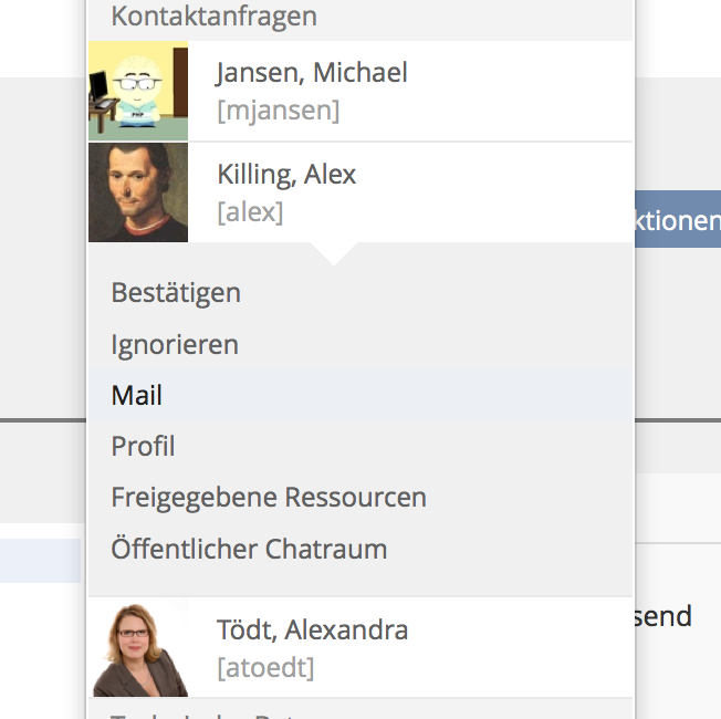
- Bestätigen » Kontakt bestätigen
- Ignorieren » Anfrage ignorieren
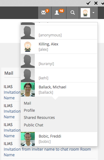
- Mail » Mail schreiben
- Profil » Profil ansehen
- Freigegebene Ressourcen » Ressourcen anzeigen
- Öffentlicher Chatraum » In Chatraum einladen
Kunkel, Matthias [mkunkel], August 31, 2015: At the time being the two related features "Who is online?" and "Contacts" use different layouts to present users, see screenshots. I recommend to use the look of "Who is online?" for Contacts, too. Additionally, the position of the pop-ups has to be a bit lower. At the moment it is hiding the top bar.
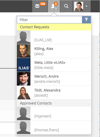
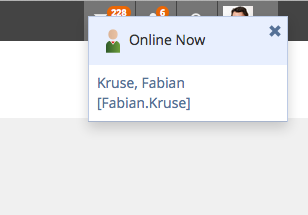
Lauener, Hansjörg [lauener]: We tested the implementation of Who is Online. This results to some additional necessary suggestions for this tool (see 1-4 below). If additional funding is necessary, please contact me.
a) Administration » Privacy and Security » Additional Settings
ILIAS needs a additional General-Settings in the Privacy Area of "Privacy and Security" - for ILIAS-Admins:
Setting: "Pop-up" of the "Who is online-Tool" for all users: Show/do not the "Who is Online"-Popup (Contact Requests, etc.)
Explanation: A teacher uses ILIAS in the course with 600 students and it would be VERY annoying for the teacher when dozens of students would start to approve-contacts with the teacher. Can be extremely annoying.
b) Setting for Contact Requests and Contacts
Setting for ILIAS Admin to allow Contact Requests and to allow the Contact-feature.
c) Settings for ILIAS-Admin to define the default state of new Users,
- Default of "Hide Me From ‘Who is online?’-Tool ---> better: "Show user in the Who is online-Tool"
- Default of: "Allow to Contact me"
2. User Settings and Action-menues
We suggest to implement a new Privacy-tab and some new Personal-settings for each user.
Explanation: There are at least two different types of ILIAS-installations with different "Privacy"-requirements: a) Our students haven't a choice to use ILIAS or not. So we care for privacy. For big university-installation privacy is very important. If we do not care about privacy, then students, teachers and the date protection commissioner will intervene. For other installation, socialising possibilities is highly welcome, and Privacy is not that important.
So we suggest:
a) A new tab "Privacy" in The Personal Profile is necessary: PD » Personal Profile
b) In the "Who is online"-tool, a "Privacy"-button or a "Privacy-Icon (lock-icon) should be implemented. When users click on this link, they`ll be forwarded to the new privacy-settings
c) In this tab: A personal setting: "Hide me from "Who is online"-tool" » already implemented in General Settings. We suggest to change the wording: "Show me in the "Who is online"-tool.
d) In this tab: A personal setting: "Allow to contact me". When users uncheck this setting, then the "Request contact-button" is not available in the Profile (or in other areas) of these users. // Already implemented in General Settings
e) In the"Preview" of the Personal Profile, users should see a preview looking as similar as possible to the preview seen by other users. This means, the "Request Contact" Button must be visible on the preview in some form. We suggest to render this button in disabled state with "Request Contact" as label. // Implementation: No button is visible. That works.
3. Personal desktop » Contacts
Some actions are missing in the dropdown: Suggestion: The "Dropdown-menu" in the contacts should have following entries: Send Mail (instead of Mail to) / Invite to Chat / Unlink / Confirm Request / Ignore Request / Cancel Requests
The "My Contact"-tab should have a new sortable row "Status", similar to "MyContacts>MyCourses>List Members with the options: Linked, Requested Contact, Request Ignored.
The "My Contact"-tab should have in the table Action-menues the wording "Actions" (instead of the wordings "Request Ignored", "Request", "Requested Contact")
ILIAS should implement a "Request Contact"-Dropdown-entry in: Contacts » "My Courses/My Groups" » Course/Groups-Member-Listed (already implemented by mjansen, 6.11.2015)
The Status-column in Contacts » "My Courses/My Groups" » Course/Groups-Member-Listed should be sortable. (implemented)
The Actions-row should be right-aligned in every tab of Contacts.
4. Personal Desktop » Settings » Show active users
This functionality is obsolete now and has to be removed
JourFixe, ILIAS [jourfixe], Nov 09, 2015: The privacy issues described by Hansjörg are related to the Contacts feature. Therefore, we discuss them at the page User Connections / Approved Contacts.
Weber, Frank [franklin66], Feb 19th, 2016: We upgraded to ILIAS 5.1.2 a week ago and feedback shows that users find the "online now" -Popup-Layer intruding. There should be a possibilty to deactivate this popup in the administration panel of the awareness-tool. Right now, the only way to get rid of the popup is to deactivate the awareness-tool at all. There should also be a possibility to individually block the awareness - information. So if a user is just not interested in who else is online he isn't bothered with that information, even if the tool has been activated by the ILIAS administration.
Another thing: In ILIAS 4.4.x a user with administrator rights could always see _all_ user that were online, even if the setting in the administration panel said to just show users from courses and groups. This way the administrator could get a feeling on "how much is going on on the plattform right now" very quickly. This is no longer possible, but it would be nice if the admin could see at least the total number of users that are online
- make the items / actions that are listed beneath the user entries configurable. "Shared ressources" are not really in use in Freiburg and the awareness tool prompts this, rather outdated, feature. As an admin, I would like to be able to dis-/enable the items / actions (Mail, Chat, Shared Ressoruces, ..) ...that are available there
- tutorial support: right now all users that are listed as "tutorial support" are sorted simply alphabetically. users who are members in lots of courses and groups with lots of "supporters" have no visual info on who belongs to which context. There should be some info on who belongs where, maybe the first 20 characters of the course / group name would do the trick...?
- popups: we strongly support to make the popups configurable: minimal requirement: enable / disable all, perfect world feature: dis/enable for the single categories (Contacts, Tutorial Support, .....)
Killing, Alexander [alex], 31 Mar 2015: We should collect this on a new feature wiki page. I created one Awareness Tool: Who-Is-Online: Usability Improvements and Advanced Options. I will move things to the new page if I find the time.
4 Implementation
Killing, Alexander [alex], 26 June 2015: The feature is merged to the edge branch now:
4.1 Configuration
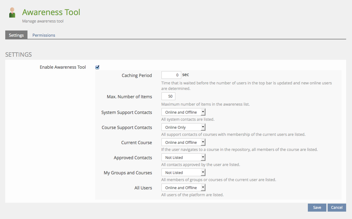
Link to the administration settings for the Awareness Tool. Icon and Position are still discussed:
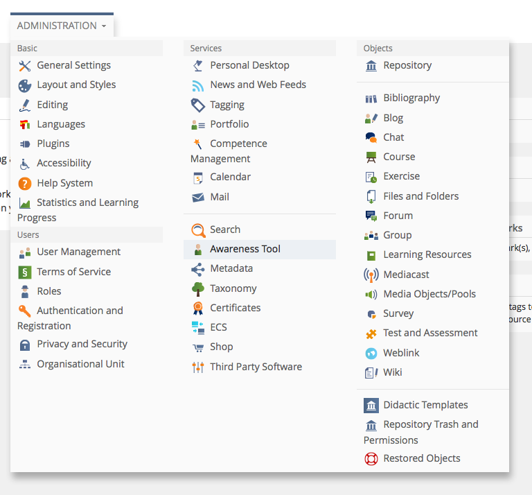
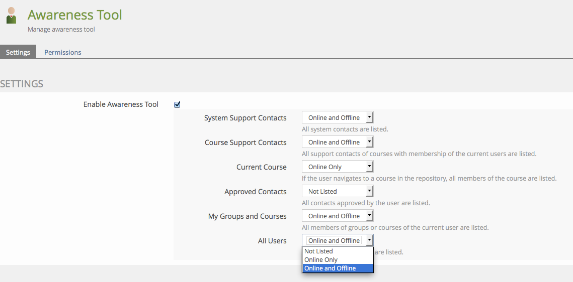
Settings of the Awareness Tool. My hope is that the "info texts" explain what happens. If not, please let me know - suggestions are welcome.
All these options have been existing before or popped up during the discussions of the feature. The underlying class structure makes it very easy to add new options (e.g. the proposed "members of my organization unit" option). My understanding is, that the relevance of these options differs greatly depending on the installation size and the way it is used. If it is a small installation just set up for a single project with 50 users the option "All Users/Online & Offline" may be totally appropriate. Big installations may reduce this to users online and to system/course and approved contacts or even less. It makes little sense to activate all these options at the same time.
4.2 Presentation
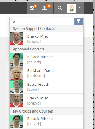
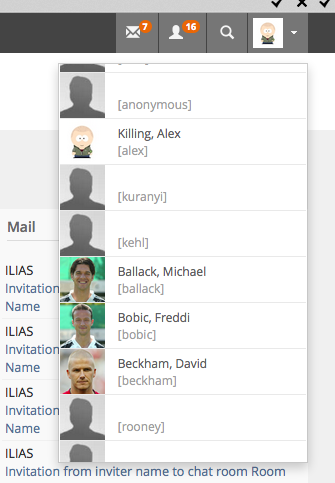
Starting Point: Top Bar Icon (second from left) in the top bar. The number is the number of distinct users that "fall into" the configured categories. If offline users are shown, they will be counted as well here, too. If caching is activated the number will only be updated when the specified time period has passed. If the number is 0 no icon will be displayed. If one user appears in two categories at the same time (see expanded list) she will not be counted twice.

Expanded List: Clicking on the icon will open the list (asynchronously). The visibility of the user depends on the personal settings ("Hide me from awareness tool") and the public profile settings (visibility of firstname/lastname and personal picture). User that have not yet agreed to the user agreement (if activated) will not be listed.
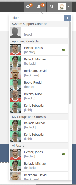
Sorting: Grouped by categories, inside each category "online" users on top and at last a alphabetical ordering (lastname, firstname, if profile is public, account name, if user is not public). The order of the categories us currently "hard coded", i.e. there is no way to change it in the administration. My hope is, that the ordering is feasible and there is no need to configure it.
Filter: The filter does not run automatically like an auto-complete feature would do. The use has either to press enter or click the filter button. The filter looks for the entered string in the firstname and lastname (if visible) and in the account/login name.
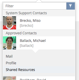
- Profile
- Chat (currently no new chat implementation is ready, so this links to the old implementation)
- Shared Resources
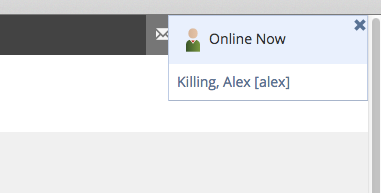
On Screen Notification: If new online users are identified, an on screen notification is displayed. The Awareness Tool reuses the existing OSD service of the chat notification service. A visual redesign may be discussed.
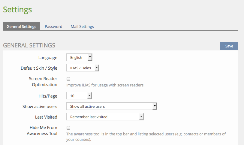
4.3 User Settings
The old "Hide my online status" setting of the user settings is no re-interpreted and renamed as "Hide Me From Awareness Tool". Please note that the visibility of this settings needs to be activated in the administration.
Killing, Alexander [alex], 22 June 2015: Current settings include "old modes" (all users, my groups and courses) + all new modes that have being discussed so far (to my knowledge). Offering an admin flexibility in what should appear in the awareness list.
Killing, Alexander [alex], 22 June 2015: Current presentation: Grouped by categories, inside each category "online" users on top and at last a alphabetical ordering (lastname, firstname, if profile is public, account name, if user is not public).
With this approach there is little room for introducing "tabs" as suggested in the original proposal. So I would suggest to go with these "sub headers" as presented in the screenshots.

Test Cases
- 22 test cases in a dedicated testsuite at http://testrail.ilias.de/index.php?/suites/view/111
Approval
Approved at 28 Aug 2015 by André Mersch.
Last edited: 15. Dec 2021, 09:09, Schmid, Fabian [fschmid]
