Feature Wiki
Tabs
Long Menu Question
Page Overview
[Hide]1 Requirements
1.1 Request History
Overview:
Choose an answer from a long drop down list or fill in an auto completion text field
based on item lists. It is often used in medical environments and implemented in
some special medical examination software.
Maybe its also an improvement for the cloze question, but the implementation without
changing the gap section overall will be difficult. So it is described as a complete
new question type.
Item pool:
The question type based on item lists. So we need the items.
Because of the amount of items its not usefull to handle the lists question by question or
item by item. The easy way to use itmes for a gap will be the import of a simple item list file or a
prepared item list from something like an item pool inside the test question pool.
The item pool element could be a simple glossary element where the items can be managed by
item categories. It will be uesful to export an import the whole content of an item pool
element or to export one or more selected item categories.
Item pool funktions:
- add, delete or edit an item category
- add, delete or edit itemes inside a category
- import/export a whole item pool element
- import/export selected item categories
Editing the long menu question
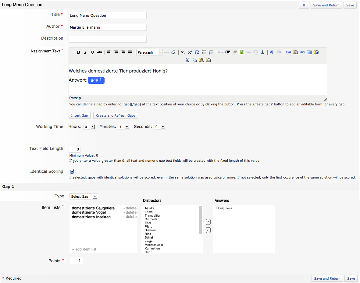
The editing will be similar to the editing of the cloze question defining gaps in an assignment text.
The gap type can be a textfield or a dropdown list. The creation of gap section is similar to the
cloze question with buttons "Insert Gap" and "Create and Refresh Gaps". The gaps should have a name
and a kind of visual reprasentation. So it is easier to find them in the gap section.
Editing the gaps / Use item lists for gaps:
First the gap type will set to "select gap" or "text gap". The use of the item lists is not dependent
on the gap type.
One or more item list from the avalibale item pools can be added or an item list file can be imported
(which causes a new item pool element or a category in an existing item pool).
The items will be loaded in a select field called distractors. Now the right answers for the gap can
be selected to move them into the answers field. (mockups will follow!). There is no possibility to edit the
items in the gap section (this could be an option). The item pool has to be upgraded. Editing item pool
should have no effect to the long menu question. Upgraded item lists have to be reimported.
Finally the answers becoming points for right selection by a user (this could be an option, in our environment
a single point entry for each gap would be enough!).
Gap section functions:
- chooce a gap type (textgap, select gap)
- add, delete item categories from available item pool elements
- show the items in a distractor field
- move the items from the distractor field to an answer field
- move items back from the answer field to the distractor field
- import an item list (a category) with adding it to an item pool element (option)
- add items to an item category (option)
- edit points for each item in the answer field (option) or for the complete gap
Using the long menu question:
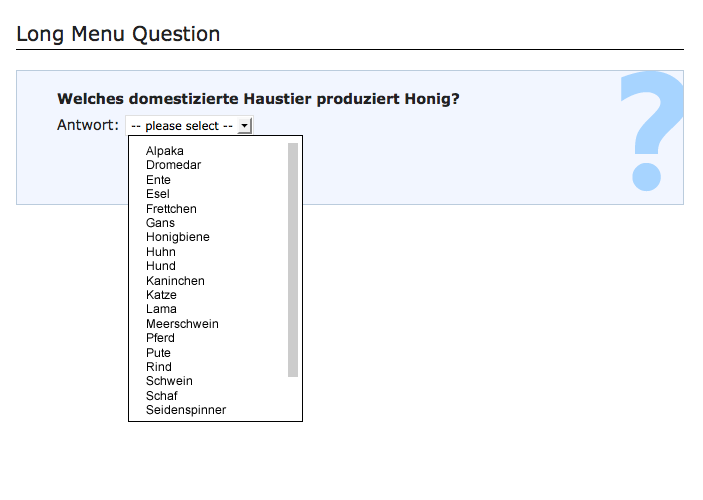
The user gets an assignment text with one or more gaps. A gap is defined as text gap or select gap.
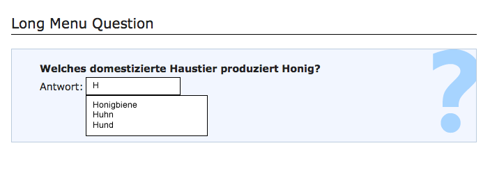
The textfield works like an autocompletion field with shows the answers and distractors depending
on the typed initial letters. The item list is shown in alphbetical order.
The user have to select one of the shown items to complete the gap.
The drop down list is showing all distracors and answers of the selected item lists in aphabetical order
and the user have to select an item to complete the gap.
Mockups:
Edit the long menu question: | Exam view select gap: | Exam view text gap: |
11.03.2014 (martine, Uni Bonn):
Not shure about a wise place to manage the item lists. Place the item lists as an element in the "question pool test" could be a little bit confusing. I will build some mockups soon.
- The items should not be handled in the level of question pools, since question pools are container for questions, not for any items used by a single question type.
- We do not see a need for a new object type (item pool) just handling item categories that are used for a single question type only. Are there any reasonable usages for these item lists except the long menu question type?
- The item lists could be managed in the plugin administration (or in the test & assessment administration if this feature become a core question type) like the units for formula questions. It should be possible to create new item lists with file uploads initially.
- Alternatives for glossary objects could be the use of file objects (simple text files, one item per row) or data collection objects
- What is the average length of these item lists?
- Is it really neccessary to differentiate between select and text gaps? As I can see in your mockups the text gap works with an autocomplete, so this is a kind of selection list as well and would also require such an item list. Or do you want to accept answers which are not listed?
We are also interested in the JourFixe valuation about the suggestions for this part.
23.06.2014 (martine, Uni Bonn):
I am following the argument not to handle item lists in the question pool level.
The item lists have to be handled by question authors, so they have to be managed in the course level and not in the administration level. A simple item list as a textfile for each question is a easy and quick possibility. Simple text file uploads are easy to use an will make it easy for the single author to handle the question.
In the long term managing as a kind of glossary object or data collection will be the better way. Maybe in a second step. So, for this feature request i prefer the simple text file upload.
Its difficult to set an avarage length of the item lists. There are ideas for a few up to hundreds of items. The question type is often called the "endless list" question.
The differentiation between text gap and select gap is neccassary. In the select gap option the trainee will see all items initial. In the text gap option he will see nothing. I thing with a wildcard option the text gap will work as select gap!
The requirement description references the workflow of editing a cloze test question. This workflow was overhauled with 4.5 to improve usibility. These usibility improvements should also be considered for the editing workflow of the long menu question type.
Handling the item lists in a per gap item file upload should be ok for a first implementation. The item lists has to be considered in the questions ex-/import process. In a second step, the item list handling should be moved to any convenient place, but the conceptional discussion for this should take place within a new feature request.
Differntiation between text and select gaps is neccessary, since the behaviour differs as martine described. But we have to find another wording, since the text gap does not accept any entered text. When I understand of martine description in the right way, the text gap's text field is just a search field, for selecting a specific option from the item list.
For select gaps the item list data can be delivered with the initial server request, that ends in the question presentation. For text gaps, the item list must not accessible within the browser prior to any text input of the participant. Therefor this question type will make use of ajax requests, that receives large data amounts, very often, the performance of this question type directly depends on:
- Network Performance
- Available Server Ressources
- Concurrent Participants
Also the ratio of questions of this type to questions of other types should be chosen carefully. When e.g. only the half of the total questions are long menu questions and the participants sequences are shuffled, the maximum peak of network and server load should decrease accordingly.
1.2 Current Requirements
Overview
Choose an answer from a long drop down list or fill in an auto completion text field based on item lists. It is often used in medical environments and implemented in some special medical examination software.
Question Editing
The editing will be similar to the new editing workflow of the cloze question. Gaps are to be defined within an assignment text. The gap type can be a textfield or a dropdown list.
Editing a single gap
First the gap type will set to "select gap" or "text gap". Both gap types make use of item lists.
The item lists are created by uploading a text file with one item per line. After uploading the item list file, the items will be presented in a multi line select field called "Distractors". An additional empty multi line select field called "Correct Items" is shown next to the distractors field. Per selecting the correct answers can be moved from the distractors field to the field with correct items. Within the gap section there is no possibility to edit the items itself. The currently configured item list can be replace with the upload of a new item list file.
Finally a points value has to be defined for each single gap.
Using the long menu question
The user gets an assignment text with one or more gaps. A gap is defined as text gap or select gap.
The input field for a select gap is a simple drop down list that shows all items in an alphbetical order initialy. The user has to select one of these items to complete the gap.
The input field of a text gap works like an autocompletion field. It does not show any item prior to an initial input of the user. After this initial input a filtered list of items matching the users input is shown. The items are shown in an alphbetical order. The user have to select one of the shown items to complete the gap.
Mockups Authoring View:
Normal Version of Form Section:

Mobile Version of Form Section:
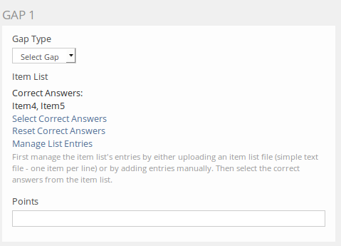
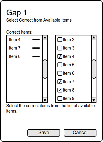
In the mobile version all elements wraps into the next line, so all elements are stacked vertically.
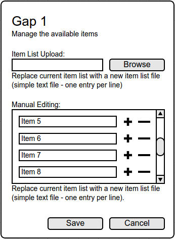
The mobile version can wrap the +/- icons into the next line as well as the second command button.
Mockups Participant View:
Exam view select gap: A simple drop down is shown containg all items. |
Exam view text gap: It is to be discussed wether the text input field that sends the autocompletion search string is to be separated from a possible additional field showing the item selected by the user. |
2 Additional Information
- Idea / concept: Martin Ellermann (Uni Bonn), martin.ellermann@uni-bonn.de
- Funding: Universität Bonn
- Maintainer: Heyser, Björn [bheyser]
- Implementation of the feature is done by Vollbach, Guido [gvollbach], Databay AG AG
- Tested by / status: (name, e-mail), (status information set after implementation)
3 Discussion
JourFixe, ILIAS [jourfixe] 27 Oct 2014: We appreciate the introduction of a new question type "Long-Menu Question". In the discussion today Björn mentioned that the current feature description above does not reflect the current envisaged implementation anymore. Please update the description and re-schedule the feature for the JF.
Heyser, Björn [bheyser] 10 Nov 2014: The current envisaged implementation is now documented with the requirements chapter. Historical ideas and discussions are still available within the request history chapter.
The maintainers still support the idea of a new question type long menu question. The term "long menu" is a well known expression within mediacal education enviroments, so the title should not be changed.
- The think that the reusability of the input element in the authoring screen (two list element with "<" ">" icons) may be limited - but the general use case (select some elements from a large list) is. The suggested element will not work in filter elments of tables and it will not work very well in "multi"-input scenarios. Additionally a responsive version for small screen may be hard to implement. We would suggest a user interface element close to the taxonomy node selection input element, that works with an overlay (for showing a larger list). The overlay should include a multi-select list (that reacts on simple mouse click without the need to press any special keys). Additionally the selected items should be visible, either in the overlay (e.g. on top) or in the form element (being updated immediately).
- Please check if we can implement a simple way to edit the large list within ILIAS without the need to upload files, e.g. to correct typos or remove single elements.
We adopted the idea of making a whole gap section editable within a modal dialogue like it is implemented in the newest version of the cloze gap question. This keeps the possibility of extracting complex/unclear editing work flows for a single input element (the large list element) to any kind of overlay.
So the large list input element will now work as follows:
- A single upload field is shown in the input section of the form field (it could also get a +/- icon for multi input scenarios)
- With uploading a file, the field switches to the presentation view of the uploaded item list
- This presentation view shows a link/button for removing/replacing the allready uploaded file
- This presentation view initially shows a hint on no available "correct answers" (all items are distractors initially)
- When correct answers were selected, they are presented in a comma separated list (similar to the taxonomy select input)
- This presentation view shows two links/buttons to perform editings on the input
- The first link/button opens an overlay that provides possibilities for managing distractors and scored items
- We would like to keep the initially suggested editing style with the two list fields having "move" links/buttons between
- Since these two lists should be presented side by side we would like to use a centered modal dialogue with nearly 100% height
- The second link/button opens an overlay that provides possibilities for editing the list's items itself
- We would like to make use of the overlay beside for presenting the two lists stacked (correct answers first)
- On opening the overlay the list's items are ordered alphabetically
- All items are presented in a text field making the content editable
- All items get Add/Remove icons to delete or complete single elements
- The first link/button opens an overlay that provides possibilities for managing distractors and scored items
This UI concept for the new "large list" field should also fit the requirements for using it as table filter, although we do not see any real context where this could be interesting (at the moment). First assocciations were: Why filtering a large list (table) with a large list filter (new input element)? But sure, imagination is limited.
JourFixe, ILIAS [jourfixe] 13 Apr 2015: Please provide mockups for the different screens/elements of the workflow. Please make a mockup of the responsive version of the "large list selection" ("< >") user interface element (if any such version is planned). Please get also in touch with the kitchen sink group and ask for suggestions.
- We turned over to your suggestion using known list styles
- We decided to not use checkboxes for the selected items, because it would be confusing that a checkbox element gets removed when you remove the check state
- Mockups for the different Views are provided
- Should the upload field for creating/replacing an item list be involved in the "Manage List Entries" dialogue, or in the main form?(The mockup shows a solution involving the upload field within the modal dialogue)
Amstutz, Timon [amstutz] 08 Juni 2015: The base problem here is selecting n from m items where n<m. This is a quite well known problem in interaction design and there commonly accepted solutions to solve it. We planned to propose such a solution soon during a workshop meeting of the UI-Kitchen-Sink group. Since a solution is required now we strongly recommend on accepting a commonly used multiple select input gui along with a well integrated service in ILIAS.
One such example is: https://select2.github.io/
Such a GUI element is flexible enough to serve many different needs due to its high flexibility (multiple select, user selection, ...) and can be used in many different places. Using the same technique helps streamlining interaction design in ILIAS. As soon as the jour fixe accepts the use of such a solution we will work out a recommendation of which library to use and will work out guidlines of how it should be used in ILIAS. We also offer to work closely with the developer integrating the service of this GUI element in ILIAS.
Please be aware that the user selection in the aministration already uses a similar input gui which is quite limited in it's flexibility. The user interaction would therefore not be new but could be used in other scenarions than the one already given.
Also keep in mind that the user interaction offered by select2 has be come a kind off standard for selection n from m items and is well known among users in the web.
08 Juni 2015: We argree with that proposal of a multiple select Input! It can be used for selecting right answers from the distractors in editing mode and quite similar to answer the test question in testing mode as well.
JourFixe, ILIAS [jourfixe], June 08, 2015: We assume that all entries are always sorted alphabetically and a manual ordering is not needed. In this case the fourth mockup by BH could feature a second input text field (under Item List Upload) and an "Add" button instead of "+" icons for every entry in the list. "Manage List Entries" should be listed before "Select/Reset".
Answers Answer Options: 200 [Edit] Correct Answers: Item1, Item 2 [Edit]
Moving the upload field into the overlay is ok. We appreciate the mockups in general and this implementation would be ok for us, we schedule this for ILIAS 5.1.
- uses minimal space
- similar ui is used on well known websites
- autocomplete gives flexibility when entries are searched/filtered (however this could be added to the "edit correct answer" screen in Björns solution, too
- new dependency to third party lib
- seems to have a bad accessibility (screenreader)
- if the user does not use type-ahead, but selects from the list, a lot more clicks are needed to select multiple items
I could not disagree more. How do you come to such a conclusion? I am evaluating these kind of inputs since some time and I have never seen any other input element with so much diversity when it comes to user interaction. Especially when it comes to the way how keyboard actions are handled. Have a look at the default behaviour of:
- Tagging at delicious.com (Being the first ones introducing this kind of elemtent and changing its behaviour over time, too)
- The tagging support example at select2
- This bootstrap jQuery plugin
The standard way for selecting n from m elements in HTML is a simple select multiple element. Solutions like select2 keep this select element in the DOM, but try to hide it from screen readers. They "replace" the select by a structure of SPANs containing UL/LI elements [sic] and within SPANs again. Screen readers do not assume any interactivity here. Now aria and role attributes are added to tell the screen reader that these are parts of a multi select input UI element. I would really like to know how tools like JAWS interact with this.
Amstutz, Timon [amstutz], 9 June 2015: @Alex: Thank you for the detailed remark.
I agree with you, the words "kind off standard" and "commonly accepted solutions" have been chosen poorly, since it leads to the conclusion that there exist a well defined standard that is commonly accepted. This is NOT the case. Let me rephrase that, to make clear what I try to say: "There exist widespread solutions that are ready to use and known to users. They offer an improved user interaction over the html multiple select which is hard for inexperienced users to handle properly."
Can we agree on that?
Also, what I meant with "the user interaction offered by select2 has become a kind off standard for selection n from m items and is well known among users" was targeting the principle of 1. typing, 2. selecting from a list of proposals, 3. seeing an overwiev of selected items in the text box, 4. beeing able to remove items from the text box again. This can be seen for example on facebook when editing the profile, stackoverflow when editing tags, lots of mail clients when entering mail addressess. Surely they have their differences in the way this interaction works exactly. Nevertheless the main concept is the same and well known.
I am aware of the accessibility issue with many solutions. I consider accessibility as an important factor and I am happy to hear that you do too. Do I understand you correctly, that accessability issues can be considered as bugs? If so, I just did an audit on the page we are currently looking at: I got 5 severe errors and 68 warnings (Audits from Chrome). If we write accessability on our flag, then we should do it consistently and not differ from from problem set to problem set. As far as I can see, select2 has some flaws but does all alright job in making the list accessible (concerns current version 4.0.0, massive strides have been made in this direction: https://github.com/select2/select2/issues/2499), but I am clearly not an expert on this (do we have one I could contact in the community).
Concerning the input with keyboard, I think select2 is much easier to use by only using the keyboard than the html multiple select. That is maybe just personal taste however.
While evaluating I stumbled on a similar discussion in the drupal community which took place over the last 4 years (!) and therefore is quite extensive:
Outocomplete/Multiple select discussion. Especially the following summary was helpful: Comparison. In there is a big part about accessability.
I like to point out, that we did not recommend select2 as the definite solution. I clearly stated that to: "accepting a commonly used multiple select input gui". @Alex: since you seem to have experience in this field, we appreciate proposals/alternative solutions as long as they accomplish the main principle described above.
How can we proceed on this mather? Would select2 version 4.0 be an acceptable solution or do we need to investigate further? If yes, can you give us requirements such a solution would need to fullfill?
Schmid, Fabian [fschmid], 15. Jun 15: Thanks for the lot of work and discussion already done. I'd just like to support the direction of impact to a highly functional "n from m"-InputGUI, which we used in many plugins already and we really appreciate in core. I won't comment on the "accessibility-discussion", I'd just like to emphasise the Comparison Timon Amstutz already mentioned. Whatever we do, we won't build a better library on our own with all the functionality und accessibility-features those libraries already bring with them.
Heyser, Björn [bheyser] 17 Aug 2015: I tried to evaluate the inputs on famous internet portals. In my opinion, the way Wordpress handles such input szenarios is the best related to the keyboard interaction. The most fitting lib is in fact the bootstrap lib. My evaluation results are presented in the following document:
JourFixe, ILIAS [jourfixe], August 17, 2015: We agree with Björn and decide to use the "Bootstrap Tag Input" element.
Heyser, Björn [bheyser], 31 Aug 2015: The implementation has been done using the bootstrap input field for choosing the correct answers, but the overlay containing the input is looking a bit empty now. We suggest integrate the new spyce saving input to the main form.
Kunkel, Matthias [mkunkel], September 21, 2015: I stumbled upon the German translation of the ‘Long Menu’ question type: "Langes Menü". Is that really the German term for this kind of question?
Kunkel, Matthias [mkunkel], November 03, 2015: Based on the feedback from Marburg in Mantis bug report #16926: German translation of "Long Menu Question" doesn’t seem to be used elsewhere I have renamed the question type to ‘Long Menu-Frage’ in German as this name is used in other tools, too.
4 Implementation
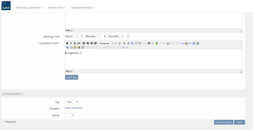
Default view of the editing screen when creating a new Long Menu Question:
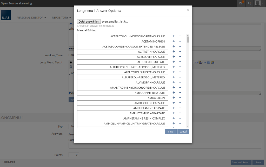
Upload and editing form for answers:
Selection of correct answers:

Student view of a Long Menu Question with a select and text Long Menu Question:

Test Cases
Test cases completed at ??.??.???? by (Martin Ellermann, martin.ellermann@uni-bonn.de)
Testrail: 6552, 6553
Approval
Approved at 26.8.2015 by (Martin Ellermann, martin.ellermann@uni-bonn.de)
Last edited: 20. Mar 2023, 09:15, Samoila, Oliver [oliver.samoila]
