Feature Wiki
Tabs
Improving Overview Page of Postings (2)
1 Requirements
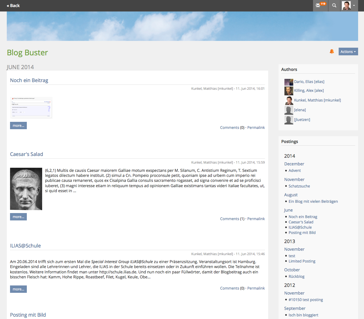
I. Keyword should be at the top of the Overview-page, Postings should be below. Or make it administrabable for Blog-Admins.
II. Blog-Administrators should have the option to activate/deactivate the two blocks "Postings" and "Keywords"
III. Blog-Admins should have different option to define the behavior of the block "Postings":
- a) Automatic (Actual behavior, with addidtional year-collections)
- b) Month-collections (Choose your month with a dropdown-menu)
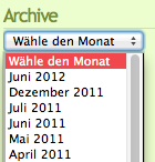
- c) Defined (Show xy expanded month collections, Show xy month)
IV. Blog-Admins should have an additional option to define how much articles will be shown on the Overview page: eg. a) One month (Actual behavior), b) Show xy postings.
2 Status
- Scheduled for: ILIAS 5.0 (will be set by Jour Fixe)
- Funding: Universität Bern
- Maintainer: Jörg Lützenkirchen
- Implementation of the feature is done by Leifos
- Contract settled: Yes
- Tested by / status: (name, e-mail), (status information set after implementation)
3 Additional Information
- Information about concept: (name, e-mail)
- Information about funding: (name, e-mail)
- Information about implementation: (name, e-mail)
4 Discussion
- We think a complete deactivation of the "postings" block is not possible without risking (in many cases) that a proper navigation and "reachability" of all postings is not possible anymore.
- Point IV) may also lead to postings that are not reachable by navigation (e.g. a month has 10 postings, but the settings limits the list to 5). We do not think this would be a good idea.
JL, 10 Apr 2014: I support this request for making the navigation elements of the blog more flexible. I also see the 2 problems pointed out above.
- I) is ok, it should be possible to deactivate the block "Authors" in collaborative blocks too and to define its position.
- II) should not allow the deactivation of the postings block
- III) ok
- IV) We discussed this again. If we see the "overview" page as the entry page, this feature can be implemented in the suggested way. Clicking a month would show more postings.
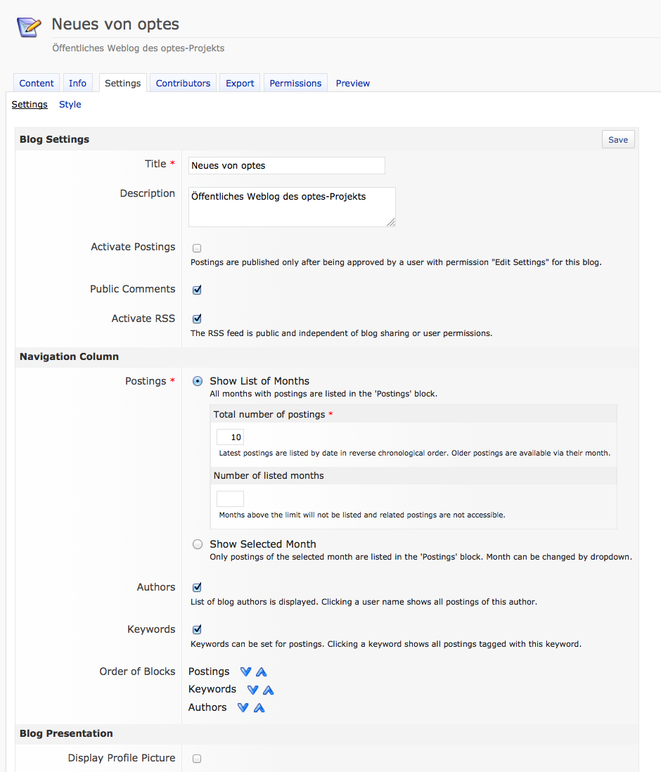
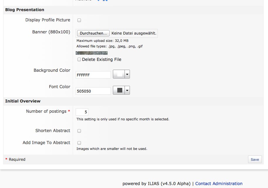
Matthias Kunkel, Aug 21, 2014: I suggest to make some slight changes in the wording and positioning of some settings elements, see screenshots below. In addition I have streamlined the subtab texts according to the forms streamlining activities pushed by Alexandra. The changes are not committed yet (only on my local installation).
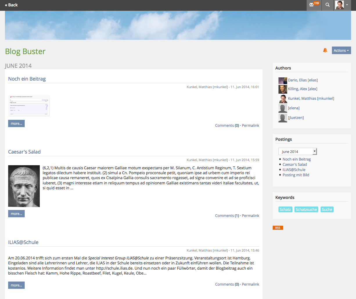
Another thing to discuss is the presentation of the "Selected Month" view. This comes with a dropdown where the selected month is visible. Additionally, this month is also shown as headline on top of the postings of this day, see screenshot below.
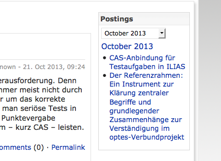
IMHO we could remove this headline and show only the posting titles, see next screenshot.
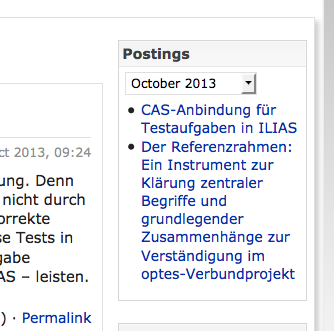
>Matthias Kunkel, Aug 21, 2014: I suggest to make some slight changes in the wording and positioning of some settings elements...
=> We agree with the suggestion from Matthias.
- At the time being there is no chance to return to the start page of the blog (in presentation view) when you are within the blog. A user needs to climb up in the upper container object and click again on the blog title. It would be so much easier when you could click on the blog title within the blog and get always the same view like when clicking on the blog title in a ListGUI. This could be the same behaviour for all navigation modes.
JF 24 Nov 2014: We agree that the settings screen should be optimized as sugested by MK in August. Due to technical reasons (see correspongin bug report) it is not feasible to make the title clickable.
JL 25 Nov 2014: The link to the initial overview had already been fixed (Mantis #13564), but was not working due to a regression caused by merging the bootstrap prototype branch. Should be fixed (again) now. I moved the "keywords" setting to the proposed posiution in the settings form. The renaming of several elements seems to already been done by mkunkel.
Matthias Kunkel, December 01, 2014: Based on Mantis Report 14779 I bring back the discussion of the current implementation of the "Single Month" mode to this page.
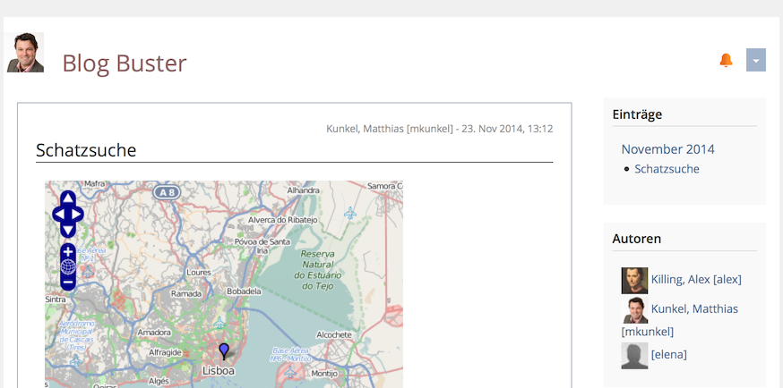
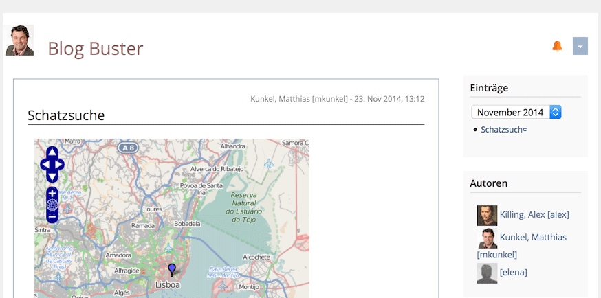
- In the navigation bar of a blog posting you already see all postings of this month. So it is easy to navigate to another posting of the same month (no need to go back to the month overview with the teaser snippets).
- The only thing that would be more difficult when we always show the month dropdown (B) is to go back to the overview page of the current month - as it cannot be reached through the dropdown element. But the only added value of this screen is the overview of postings with teaser snippets (which is a great view when entering the blog or month but not necessarily a must for navigating within the postings of a month).
- Besides the fact that the screen would be streamlined because the month view always uses the month dropdown, users would understand it easily to navigate to postings of another month. This is not obvious in (A) - unless you are curious enough to check what happens if you click on the current month ...
5 Implementation
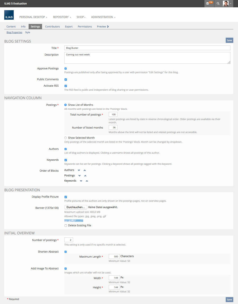
JL 17 Jun 2014: Several new settings have been implemented.
Matthias Kunkel, 15 Jan 2015: Latest improvements made by Jörg Lützenkirchen are available since Dec 14, see screenshots below.
Last edited: 17. Apr 2025, 14:49, Kunkel, Matthias [mkunkel]
