Feature Wiki
Tabs
Media object image/media: custom size in percent
Page Overview
[Hide]1 Description
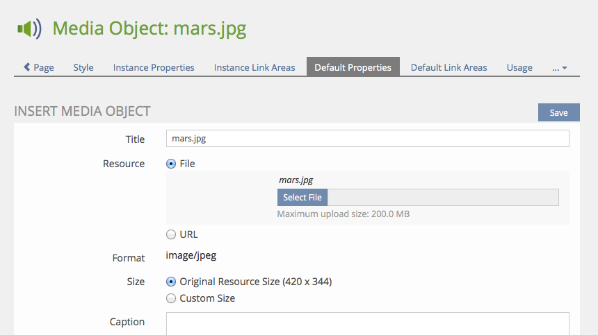
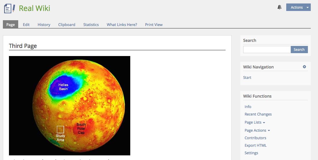
In page editor, an image file can be uploaded in original size or resized to a custom value in pixels. The picture can only be resized to a fixed value, which results in presentation problems on devices with small screen resolution.
We would like an option to resize pictures in percent instead of pixels, so that the picture would be automatically adapted to screen resolution. The same applies for other media object types, especially videos.
1.1 Proposal, Alex Killing, 18 Aug 2015 (update 10.12.2015)
There is a new proposed HTML tag called "picture" which adresses these issues, see CanIUse Picture for more info. It falls back to the img tag and offers the possibilty to use media queries to alter the source(!) and all other attributes. Safari and IE are missing on the list of supported browsers, but I think for 5.2 we should take this direction. I would like to merge the requirements from the Adjusting image size in pages FW page as well.
Killing, Alexander [alex], EDIT 10. Sep 2015: And not to forget the figure HTML5 element! It allows to group media element and its caption. This is what we need, since we also want to get rif of our ugly tables around the media elements. See w3cschools article.
Proposal for media objects and their use in the ILIAS page editor in general
- Get rid of tables around media objects, use figure/figcaption instead.
- Try to introduce the picture tag instead of img for images.
- It should be possible to enter no height/width at all, to allow CSS to take over the sizing.
- We should (as written above) introduce some default styles for standard cases (50%/100%).
- Nice to have: Media Pool: Simplification of media object creation dialog (move things that are rarely needed to an optional second configuration step)
- Nice to have: Upload multiple files in media object at once (e.g. by using drag/drop input GUI class which is used for file objects).
2 Additional Information
- Idea / concept: Klaus Zimmermann / k.zimmermann@fh-muenster.de
- Funding: ILIAS-Verein as part of Design Revision Part 2
- Maintainer: Alex Killing
- Development: Feature is to be developed by Leifos
3 Discussion
Alex Killing 13 Apr 2014: I understand the problem, but I doubt that a simple value in percentage would solve the problem. For small screens you usually want a "max-width: 100% of parent container" behaviour. On large screens you want a max-width: defined size (in pixels) behaviour, which unfortunately must not equal the "original" size of the image.
Example: You have a picture 800*400 in a media pool. Within a learning module this should be reduced to 600*300. However on small screens it should come with a max-width of 100% of the parent container. I did not find any HTML/CSS solution for this yet. Only one that uses Javscript.
However, I support that we try to adress this problem with ILIAS 4.5.
Matthias Kunkel, Alexander Killing, 13 June 2014: We would like to implement a solution that results in a "max-width 100%" like behaviour automatically, if pictures are included in the page editor, even if Javascript needs to be used. We schedule this for ILIAS 4.5. Alexander will provide a prototypish implementation on the 4.5 test installation.
Colin Kiegel: {width:auto !important} might be an alternative to JS to override width-attributes.
Matthias Kunkel, 15 Feb 2015: Modification was not made for 5.0. I add it to the 5.1 list again.
Matthias Kunkel, 28 Feb 2015: This feature was already scheduled for a previous ILIAS version but not implemented due to missing funding or time. We re-schedule it automatically for 5.1 to save time for discussing new feature requests.
JF 2 Mar 2015: We discussed this topic today again. We envisage a set of standard behaviours that are mapped to CSS classes and support typical layout requirements (e.g. half width on large screens, full width). Alex will make a detailed proposal before implementation.
Killing, Alexander [alex], 18 Aug 2015: We won't be able to tackle this for 5.1. This is not that bad, since there is currently a new picture tag being already introduced in some major browsers. And this tag may be what we are looking for. I will add this as a suggestion for 5.2.
- We should get rid of the HTML tables around images - which would be possible with the ‘figure’ tag.
- Support for IE >9 should be given (which is possible with ‘figure’ tag)
- Please create separate feature wiki pages for the two ‘nice to have’ suggestions (which we highly appreciate).
Kunkel, Matthias [mkunkel], March 24, 2016: I have created the requested two pages ‘Media Pool: Simplification of media object creation’ and ‘Upload multiple files in media object at once’ as suggestions for 5.2.
4 Implementation
Technically we switched from the old table-based layout to a figure/figcaption combination in the HTML code. Please note that borders being applied to the figure will not include the caption anymore.
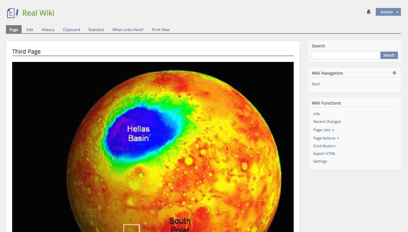
The option "original size" is now interpreted differently. In the past ILIAS determined the size of images automatically and has set them as width and height. Original size now means: ILIAS will not set width/height attributes. The size is the original size, as long as CSS rules are not applied on the image.
Standard behaviour for newly uploaded images is: Original size options is set. Since we have a general max-width:100% rule on images this will reduce their size, if not enough space is given and keep the aspect ratio.


We add two standard styles that allow a fullwidth behaviour (width 100%) and a max-50% behaviour (intended to be used for floating images). We may add more default style classes in the future.

Note: Using % for (max/min)-width/heighth CSS rule is always relative to the container of the image. If you are putting images, e.g. into tables, the size will be relative to the table cells size. Not to the overall page div.
Test Cases
Approval
Approved on 29 Aug 2016 by Kunkel, Matthias [mkunkel].
Last edited: 19. Apr 2023, 16:55, Killing, Alexander [alex]


