Feature Wiki
Tabs
Multiple (User) Input Fields
1 Requirements
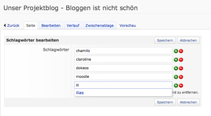
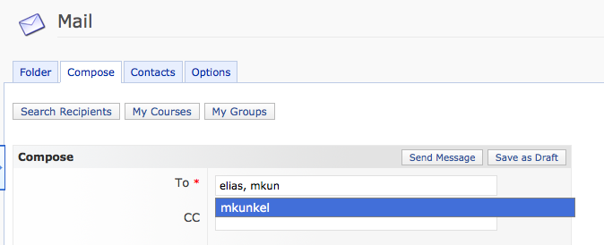
There are several ways for a multiple input in ILIAS. The most widely used is the one with the red/green arrow on the side. These are nice if you need an ordered input but are in general a bit clumsy. For an intuitive and fast user experience I would suggest the Multi Input Search GUIs, as shown in the videos below.
The advantages are as follows:
+ It's intuitive as it is widely used around the internet (e.g. GMail, Facebook, ...)
+ It allows searching for results by typing in parts of the wanted entry. (useful for 10< entries)
+ It allows searching for results by browsing the dropdown.
+ It supports AJAX and can thus dynamically load results (useful for 100< entries)
+ It's more responsive than e.g. the current user login selector, as it marks which users are selected.
+ It's already developed
Drawbacks:
- No ordering of the entries.
2 Status
- Scheduled for: Not scheduled yet
- Funding: Funded.
- Development: Feature is to be developed by studer + raimann ag
3 Additional Information
- If you want to know more about this feature, its implementation or funding, please contact: ot@studer-raimann.ch
Relies on select2 jQuery extension.
4 Discussion
JF 5 Aug 2013: We object the introduction of these new GUI elements for ILIAS 4.4. There are already implementations for multi-input fields which support auto-complete feature:


- support of autocomplete like your approach
- works with "multi-value" multi input fields (e.g. in test and assessment)
- ordering, if extended by arrow icons
- already introduced in ILIAS and known by ILIAS users
- the ILIAS approach works with "classic" HTML solutions (all inputs are in input fields) and not with inputs being transformed into spans (usually better for screen readers)
- no additional third party library is needed
- It indicates how many letters have to be typed for a search to begin
- It indicates when it is searching (ajax loader)
- It can search for the user login as well as the user's first- and lastname and it displays those.
- It is not possible to add an invalid/nonexisting user or adding a user twice.
- It exists as a ToolbarInputGUI (which could somewhen replace the "add member" function in a course as this is not implemented in the standardized ToolbarInputGUI way).
- It is not broken in 4.4
- Third Party Library: In general using a third party library can have positive and negative effects. In this case I think using a third party library is the right choice. First of all the license is not a problem as it is under GNU license as well. Secondly there should be no versioning problems as there's not much functionality that can be added, the project is finished. Furtheremore this library is the most prominent to be found around the interwebs these days, this has the benefit that the functionality is very well tested and the usability is widely known.
- Screen Reader: I tried the Input with ChromeVox Screen Reader. When clicking on an empty field it reads: "input", when clicking on a field with e.g. three entries it reads: "list with three entires: enty 1, entry 2, entry 3".
- In the Email Form
- Add multiple user to courses
- Filter multiple users in the user account administration.
- It would be possible to introduce new processes like: assign multiple permission roles in one step, ...
- This remote loading indicator is available in the jQuery UI solution, too, but currently not activated by ILIAS.
- The current impementation version can search for the user login as well as the user's first- and lastname and it displays those, too.
- The current solution does not reject duplicate entries, but we think this is only a minor advantage. But it allows to add entries that are not searchable / displayed in the drop down. This can be necessary sometimes.
- The current solution exists as a ToolbarInputGUI, too and is not broken anymore in 4.4.
- Screenreaders should read input fields as input fields not as lists.
- selected entries can be removed easaly with the "x"
- avoid double entries is a plus
- it makes us think about interfaces like the one of the "schlagwörter". The interface there is old fashioned and should be relaced by one single input field and an interface like proposed. There are certain places (e.g answers in the test tool) where an input like this is right, but not for keywords (Schlagwörter).
5 Implementation
...
Last edited: 19. Aug 2013, 14:56, Schmitt, Pascal [pascal.schmitt]