Feature Wiki
Tabs
Copy or Link objects: Repository and My memberships
1 Requirements
When course- or group administrators copy or link objects from one container to another container, they actually have to browse throught the repository.
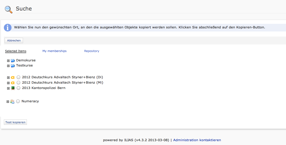
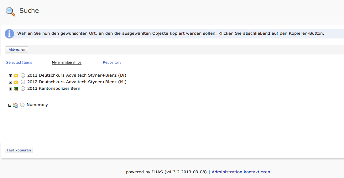
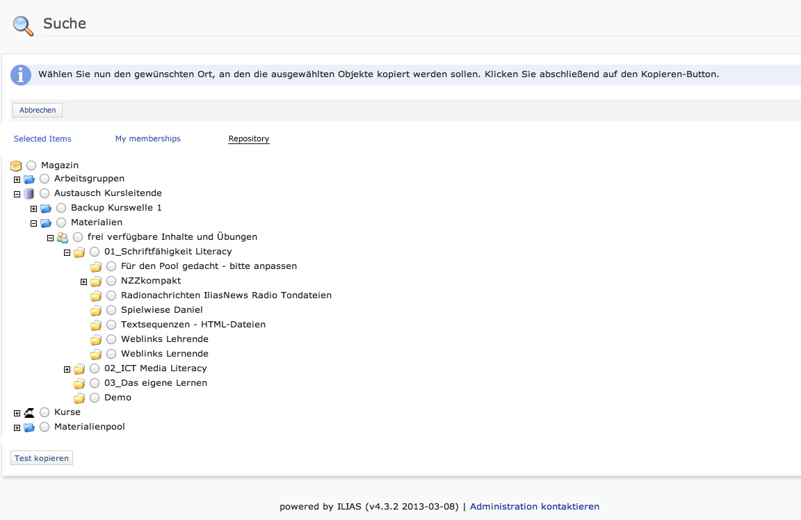
We suggest to add a new user-interaction, two subtabs
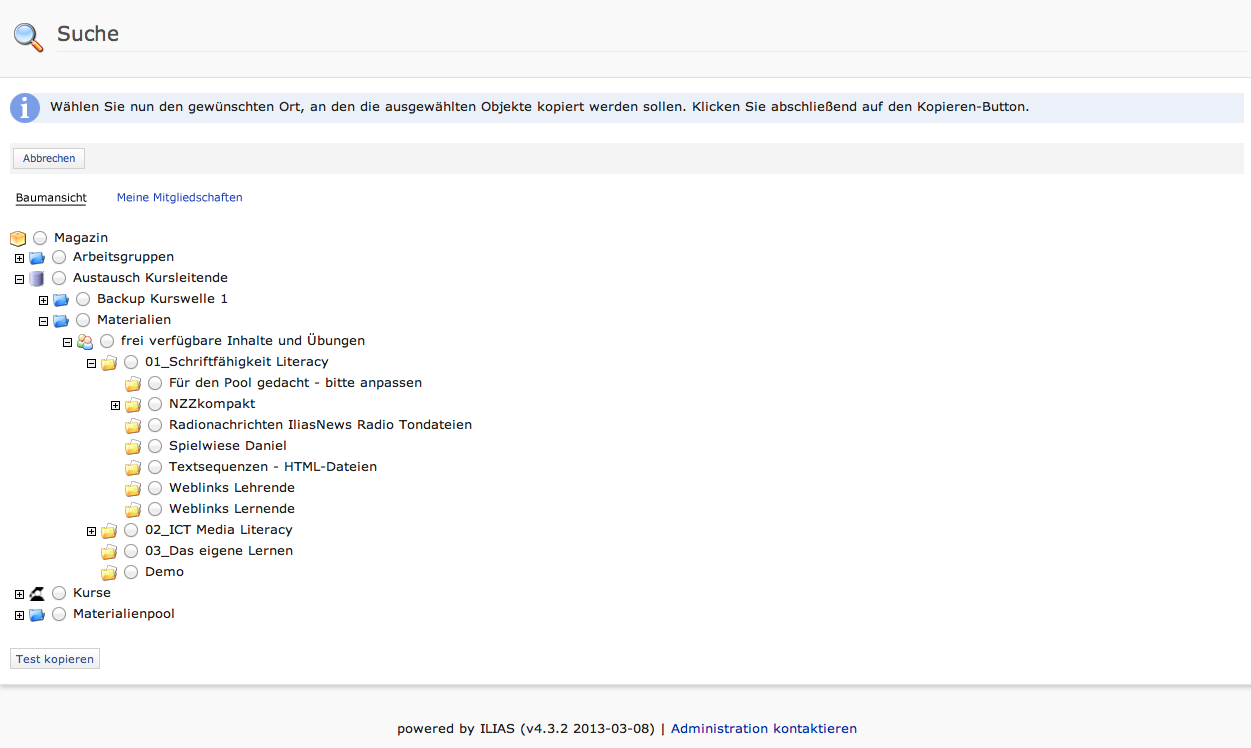
- Repository / Baumansicht (actual view)
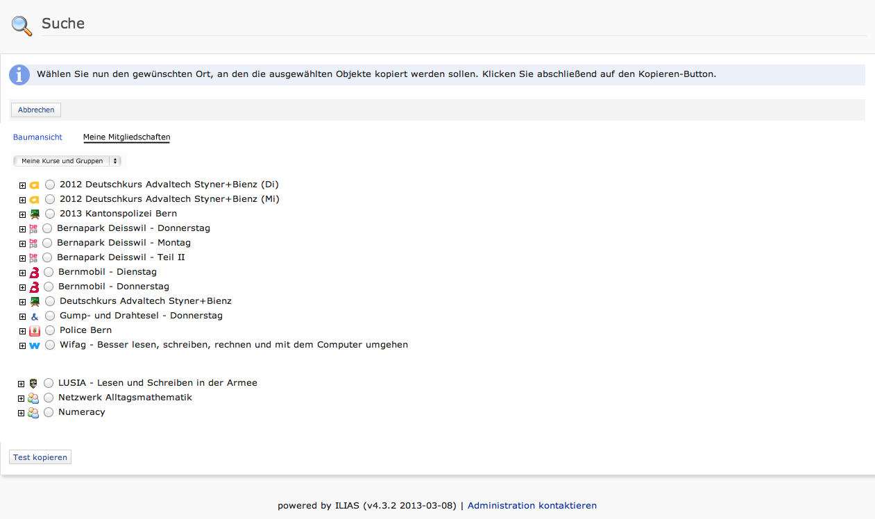
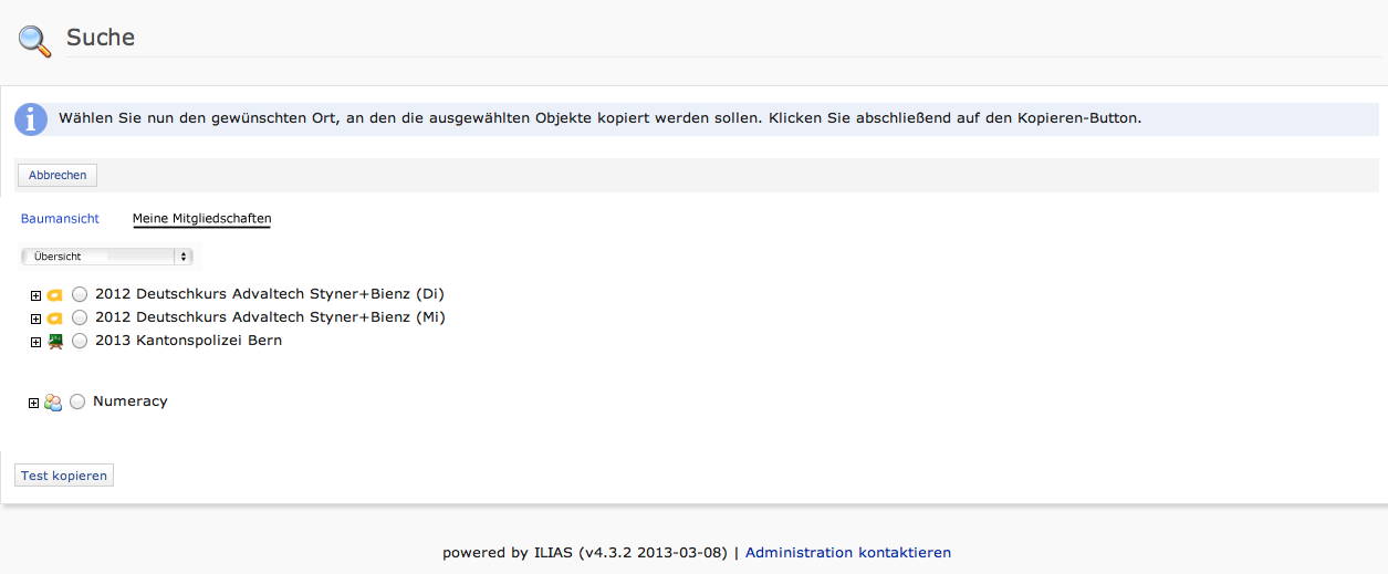
- My Memberships / Meine Mitgliedschaften (new view) with a dropdown menu where users can decide between: "Personal desktop (overview)" (Only the courses and groups are shown) and "My courses and groups" (All courses and groups are shown).
This new functionality develop the usability when admins must copy or link objects. They know their individual structure very well, the whole repository is often too complicate, especially when you have installations with thousands of courses.
Open questions:
- Is this a functionality sys-admins can activate/deactivate
- Is the suggested wording correct?
- Shall we save the users preference for the actual view or the new view?
This feature request is related to "Consistent Visible and Read Permission Behaviour".
2 Additional Information
- Idea / concept: Hansjörg Lauener
- Funding: Funded by Universität Bern
- Development: Feature is to be developed by tbd
3 Discussion
JF 27 May 2013: We appreciate the feature and schedule it for 4.4. The naming should correspond to the terms on the personal desktop screen "Selected Items" / "My Memeberships" (depending on the activation of these screens). Moreover the "Selected Items" list should also list selected categories and folders.
HL, YS 28 May 2013: Thanks for support. We agree with your comments.
So we now recommand the following submenues: a) "Overview" (courses, groups, categories, folders), b) "My Courses and Groups" and c) Repository (actual behavior)
AK 28 May 2013: We meant the titles of the blocks where the items appear, not the menu items for the screens. So the terms would be "Selected Items" / "My Memeberships".
HL 28 May 2013: This is also possible.
YS 28 May 2013: Mockups adapted (version 2).
JF 10 June 2013: This feature is related to a more general behaviour of repository trees, especially when read and no visible permission is given. We discussed this today on the Consistent Visible and Read Permission Behaviour page. The difference of a drop down on top of the tree is, that a click on an item (of my selected items or my memberships) would open one tree with the selected node (and its path) opened and highlighted and allow to navigate into this tree but also upwards or to siblings of the selected node, if the permission is given. We consider this solution being more "focused" than a list of expandable nodes, like above.
A possible 4.4 improvement of the copy/link/move screens should be in line with the general issue we would like to adress with 4.5.
For us and the behaviour of copy/link/move objects it's important, ...
- that user has a simple and fast access to the current position (f.e. an object will be copied/linked/moved in the same container object like a course, in 4.3 highlighted),
- that user sees only container-objects, where he has read/write permissions not all objects like now with the repository tree
- that user has an easy access to his objects and the view he knows well (like "selected items" or "my memberships") => we believe, that users almost don't know the repository structure and know better his personal desktop structures,
- that the look-and-feel of the dropdown should simulate the personal desktop: Means show the icons of objects like in tree-view (better usability) and not like f.e. the dropdown in "Resources of other users" in "My workshpace") and
- that an administrator - which knows the repository structure well - has access to the repository tree with nodes, because he has to switch faster between several container objects than a user.
Matthias Kunkel, 04 Nov 2013: Postponed to 4.5 due to missing resources.
4 Implementation
...
Last edited: 3. Jun 2015, 23:46, Kunkel, Matthias [mkunkel]
