


Feature Wiki
Tabs
Improved survey statistics display
1 Requirements
- Survey summaries in ILIAS lack proper separation between questions and question blocks (see image). Introduce white space to separate.
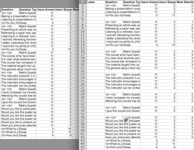
- The same problem plagues the Excel export (see image). Introduce free lines to separate content that belongs together.
- The order of items should be according to their importance. Question > median > diagram > numerical breakdown > respondents. Respondents (answered & skipped) are too prominent at the moment.
- The summary statistics often don't make sense. Questions in a block are automatically averaged even though that often does not make sense. Therefore, the summary should go last.

2 Status
- Scheduled for: Not scheduled yet
- Funding: Required / Partly funded by / Funded by ...
- Development: Feature is to be developed by
3 Additional Information
- If you want to know more about this feature, its implementation or funding, please contact: your name / your e-mail
- Related to Survey Usability Improvements
4 Discussion
AT 2015-07-21: I have administered a survey with martix questions and everything worked brilliantly.
I interpret my results in the Results tab because I do not need refined statistical methods: I can derive a lot of information from comparing the two basic measures of central tendency "Most Selected Value" and "Median": Are they the same? Is the Median left or right of the Most Selected Value? This speaks to me.
I stumbled accross a usability issue:
For the column "Most Selected Value" I am presented with the value and its text.
For the column "Median" I am just presented with a number.
It would be helpful for me if the calue AND text was displayed for the Median as well.
In the subtab "Details" the Median is as well only given with a number. Could in these tables the number and the value be shown? Could the Most Selected Value be shown in the table, too?
Zenzen, Enrico [ezenzen], 16 SEP 2022: This request no longer fulfills the requirements of the Feature Wiki. In consultation with the maintainer I change the status of the feature request to "Redundant / outdated". If the request is still relevant, please update template and mockups.
5 Implementation
...
Last edited: 16. Sep 2022, 08:05, Zenzen, Enrico [ezenzen]