Feature Wiki
Tabs
Separating Submission and Navigation
Page Overview
[Hide]- 1 Requirements
- 1.1 Requirement: Navigational Elements are Grouped
- 1.1.1 Toolbar
- 1.1.2 Actionmenue
- 1.1.3 Modal Dialogue
- 1.2 Requirement: Separating Submitting Answers and Navigating in the Test
- 1.3 Requirement: Streamline Navigational Elements for all Three Test Modi
- 1.4 Other Requirements with Respect to Navigation and Submission
- 1.1 Requirement: Navigational Elements are Grouped
- 2 Additional Information
- 3 Discussion
- 4 Implementation
Requirements
Separating submission and navigation would have several advantages for users, tutors and developers:
- If a user has to click "Submit Answer" at the bottom at the end of the question we have clear data that this is the given answer.
- The back and forward arrows would only be offered to jump from question to question - and could be deactivated if a step-by-step-test should be implemented where one gets the next question after submitting the former one.
- We could introduce a read-only view for those questions that have already been answered (and of course an option to "Modify My Answer"). We also can force a read-only mode for e.g. a question that has been evaluated by the user instantly while showing the best solution.
- It would be easier to allow several questions on one page because we can easily see which questions have already been answered. (this is not a part of the proposal but a possible advantage)
Discussion
- Questions are shown in a non-editable "navigation" view per default. In this view answers cannot be submitted. Previous/Next buttons are displayed and if activated the buttons "Postpone"/"Suspend" or the list of questions would be offered in the navigation mode as well (and only here). An "Edit Answer" button would lead to an editing view that allows the editing and includes a "Submit Answer" and a "Cancel" button, but hides the Previous/Next buttons and all other navigation elements.
- We do not introduce a non-editable view but a "Submit Answer" button would be added. The Previous/Next buttons are renamed to show explicitly what they do, e.g. "Do not submit answer and move to next question".
- We do not introduce a non-editable view but a "Submit Answer" button would be added and always leads to the next question. If the user hits "Previous/Next" a confirmation message is shown ("You did not submit the answer, do you want to continue?"). The effort for this implementation could be quite high, if the messages should only be shown if any change has been made to an answer.
Sigrid Röhling 13 June 2013: The alternatives mentioned above all increase the number of clicks required while taking a test. My concern is that test takers might find this cumbersome and distracting, which could ultimately reduce acceptability of electronic tests. Intuitively, I see few problems with the current implementation as it follows the process in paper-based tests where, if I give an answer to a question and turn the page, there's no question as to whether I answered the question or not. Possibly I'm not understanding the underlying issue correctly. Perhaps someone could elaborate on the "serious problems" referred to in the requirements section?
- introduce a new button "Submit Answer" for getting distinct data about the submission of an answer
- introduce a read-only mode for already answered questions (incl. option to modify answer)
- introduce answer-sensitive navigation depending on settings, e.g. having a mode where ILIAS redirects the user to the next unanswered question after having submitted an answer.
Nevertheless, we see a strong need to have mockups for such a revisioned test question screen before starting the implementation. A future test question screen should show a clear distinction between navigation elements like "Back" | "Forward" | "Question List" and submit actions like "Submit Answer" | "Postpone Question (and show next)". It is very important for us that the new screen prevents from confusing users due to additional navigation elements.
1 Requirements
- questions that were displayed but not answered: Participants merely flicking through the test
- questions that were never displayed and thus not answered: Participants never progressed that far into the test, that they have seen the question.
This project is supposed to improve the ILIAS Test so it can clearly distinguish between seen-but-not-answered questions on the one hand and not-seen-and-thus-not answered questions on the other hand.
1.1 Requirement: Navigational Elements are Grouped
To the test as a whole the following controls apply:
- Suspend Test
- View All Questions (was: List of Questions)
- Change Question Selection (was: Change Current Question Selection)
- Navigation Tree On
- Next
- Back
- Postpone Question
- Check
- Hint
We have prepared three options to be considered: implementation as toolbar, implementation as action menue, implementation as modal dialogue.
We have to decide upon the implementation. Please leave a comment in the Discussion-section at the bottom of the page with your preferences and /or general thoughts about this whole project.
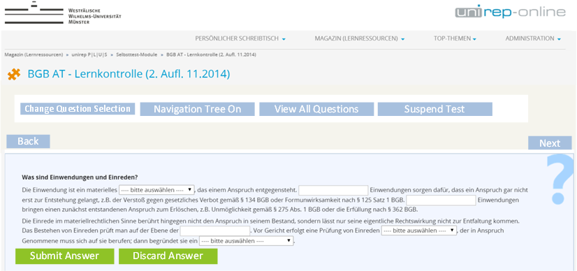
1.1.1 Toolbar
We could also implement a version of the toolbar, where the buttons of the testrelated options can only be clicked once the anser to the question was submitted or discared. Untill then the other button or the navigational tree would be greyed out.
- Pro: All controls related to the test as a whole are always visible.
- Contra: The toolbar is taking up premium screen estate, the question is moved down a bit.
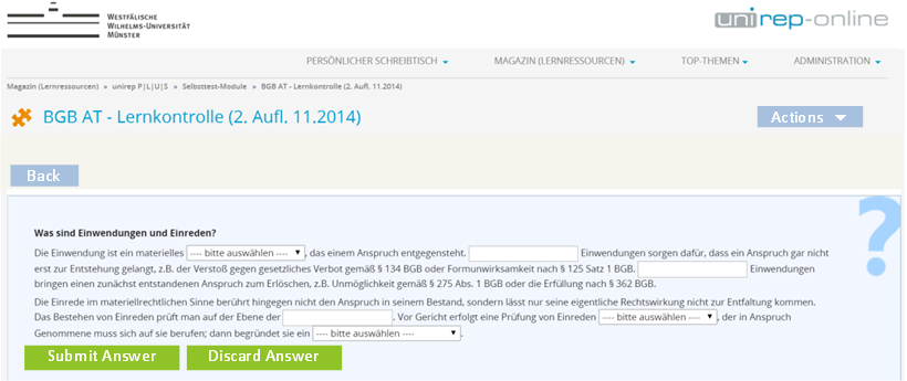
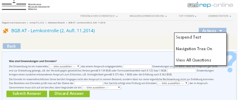
1.1.2 Actionmenue
- Pro: The question is the most prominent thing on the screen.
- Contra: The test related controls cannot be seen, the action menue has to be opened. People might not find it especially if the are nervous in an online exam.
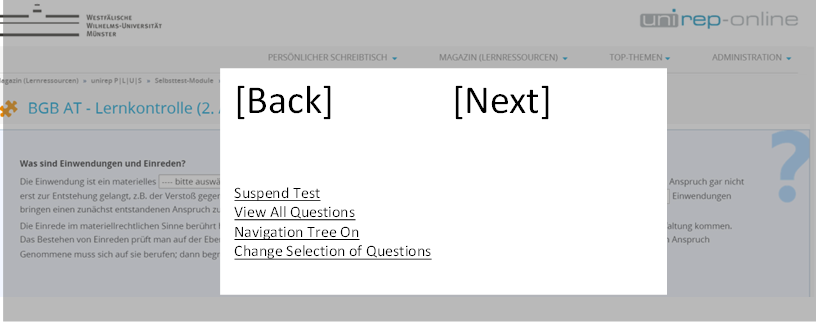
1.1.3 Modal Dialogue
- Pro: The question is the most prominent thing on the screen.
- Contra: Opening the overlay after every question might be considered intrusive.

1.2 Requirement: Separating Submitting Answers and Navigating in the Test
Submitting a question is supposed to be a separate action from navigating the test. If the submission of a question is a distinct action, then editing a submitted question mustt also be a seperate action. We would like to introduce a 'read-only' view of a submitted question and an editing view of a submitted question.
Note: A 'read-only' view will improve the perfomance of ILIAS at the end of high-stakes exams, when participants flick through the test for double checking their answers. currently this forces ILIAS to actually submitt all questions again. This is suposedly very helpful for the online exams.
We want to keep the "Autosave"-option that is currently offered by ILIAS. This poses extra complexity, since the Autosave currently secretly submitts the answer every x seconds without the participant doing anything. We would like to keep this automatically saved answered while distinguishing their autosave-status clearly from the answers actively submitted by a participant.
We have listed several situations and what happens with respect to autosave and submitting:
Starting point; Participants works through the test. Autosave is activated. ILIAS displays question with the suggested new submit-options: "Submit Answer" and "Discard Answer".

What might happen next?
- Stare only: Participant stares at the question. After x seconds ILIAS saves the empty question to the Autosave table. ILIAS does not consider the question as 'submitted', though. On logging-in to a different browser ILIAS would display the autosave status.
- Edit answer but not submitting it: Participant enters answer but does not submit it. After x seconds ILIAS saves the edited answer to the Autosave table. ILIAS does not consider the question 'submitted'. On logging-in to a different browser ILIAS would display the autosave status.
- Edit answer and click on "Discard Answer": Particpant enters answer and then clicks on "Discard Answer". ILIAS DOES NOT SHOW A WARNING MESSAGE but merely empties Autosave, does not save any kind of answer. On logging-in to a different browser ILIAS would display the original question without any entries.
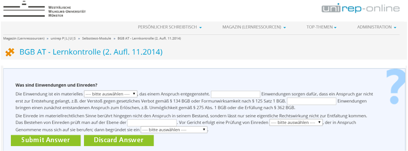
- Click on "Submit Answer": Participant enters answer and then clicks on "Submit Answer". ILIAS submits the answer and empties Autosave. On logging in to a different browser ILIAS would display the answered question. After submitting the answer ILIAS returns to the question and now displays it in 'Read-Only'-mode. Please consult the following screenshot:

6. Click on "Back": On click the last question is displayed. Note: There should be no "Back"-button in the "Continuous Test Mode".
- If the last question was discarded before, the question is displayed empty.
- If the last question was submitted before, the question is displayed in ‚Read-Only‘-mode with "Edit Answer"-button.
- If the option "Freeze Answers Given" of the section "Instant Feedback" was activated and the the last question was submitted before, the question is displayed in ‚Read-Only‘-mode and NO "Edit Answer"-button is displayed.
- If the next question was never submitted before, the question is displayed empty.
- If the next question has been submitted before, the question is displayed in ‚Read-Only‘-mode with "Edit Answer"-button.
- If the option "Freeze Answers Given" of the section "Instant Feedback" was activated and the the next question was submitted before, the question is displayed in ‚Read-Only‘-mode and NO "Edit Answer"-button is displayed.
1.3 Requirement: Streamline Navigational Elements for all Three Test Modi
Current Status in ILIAS 5.0
- For the modi "Fixed Set of Questions" and "Random Set of Questions" there is a table available listing all questions of a test: "List of Questions". It comprises a list of all questions and presents their status (like Maximum Points, Worked Through). Additionally a tree compising all titles of the questions can be displayed next to the questions in the test, serving as a navigational element.
- For the modus "Continuous Testing Mode" there is a list of all previously answered questions curiously accessible via the "Back"-button and no tree view.
The two modi "Fixed Set of Questions" and "Random Set of Questions" stay as they are, the third modus is extend as follows:
For the "Continuous Testing Mode" the question tree is built accoring to the following rules:
- At the top of the list all questions answered correctly are listed in the order of being answered. Questions answered incorrectly are not listed.
- Then the currently displayed question is listed. It carries a visual emphasis like bold.
- Then follow newly added questions (speciality of this mode).
- Then follow the questions that have not been displayed yet.
- Then follow the questions that were displayed and answered incorrectly. They were answered incorrectly before and and are appended to the list.
- Question Title a (answered correctly)
- Question Title c (current question)
- Question Title d (new question)
- Question Title e (not answered yet, never shown)
- Question Title b (answered incorrectly)
1.4 Other Requirements with Respect to Navigation and Submission
1.4.1 Requirements: Assorted Small Changes to "Instant Feedback"
- If the "Instant Feedback" is activated a button "Check" is displayed in the test. Clicking on "Check" will show either the points earned or the correct answer or information on every answer options. What is displayed can be set in the settings-tab.
- We envisage a setting that allows making the "Check"-button to behave like the "Submit Answer"-button and not show the "Submit Answer"-button.
- If people do not want this kind of scenario, where submitting an answer is ALWAYS going along with viewing further subject matter input about the question, can hust turn this off and would keep two seperate buttons: "Submit Answer" and "Check".
- Status in 5.0: If the option "Freeze Answers Given" of the section "Instant Feedback" is activated, after submitting an answer, that very answer cannot be edited anymore.
- Suggested change for 5.1: For the "Continuous Testing Mode" there should be an option to 'unfreeze' the frozen answers if a second testsession is taken. If participants select "Wrong answered Questions" in the "Answer Status" of the "Test Question Selection and Selection Statistic" AND the 'unfreeze second take' option is checked, participants will be presented with a screen: "There are questions to which your inital answers were fixed and you could not make any changes. Do you want to answer them one more time now and thus unfreeze your answers? [Answer once more], [Keep my current answers]".
1.4.2 Requirements: Improve "Test Question Selection and Selection Statistic"
- The labels of the screen "Test Question Selection and Selection Statistic" need to be refurbished to comunitcate their prupose more clearly. This applies to the table headings as well as to the drop-down entries.
- The column "Postponed Questions" is to be removed entirely since its contents are already included in the other columns and thus the sums curiously differ from what a sane person would expect. To avoid this disturbance this information will no longer be shown.
1.4.3 Requirements: Change "Postpone Questions" from button to option
The behavior of the test should not be governd by an option in the settings-tab:
- We suggest a checkbox "Append questions that were initially not submitted during the test again at the end of the test". If that checkbox is activated then participants would be presented with all those questions they flicked through again at the end of the test automatically.
- If the checkbox is not activated the questions would not automatically be appended to the test and if participants want to answer them they have to actively navigate to them.
2 Additional Information
- Idea / concept: Stefan Schneider, Tödt, Alexandra [atoedt], Kunkel, Matthias [mkunkel] et al.
- Interested in funding: Universität Münster
- Maintainer: Heyser, Björn [bheyser], Databay
- Development: Feature is to be developed by Databay AG
- Testcases: tbd
3 Discussion
Matthias Kunkel, March 18, 2015: This feature was already scheduled for 4.4 but not implemented due to missing funding / time. There is still a need for this feature. Therefore I have added it to the Jour Fixe agenda to discuss it for 5.1. Nevertheless, funding is still needed to release this change of behaviour.
Kunkel, Matthias [mkunkel], June 09, 2015: Related feature request: Scoring Revision
Kunkel, Matthias [mkunkel], June 15, 2015: Another related feature request is Option to hide the back button in tests. When we separate submission and navigation, we could offer a mode in which ILIAS does not present any navigation buttons (neither forward nor backwards) but opens the next question only when an answer to the current question has been submitted.
JourFixe, ILIAS [jourfixe], 22 June 2015: Alexandra Tödt, Volker Reuschenbach and Björn Heyser made a small workshop on this topic last week and summarized their suggestions on this page (they still make a few additions). We ask everyone using the test tool to read through the proposals and to give their opinion on the alternatives. We will continue to discuss this in an upcoming Jour Fixe.
Amstutz, Timon [amstutz], 23 June 2015: Thank you for this very detailed description of the current and possible future layouts of test submissions and navigation. I think a key element is to keep in mind which element has which role in ILIAS and not just in the test module. Since to my best knowledge we do not have a clear disitinction on what kind of action/navigation is to be placed where, this request might be a good opportunity to think about some basic concepts.
A first element that could be used is as suggested the "action" menu. My impression (unfortunatelly so far it is really not more that, so please correct me if wrong) is that this menu is mostly used to add Metadata like information to an object such as comments, notes or tags. In the test this menu is also used this way while residing in the "settings" or "info" tab but disappers once navigated to the "Questions" tab or while actually performing a test. This is a small issue since it is not consistent with other object and with the general rule, that navigating the tabs should not chang items placed above the tabs. It is a big issue however if the role is changed suddenly completely to a key element in navigation.
My opinion: Unless we would like the rethink the role of the "action" menu completely, I would strongly recommend to not go for this option.
The modal would be a new element to ILIAS. This is not something entirely bad if this pattern can be reused in other objects as well. On the other hand it seems heavily obtrusive to me. I do not think modals should be used for navigation at all. Rather to gater information, delete items or similar. They might also be used to run a little process (like creating an object) but the in a kind of interchanging way with other modals. In this case we would flip back and forth between modal and normal view. This seems to me as popup like behavious which can not be considered as good UI design as far as I can see.
My opinion: If I understand the concept correctly, the modal would be heavily obtrusive. Maybe option 1.4 would help with that, but I did not get this one.
This leaves the toolbar. So far the toolbar is mostly used to work on the content of the current object itself (adding items, search). In the test object we also have already navigational elements placed there in the mode where questionas are added and edited by the admin of the test. From a UI perspective it would therefore probably be a good idea to continue developing the idea of also using the toolbar as a navigation tool. We should keep in mind however that this has also some consistency problems since this toolbar is not sometimes used for navigation and sometimes for editing. Also the toolbar will be very crowded. Here maybe we could think about summarizing parts to a dropdown in the toolbar (named "navigation" or similar). Also we should think about the mobile view. We are currently revising the toolbar in the scope of the design revision 5.1. We are still in the conceptional phase but probably we will have soon the option to always display certain elements even in the mobiel view (in there currently all elements disappear).
My opinion: To use the toolbar sounds promising. One thing to keep in mind is, that we mix in ILIAS two completely different actions in the toolbar (editing and navigation).
I hope this helps.
Schneider, Stefan [sschneider], 24.06.2015: Thank you for the great job! I agree with Timon and would highly prefer the toolbar version. Maybe we can discuss some alternative space-saving icons with tooltips like the navtree icon in older versions to solve the problem, that the UI should focus the content of a question. This would also better fit the requirements of mobile devices.
Loewe, Anja [aloewe], 24.06.2015: We agree with Timon and Stefan on the toolbar version.
Kunkel, Matthias [mkunkel], June 24, 2015: Thank you for this detailed feature request. Separating the process of submitting and answer and the process of navigating through a test would be a very important improvement of the ILIAS test tool. In spite of this in-depth description I have still a few questions and remarks:
ad 1 Requirements : I do not understand why ILIAS cannot distinguish between a question that has been displayed and a question that never has been displayed. IMHO the problem is that ILIAS cannot distinguish between a question that has been displayed and answered and a question that has only been displayed (e.g. when flickering through a test). I thought this „inability“ of the current test tool implementation is the main reason for this feature request.
ad 1.1 : I fully support a clear distinction between activities related to the test as a whole (like Suspend Test) and activities related to the currently presented question. Nevertheless, navigation controls like Next and Back could also be considered as a third group of controls. They are connecting questions while a Check or Hint button is just related to the presented question itself. In the end they would be displayed at different places of the GUI anyway.
ad 1.1.1 Toolbar : Facing the recent postings there is already a certain preference for this solution. As far as I understood your suggestion, a new toolbar should contain all test related controls and be displayed on top of the question itself. But even if this toolbar is not that dominant as on your mockup, IMHO these options get too much attention when displayed in a toolbar. On every new displayed question a user would see these options again and again - and in the middle of the screen. To be honest, I don’t like this suggestion!
ad 1.1.2 Action Menu : I like this suggestion, especially because it supports a clear distinction between the options related to the test and the question-related controls. I do not agree with your concern that participants in an online exam get nervous when they do not see these options. Neither „Suspend Test“ nor „Change Question Selection“ are used in an online exam. Switching the navigation tree on or off is not a crucial activity in an online exam. Only „View All Questions“ has a certain relevance in such a test. And the former implementation that used an icon seemed not to prevent institutions to use ILIAS for online-exams. If these options become part of an „Actions“ dropdown, I guess online exams can still realized successfully.
ad 1.1.3 Modal : I agree with Timon’s comment and refusal (even if I do not know what ‚obstrussive‘ means…). A modal does not seem to be the right UI element for displaying these activities. And the envisaged distinction between test- and question-related controls gets lost on the modal mockup because both appear there.
ad 1.2 : I fully support a read-only view on already answered questions to improve performance and to avoid that every displayed question is handled as newly submitted. You invested a lot of time to think about the auto save function and its impact on this separation. Maybe things get easier when you start the auto save process only in case an input has been done on the page. Why should ILIAS save empty inputs? And if a user adds an answer but does not submit it _and_ clicks on an ILIAS link outside the test, why not present a confirmation screen and ask the user if the answer should be submitted or not. Haven’t we introduced the auto save mainly to store the last input in case the user cannot submit his answer due to technical reasons. If he is able to click on another link, we just ask him what to do with his input. And if he discards the answer, we drop the auto save.
What I am missing in this context is an answer on requirements like hiding the back button or automatically present the next question after having submitted the current one. In both cases one (or all) navigation buttons would be hidden.
1.3 : Highly appreciated
1.4.1 and 1.4.2 : No comments, I fully agree
1.4.3 : IMHO we do need a „Postpone Question“ for a navigation mode that does not allow to flick through the questions. In this case it could not be just an option but it would substitute the „Next“ button. But displaying „Next“ _and_ „Postpone Question“ does not make sense in my opinion.
Amstutz, Timon [amstutz], June 24, 2015:
@Matthias
ad 1.1.1 Toolbar : ... As far as I understood your suggestion, a new toolbar should contain all test related controls and be displayed on top of the question itself. But even if this toolbar is not that dominant as on your mockup, IMHO these options get too much attention when displayed in a toolbar. On every new displayed question a user would see these options again and again - and in the middle of the screen. To be honest, I don’t like this suggestion!
You have some valid points there. I am not sure if the action menu is the point to place those items, see my arguments againts in in the above posting. I think we need a good concept on where to place navigational elements of an object in general. Most navigation is handled in the tabs or sometimes in the tree on the left-hand side. Now there is the need for a third such component. Are you sure, the action menu is the place to put it? So far I can not see any navigation related action in there. The toolbar is in some cases at least even remotely related to navigation. What about a dropdown called 'navigation' or similar in the toolbar? Could that be a solution?
ad 1.1.3 Modal : I agree with Timon’s comment and refusal (even if I do not know what ‚obstrussive‘ means…).
What I tried to spell was obtrusive, I corrected it. Sorry, my bad ;-)
Thank you very much also from our side for the very detailed description. We discussed the different ideas in our team and here are our comments:
- We would prefer the Toolbar also. Especially students who are not working with ILIAS all the time but only “must” use it for examen will have problems to find the hidden Action Menu. But as it is said before: it’s very present the way the Mockup shows it. Maybe it can be placed not above the Question but under the question/Submit/Discard Button?We would prefer a version of the toolbar, “where the buttons of the testrelated options can only be clicked once the answer to the question was submitted or discared. Until then the other button or the navigational tree would be greyed out” (1.1.1)
- We agree totally with Mr. Kunkels idea: “if a user adds an answer but does not submit it and clicks on an ILIAS link outside the test, why not present a confirmation screen and ask the user if the answer should be submitted or not.”
- We also fully agree with this suggestion: “automatically present the next question after having submitted the current one” or discard it.
- User starts test
- ILIAS presents first question in read-only mode. Toolbar and navigation button Previous / Next are active.
- User wants to answer question and clicks on "Edit Answer"
- Alternative: User wants to see next question and clicks on "Next" (continue with step 6.)
- Question is presented in edit-mode, toolbar and Previous / Next buttons are inactive.
- User enters answer and clicks on "Submit Answer".
- Alternative: User clicks on "Discard Answer" to keep the original status of the question (before first editing).
- ILIAS presents confirmation screen "Your answer will be deleted completely." (yes|no).
- Alternative: User clicks on "Discard Answer" to keep the original status of the question (before first editing).
- ILIAS presents next question in read-only mode.
The read-only mode must be identifiable as such at first glance. We need to communicate "this is not editable" at first glance. Suggestions to discuss
- Having two distinct background clors for the question body: "read-only" is light-grey while "edit" is light blue.
- Make the "next" button blue and not green to make it less prominent and put the clear focus on "Answer Question".
- The not-active buttons should be even paler. Since this would apply to all plae buttons we would like to get a decision for much paler pale buttons throughout all of ILIAS.
- NEW: a setting governs whether discarded and flicked over questions are put at the end of the test or stay were they are. WAS: Participants actively postpone a question.
- FS has requested a "Cancel" button in the "Edit" view
- IS "Submit Answer" COULD BE "Save Answer"
- NEW: "Fragennavigation an" WAS "Fragenübersicht einblenden" COULD BE "Fragenbaum an"
- Read-Only-Mode: we like the idea of two distinct background colors to distinguish between read-only and edit-mode
- Postpone-Setting: we are happy with the new behavior as long as automatic postponing can be deactivated ;-)
- Cancel-Button in edit-view: we highly appreciate a "cancel"-button to cover the case when a user starts changing his given answer but then wants to return to the prior state (at the moment he can only decide between saving his new answer or deleting everything).
- Labels: If "submit answer" changes to "save answer", "discard anwers" could be "delete answer". We expect that for students (especially in exams), save and delete will be clearer and less irritating.
- We like "Fragenbaum" instead of "Fragennavigation"
2015-08-31 Stefan Schneider/Martin Klehr
We would like to put up to discussion to modify the concept of going directly to the next question after having submitted or discarded an answer. The original idea was to avoid too many clicks but after having used it for the first time we think that it may feel to implicit for the user. We thought about making the behavior more explicit by presenting *two* buttons and let the user decide what to do: "Einreichen und weiter" and "Einreichen". In the last case the question is again presented in read-only mode an can be checked in its submitted state before continuing to the next question. (This behavior would be smiliar to the on in the Seiteneditor ("Speichern und zurückkehren", "Speichern".)
- A general problem of the current implementation is that users do not understand that the question is presented in "read-only" mode. Users will try to click radio buttons or check boxes but fail. Check boxes should be at least 'disabled'.
- To be discussed: Show a tooltip when a user is clicking on a check box / radio button or in it's surrounding area in read-only mode to notify user that "Answer Question" has to be clicked.
- Only the "Answer Question" should be a primary button (green), not the "Next" button.
- Disabled buttons have to be grey (similar to "prevent double form submission").
AT, 2015-11-09: Matthias Kunkel has required me to put this project on the agenda one last time for ILIAS 5.1.
We are to finally decide about the way we will make the general test navigation available during a test pass and not keeping participants locked in the question navigation.
We have sent the SIG EA Chairs the following suggestion on October, 7th:
My summary ( a better presentation could / should be made by the Chairs):
- Discard the project and roll-back to 5.0 status.
- Discard the Read-only mode for several question types. Making the test navigation available in Edit-mode. A mock-up ist available at: http://www.labs.odl.org/ilias-testnav51
- Present questions in Read-only once they are opened.
After deciding upon the a way to make the testnavigation available, the test cases have to be amended accrdingly, the test cases have to be tested and all bugs identified and reported need to be fixed. The testing phase will end on November, 30th. This makes this issue pressing and this is the last Jour Fixe allowing to decide upon this.
JourFixe, ILIAS [jourfixe], Nov 09, 2015: Alexandra and Björn gave a presentation of the existing options for an improved interface (modal and Fred's suggestion). We decided to realise the modal concept for 5.1 because it offers already a solution for all question types (other suggestion has no solution for MC without any correct answer, ordering question, Java Applet question and Flash question) and doesn't require a migration of existing questions. Nevertheless, we highly appreciate Fred's suggestion and would like to realise it for 5.2 when there is a solution for all question types.
4 Implementation
Description Summary
- Beside the question list naviagtion there are two main navigation element ares
- test player toolbar
- question editing toolbar
- The next and previos buttons are placed as before
- The test player stores anwser with correct paricipant's intention
- auto saved answers are non authorized answers
- authorized answers when participant explicitly wants to
- results consider authorized answers only
- The test player comes wih different navigation contexts (see description below)
- question can be shown in viewable state
- question can be shown in editable state
- question navigation toolbar context/setting sensitive
Detailed Worklfow
This is the new regular test player screen, this screen is shown to the participant when the test gots entered the first time. All buttons and actions are shown as active clickable elements although the question navigation elements within the question container actually work only.
Not all the shown navigation elements are always available, this example scenario makes use of all activatable features available for a test pass in general.
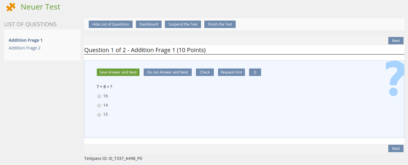
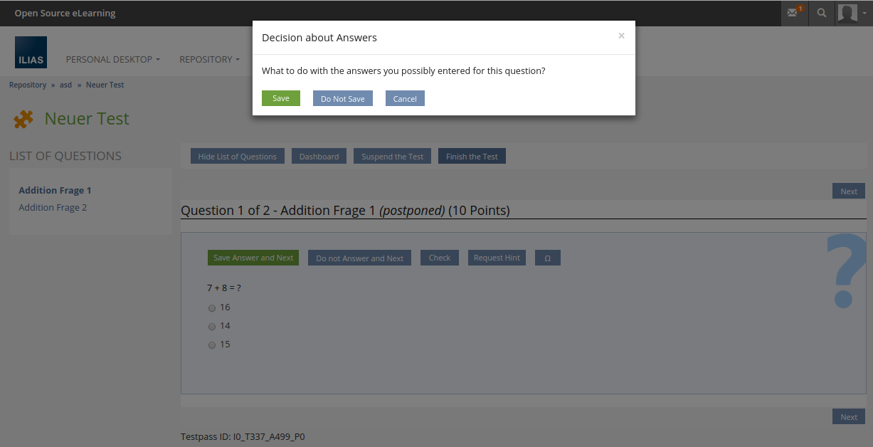
When another action than the actual active actions is triggered, a fallback modal dialogue pops up and asks what to to with the mightly edited answer.
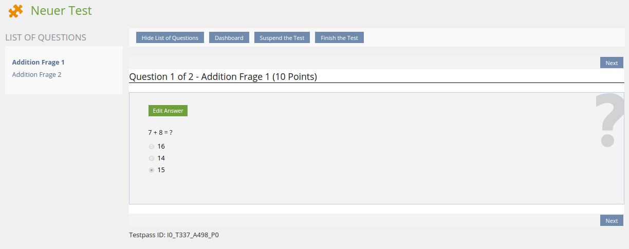
To support a workflow with less clicks the button for submitting an authorized answer opens the next question automatically. Nevertheless the participant will navigate to an allready answered question anytime. In this navigation context, the question is shown in a viewable state initially as shown below.
The question navigation is reduced to a single button that re-enables the question's editable mode. All actions/buttons on the screen are actual active navigation elements, so no modal dialogue pops up when invoking any action.
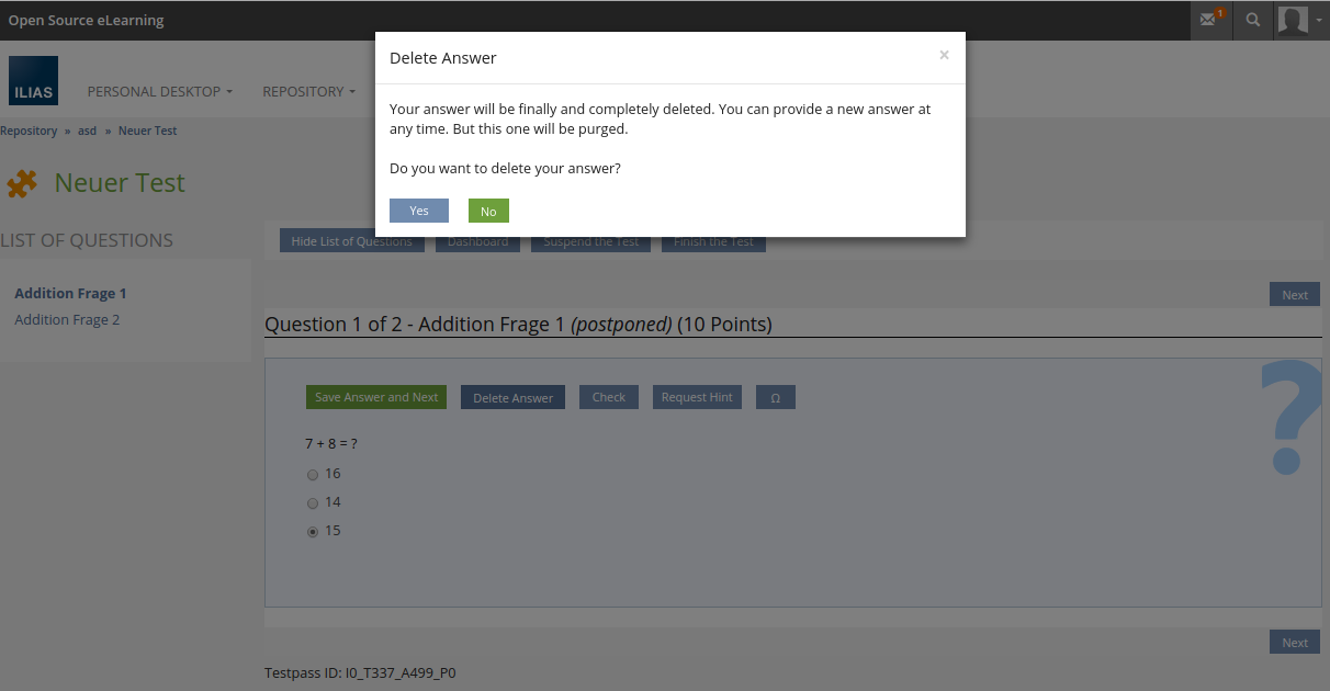
If an allready answered question is opened for re-editing, the question navigation toolbar replaces the "Do not Answer and Next" button with a "Delete Answer" button. This button intents to fully delete any particpant's input.

As invoking "Delete Answer" action could be invoked by mistake, this step is of course to be confirmed within an upcoming modal dialogue that also gives option to cancel the deletion.
When any "Check" feature is enabled, the question navigation toolbar of course shows a check button as known from previous ILIAS releases. When this action is invoked, the currently entered solution from the participant is stored as non authorized answer so a evaluation of the solution is possible.
But this solution is still not considered in the test results, the solution is still to be actively submitted by the user. The same behaviour is valid for question marking or when requesting any available question hint that also reduces grained points mightly.
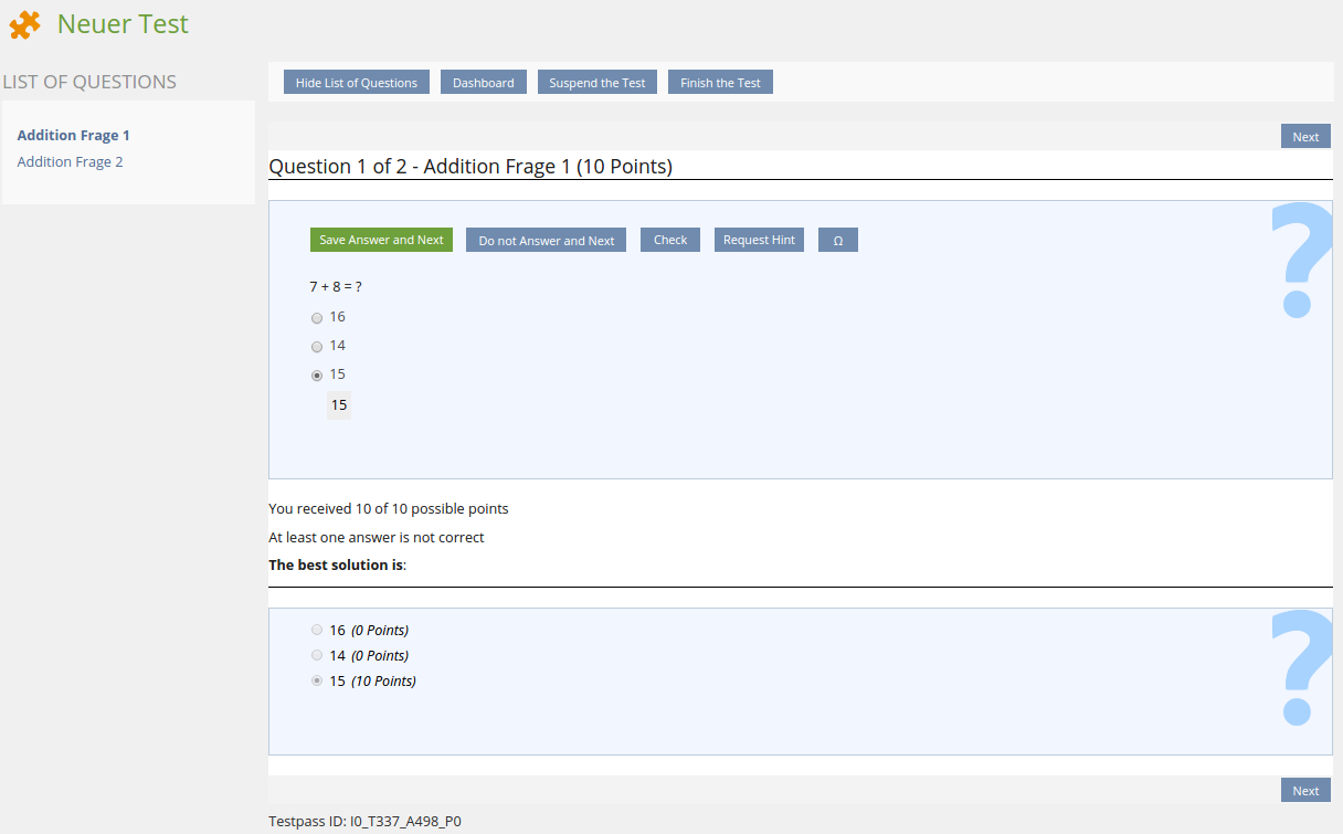
With the current release the "Check" features also allow to be forced on any answer submit by the participant. In this case the actions behind the question navigation toolbar elements behaves a bit different partly. There is no dedicated "Check" button, but the "Save and Next" button is merged with the "Check" Button to a "Save and Check" button.
Invoking the "Save and Check" Button opens the check screen directly and saves the particpant's solution as authorized answer, so it gets considered in the test results.

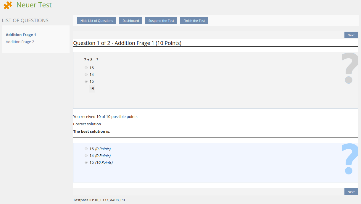
With the current release the "Check" features also allow to freeze the participant's answer after a check is invoked.
When the feature is configured in this way, the read-only view for a question is opened including the check screen itself after silution submit. The submitted answer is of course stored as authorized one and it is considered in the test results.
Test Cases
Test cases were prepared to test the new functionality in Question Queue Mode. Test cases of other scenarios will be amended as soon as labels are finally setteld.
- http://testrail.ilias.de/index.php?/cases/view/6500: C6500 Alle Schaltflächen an, die sich auf den gesamten Test beziehen
- http://testrail.ilias.de/index.php?/cases/view/6501: C6501 Fragennavigation' und 'Bearbeitungstand' nutzen
- http://testrail.ilias.de/index.php?/cases/view/6502: C6502 Wiedervorlagemodus: Reihenfolge der Fragen in der ‚Fragennavigation‘ ohne Taxonomie
- http://testrail.ilias.de/index.php?/cases/view/6504: C6504 Schaltflächen zum Beantworten der Frage prüfen
- http://testrail.ilias.de/index.php?/cases/view/6505: C6505 Mit Autosave: Frage nur anstarren
- http://testrail.ilias.de/index.php?/cases/view/6506: C6506 Mit Autosave: Antworten eingeben, nicht einreichen, dann abstürzen, dann verwerfen
- http://testrail.ilias.de/index.php?/cases/view/6507: C6507 Mit Autosave: Antworten eingeben, nicht einreichen, dann abstürzen, dann einreichen
- http://testrail.ilias.de/index.php?/cases/view/6508: C6508 Mit Autosave: Gegebene Antworten ändern
- http://testrail.ilias.de/index.php?/cases/view/6509: C6509 Ohne Autosave: Frage nur anstarren
- http://testrail.ilias.de/index.php?/cases/view/6510: C6510 Ohne Autosave: Antworten eingeben, nicht einreichen, dann abstürzen, dann futsch
- http://testrail.ilias.de/index.php?/cases/view/6511: C6511 Ohne Autosave: Antworten eingeben, dann verwerfen
- http://testrail.ilias.de/index.php?/cases/view/6512: C6512 Ohne Autosave: Antworten eingeben, dann einreichen
- http://testrail.ilias.de/index.php?/cases/view/6503: C6503 Im Wiedervorlagemodus werden nicht-beantwortete von falsch beantworteten Fragen unterschieden
Approval
Approved at August 28, 2015 by Kunkel, Matthias [mkunkel] on behalf of Volker Reuschenbach.
Last edited: 20. Mar 2023, 09:15, Samoila, Oliver [oliver.samoila]