Feature Wiki

Information about planned and released features

Tabs

Revision of Info Page

1 Description

The current presentation of the info page is not satisfying. A lot of the features that have been placed on the Info page originally are now available on other screens too. So the aim of the page has become unclear. Until now every object type has an Info page - but it is not evident that every type and every content needs one.

On this page we would like to collect suggestions on how the Info page could look like in the future and which tasks this page has to support.

1.1 Content and Features of the Info Page

Content / Feature

Type

Comment / Suggestion

Description

text only

Could stay - but is already shown as subtitle under object title

Metadata

text only

Could stay. This is an info in the real sense of the word. It offers me additional information about this object that one cannot get from the content page itself.

Access Information

text only

Could stay. Important as it gives additional information how to access this object.

Tags

feature

Could be moved to the content view. Is a mix between information and navigation.

Permanent Link / Bookmark

feature

Could be removed. Permalink should always be displayed on the footer of an object (at least at the content page).

Creation Date

text only

Could be removed. This is poor information. More interesting would be a "last edited" info (which we do not have).

Owner

text + link

Could be removed. Info is already shown in Permission tab and not necessary at Info page. Requires WRITE permission anyway. More interesting would be a "Contact" info as the owner info refers to the user that created this object - who is not necessarily the one who takes care about it.

Number of Read Events

text only

This is statistic data and only accessible and interesting for users with WRITE permission. Should be moved to a better place.

Number of Users

text only

Same as "Number of Read Events"

Learning Progress

feature

Needs a better place and should therefore be moved to another tab. Why not showing always a LP tab if an object has activated LP (including Actions menu for objects like SCORM or HTML modules).

Download / Start Button

feature

Should be placed on a dedicated tab. These buttons are no information but give access to the "content" of a file, survey or test object.

News block

text + link

Difficult to decide. Some objects show the news on the content page (courses, categories, ...), for other objects this does not work (learning modules)

Notes and Comments

feature

Should be removed. Notes and comments should always be accessible through the top action menu (top right).

1.2 Object Types And Info Page

Some object types need / use the Info page to display information about themselves that cannot be placed on the content page or on another tab, e.g. all objects that need to display information to users that have only VISIBLE permission for this object and should know how to join / subscribe / start this object. The Info page of other object types has no important information that is not displayed somewhere else in the object - or might be easily moved to another tab.

Container Objects

Object Type

Aim of Info Page and Displayed Information

Comment

Category

Info page shows only a few information: Tags (only if enabled and logged in), Permanent link,
Create date, Owner (only with write permission), read events, number of visitors

agging could be moved to the content view (because content related). Permanent link is shown in the footer of the category anyway. Owner info and statistics could move to a tab which is accessible with write permission. Only information available for every user is create date (which is not very important). Conclusion: an Info page for a category has no added value for users. Therefore we should abandon it - or at least give the option to deactivate it in the settings when one really needs it. [1]

Course

Info page is used to give information about course target, rules of enrollment, dates. Target group: users that not member yet. Therefore VISIBLE is sufficient to access Info page. Course members, tutors and administrators do not need Info page.

Info page for courses could be substituted by a kind of "Become Member" page. This could be presented as tab and transformed into an "Unsubscribe" tab once a user is member.

Folder

Same like for "category"

Not really needed. Option to activate Info page if really needed.

Group

Same like for "course"

Same like for "course"

Content Objects

Object Type

Aim of Info Page and Displayed Information

Comment

Blog

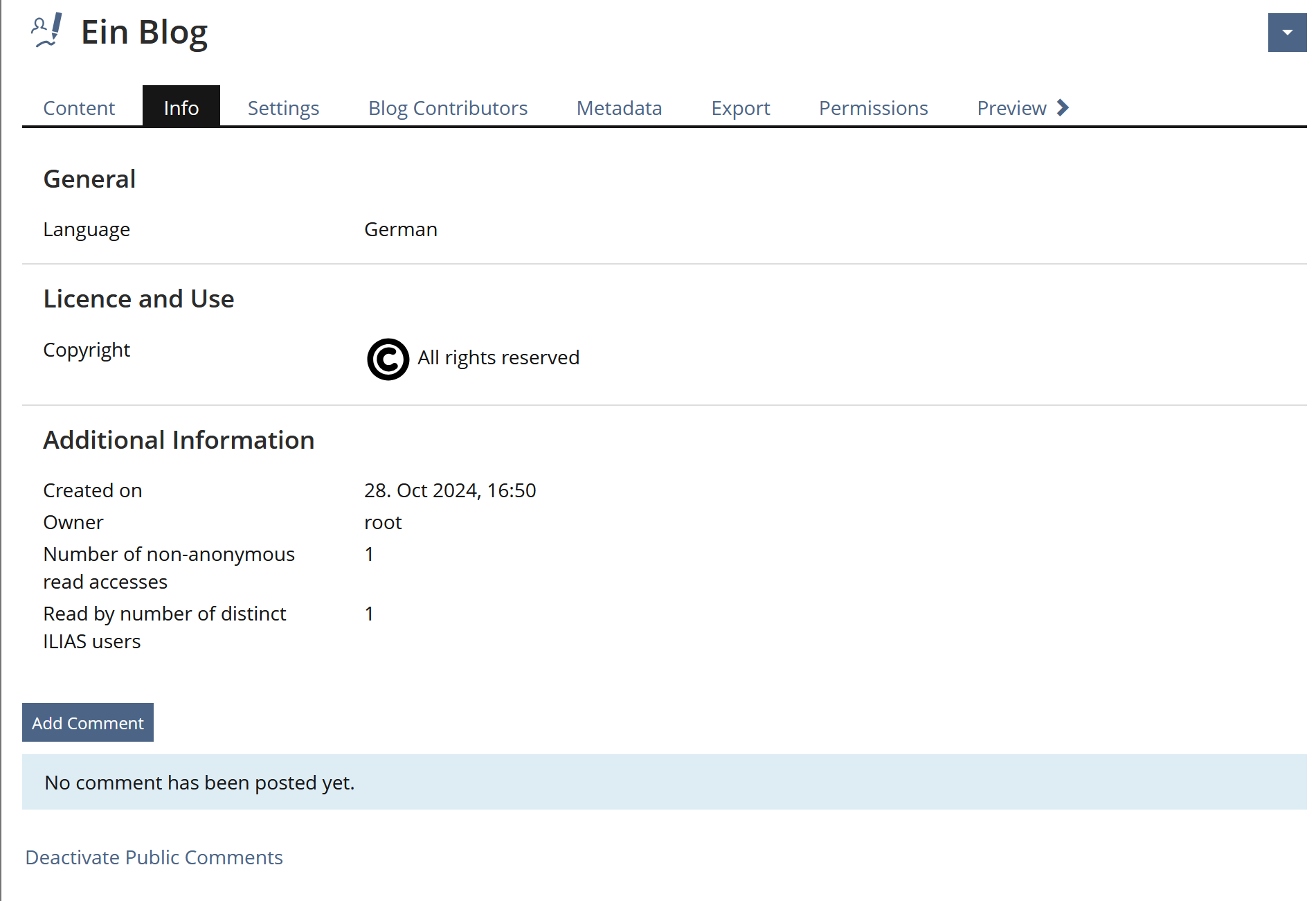
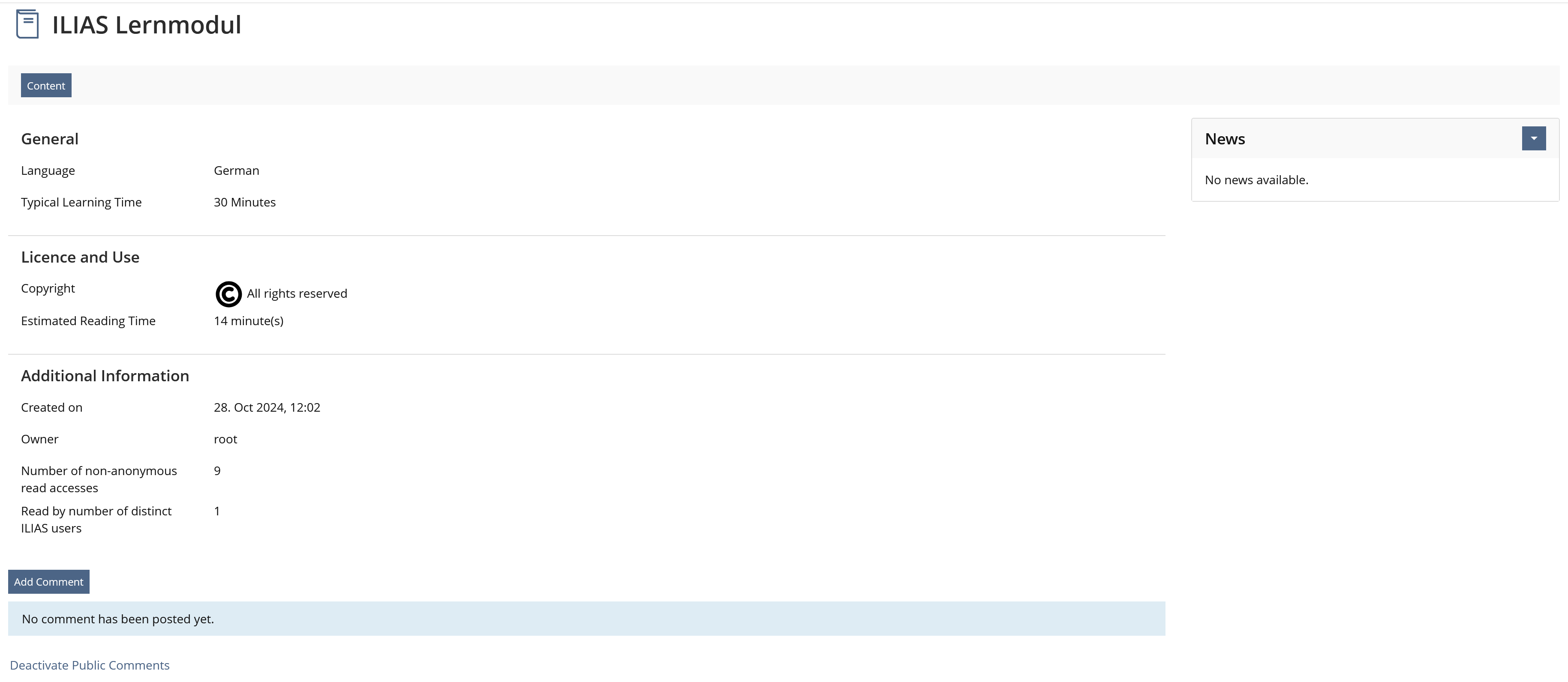
Shows 'Tags', Permanent Link', 'Created on', 'Owner', 'Comments'

Tagging and Comments are also accessible through Actions in content view. Permalink should always be displayed in footer. Conclusion: Info page has a weak "right to exist".

Booking Tool

same as Blog

dito

Chatroom

same as Blog

dito

Data Collection

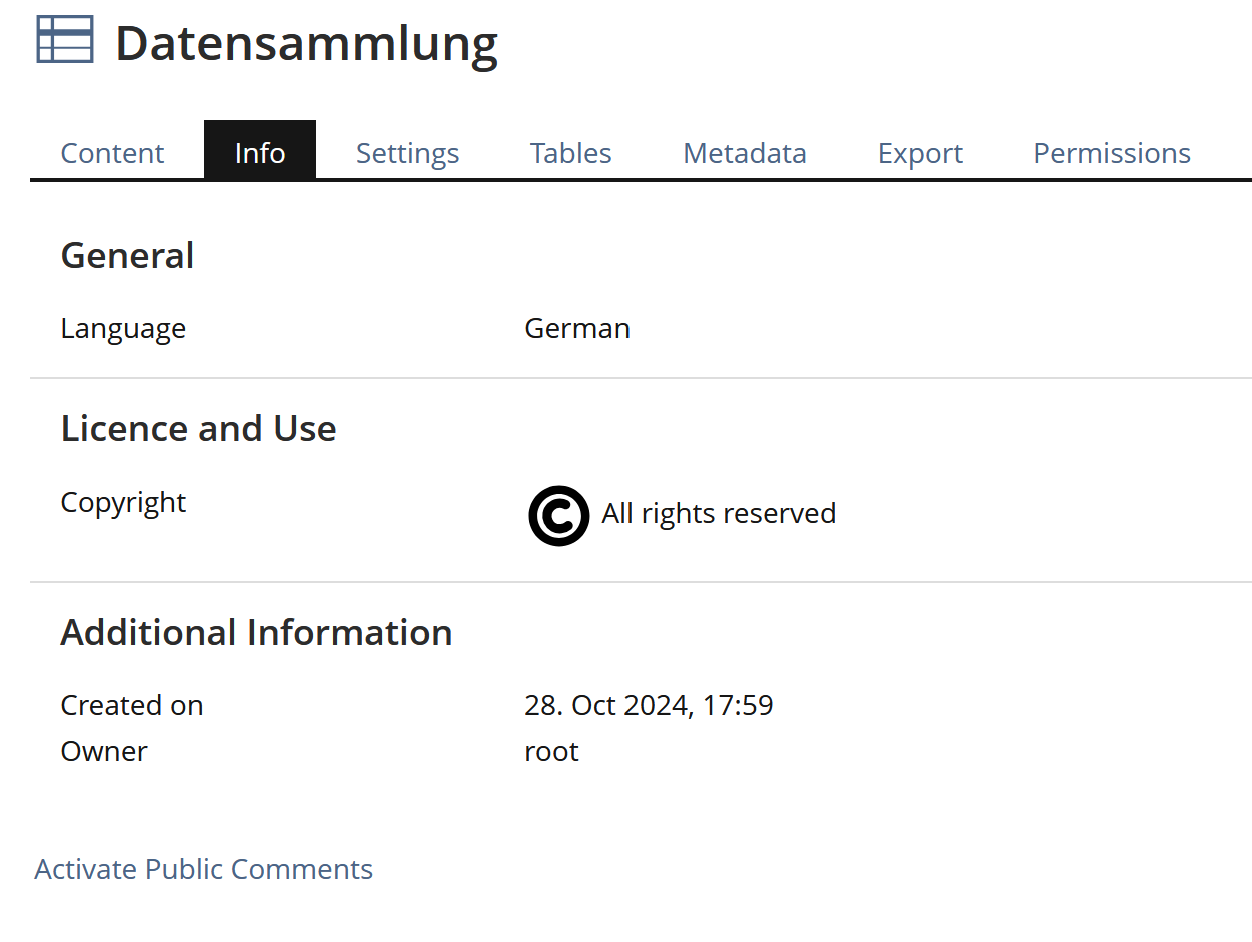
same as Blog

dito

Exercise

  • Information about number of assignments, how much are mandatory and about the pass mode
  • Tags
  • Additional Information: Permalink, Repository Links, Created on, Owner, Disk Usage
  • Comments
  • News block

  • Assignment info could alternatively be displayed in tab "Assignments". This information is mainly interesting for learners who can access this tab.
  • Tags and comments are accessible through Actions menu.
  • News block has to be discussed
  • Permalink in footer

File

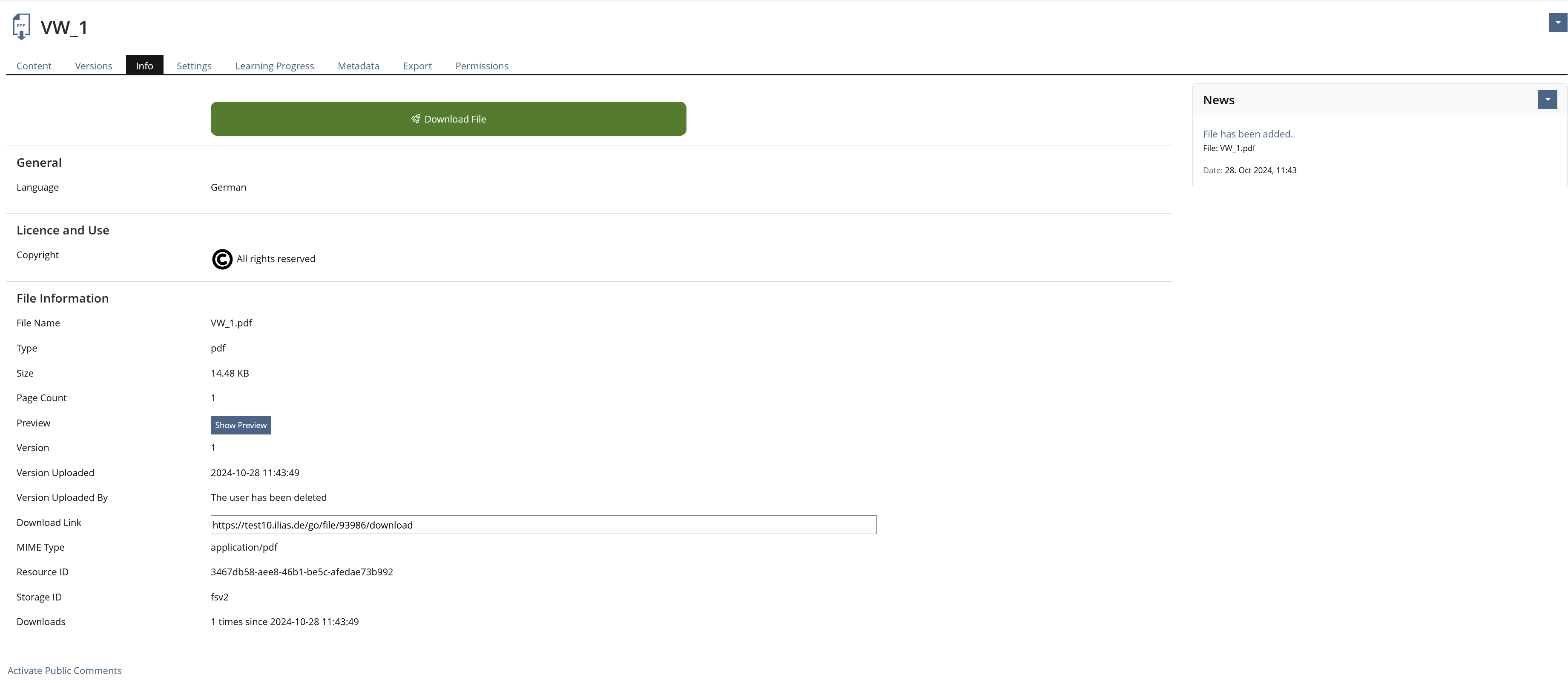
Page used to download file as well as getting details about the file. ILIAS displays:

  • Button "Download File"
  • Metadata: Language, Keywords, Author, Copyright, Typical Learning Time
  • File infomation: name, type, size, version, uploaded by
  • Tags
  • Additional Information: Permalink, Repository Links, Created on, Owner, Disk Usage
  • Comments
  • News block

Info page is mainly used to display Download button and file information. This could also be done on a dedicated "Download" tab - similar to the "Content" tab of other objects. This would also be a good place for the News block.
 

Forum

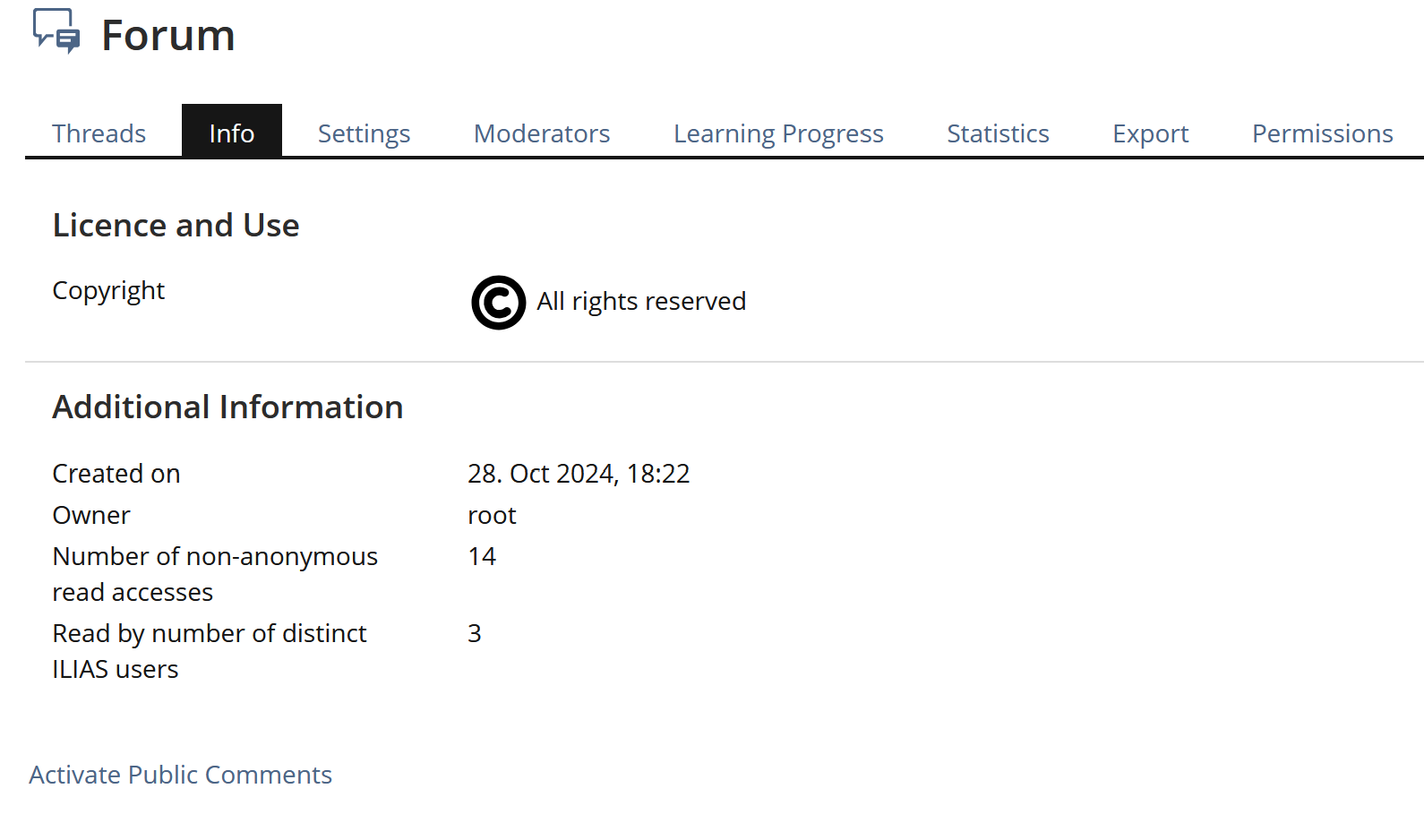
same as blog + 'Repository Links' and 'Disk Usage'

Glossary

Shows metadata and which ILIAS LM is using terms from this glossary.

Page is mainly a meta data page

Learning Module HTML

Page used for starting module, handling learning progress and several information about content

  • Button "View"
  • Personal Learning Progress (if "Manual by Learner"): status, last access, no of visits
  • Metadata: Description, Language, Keywords, Author, Copyright, Typical Learning Time
  • Tags
  • Additional Information: Permalink, Repository Links, Created on, Owner, Disk Usage, Read Accesses, Distinct Users
  • Comments
  • News block

Info page is used for several purposes and information. There seems to be a real need of it.
 
Possible changes:

  • Option to activate / deactivate Info page (no page if not needed)
  • Information about Learning Progress could be moved to a new learner view in "Learning Progress" tab.
  • "View" button could be removed due to "Presentation View" link in tab menu.
  • Tags and Comments are accessible through Actions menu and could be removed from Info page
  • Permalink in footer

Learning Module ILIAS

Page used for handling learning progress and several information about content

  • Personal Learning Progress (if "Manual by Learner"): status, last access, no of visits
  • Metadata: Description, Language, Keywords, Author, Copyright, Typical Learning Time
  • Tags
  • Additional Information: Permalink, Repository Links, Created on, Owner, Read Accesses, Distinct Users
  • Comments
  • News block

same like LM HTML

Learning Module SCORM

Page used for starting module and several information about content

  • Button "View"
  • Metadata: Description, Language, Keywords, Author, Copyright, Typical Learning Time
  • Tags
  • Additional Information: Permalink, Repository Links, Created on, Owner, Disk Usage, Read Accesses, Distinct Users
  • Comments
  • News block

same like LM HTML
 
Handling of learning progress information is different from ILIAS and HTML. There is already a dedicated tab for it.

Media Pool

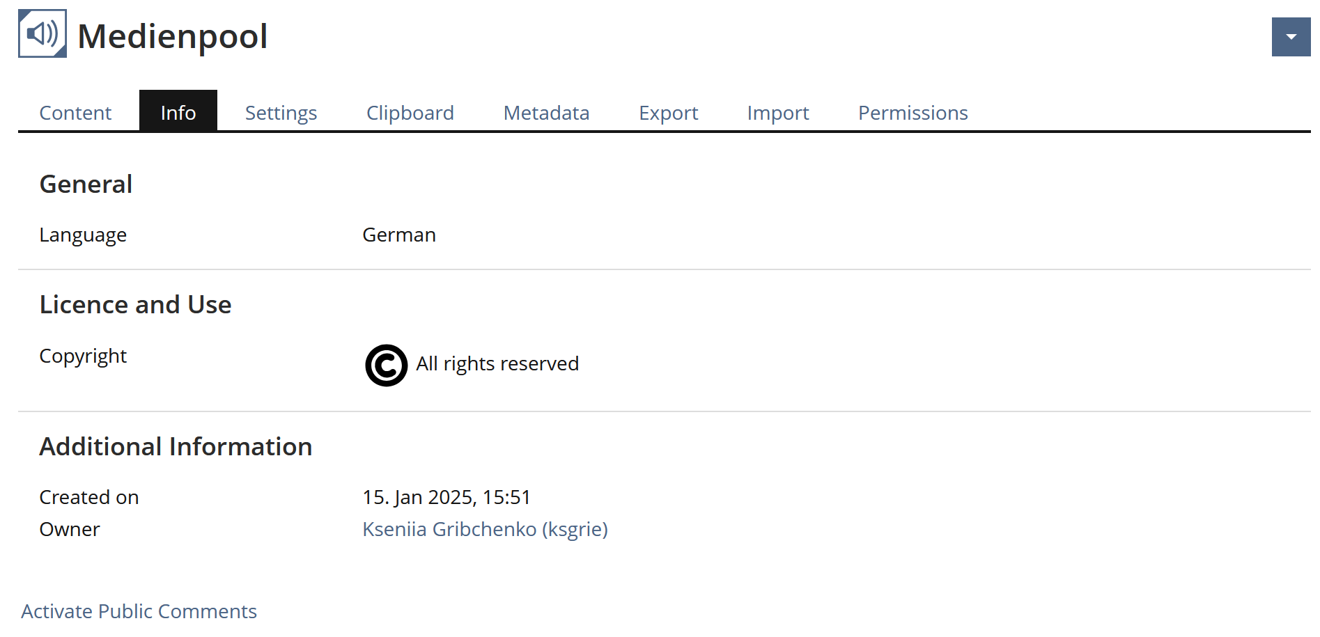
same as Blog

dito

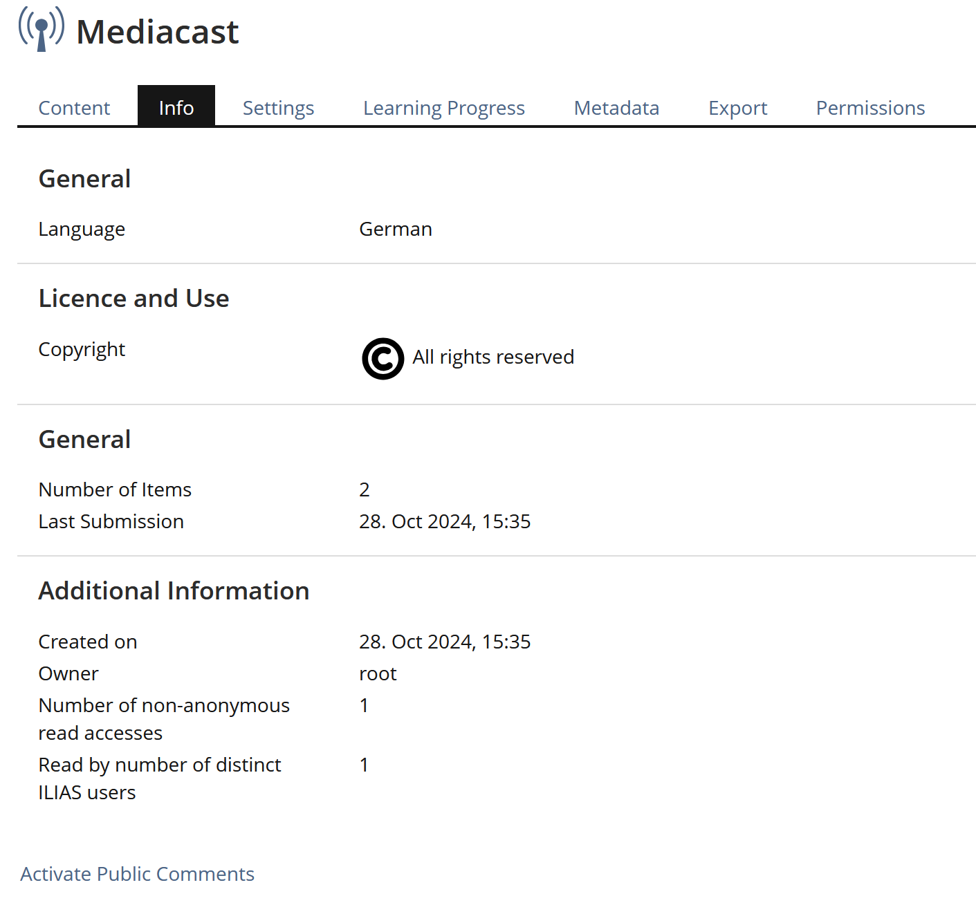
Mediacast

same as Blog + number of items and last update

dito

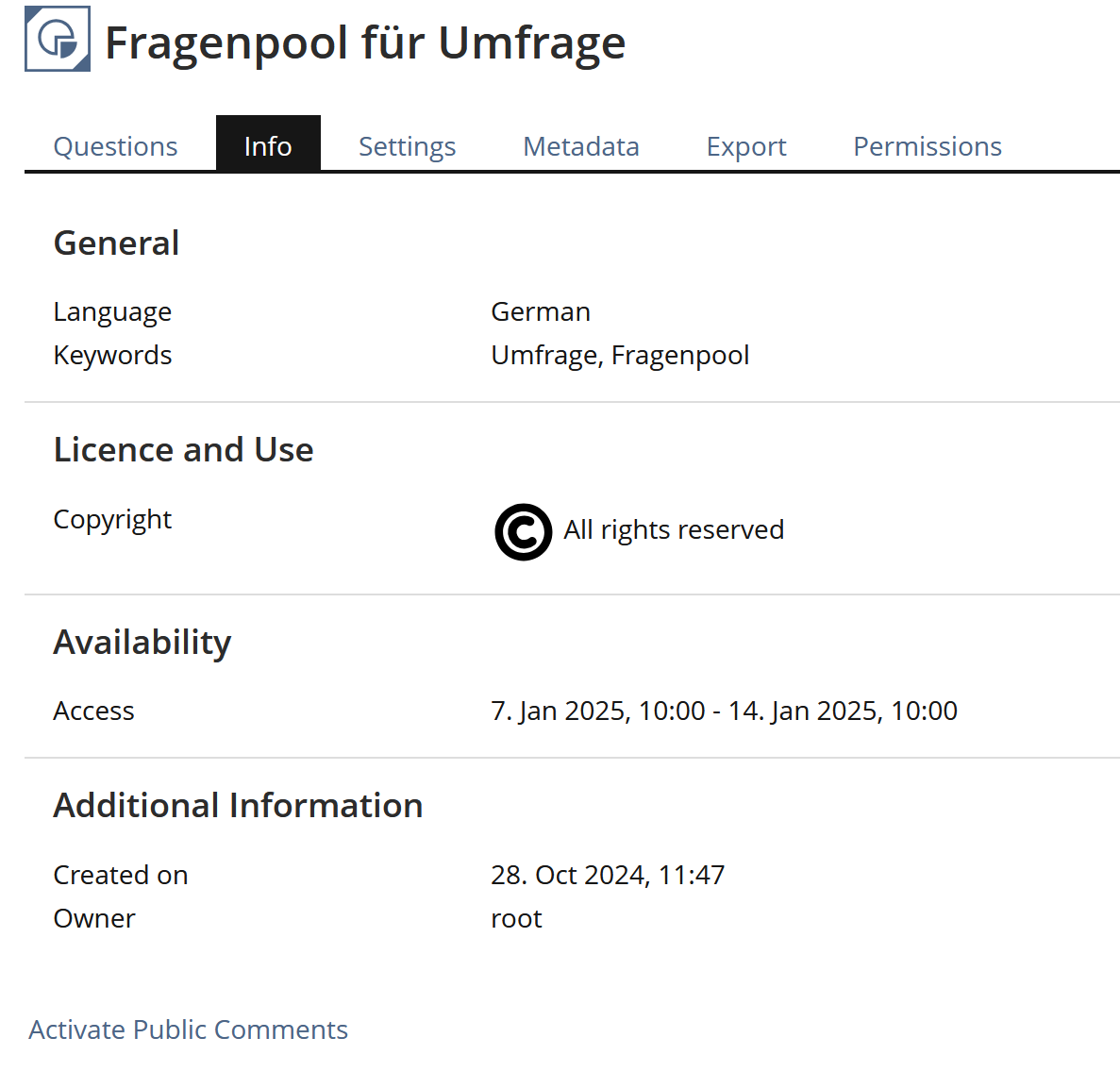
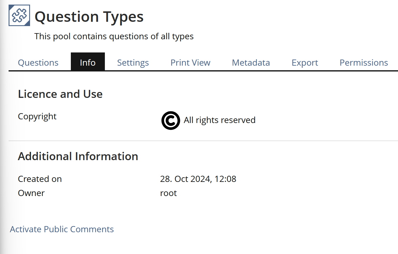
Question Pool Survey

same as Blog + Metadata

Page is needed for metadata presentation

Question Pool Test

same as Blog + Metadata

Page is needed for metadata presentation

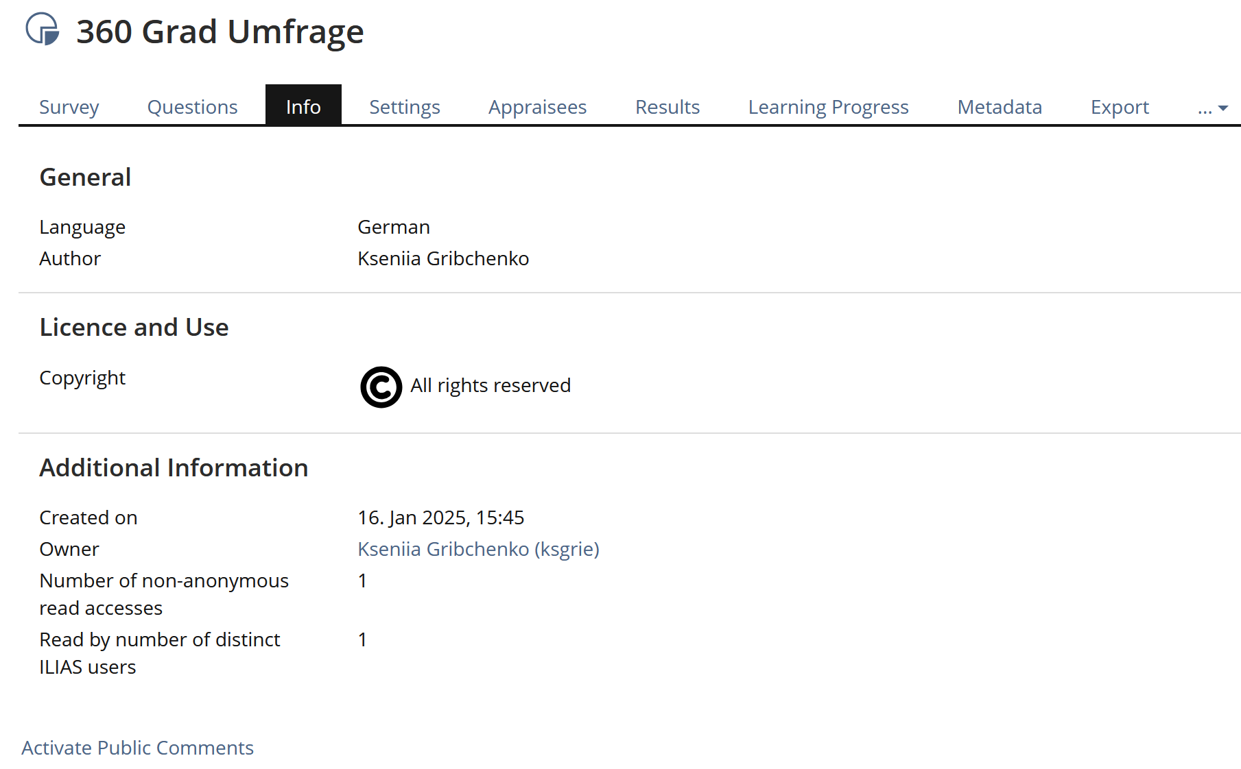
Survey

Page used for introduction to survey, starting survey and displaying several information about survey itself

  • Introductory Message
  • Start Survey
Following information is hidden when entering Info page:
  • General Properties: Author, Title, Anonymization, Evaluation Access
  • Metadata, Tags, Additional Information
 

Maybe a tab called "Start" is a better place for Introduction and button to start survey.

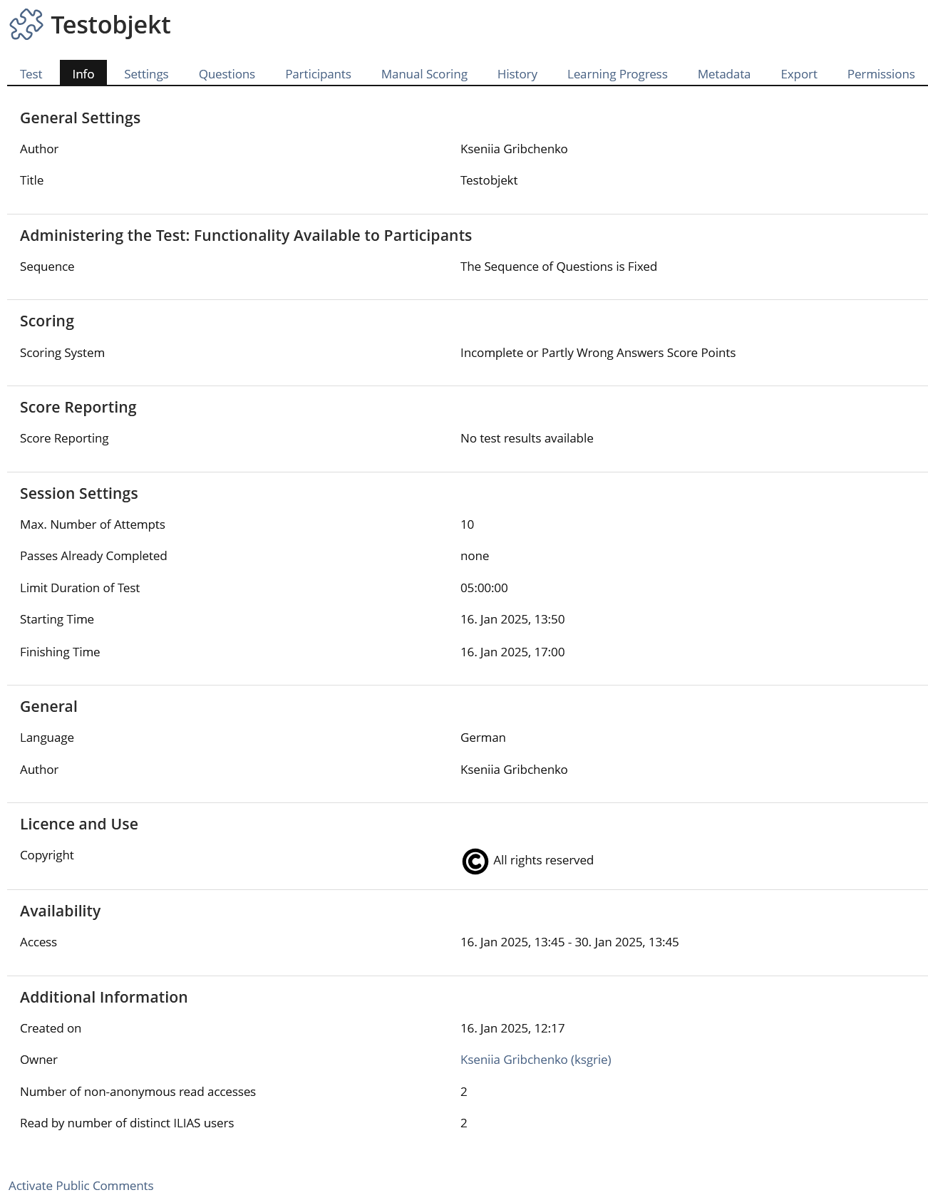
Test

Page used for introduction to test, important information for users (e.g. obligatory), start test and additional information

  • Info text (!)
  • Introductory Message
  • Start Test
  • General Settings
Following information is hidden when entering Info page:
  • Sequence Settings
  • Scoring
  • Score Reporting
  • Session Settings
  • Metadata, Tags, Additional Information

same as Survey

  • The hugh amount of information about a test needs a lot of space. We have to discuss how we could present this data in a easier readable way.
  • Which information is needed by test participants - and which not.

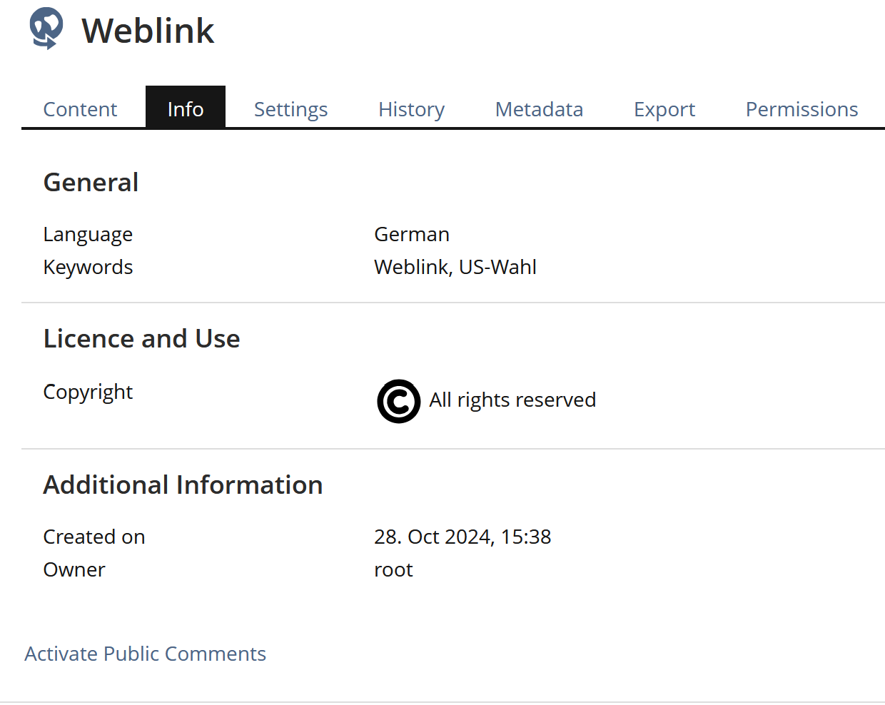
Weblink

same as Blog + Metadata + Number of non-anonymous read accesses and Read by number of distinct ILIAS users

Page is needed for metadata presentation

Wiki

  • Button "Start Page"
  • Introduction
  • Tags
  • Additional Information (incl. Number of anonymous read accesses, Number of non-anonymous read accesses, Read by number of distinct ILIAS users

same as blog

  • Where to place the "Introduction"?

1.3 Presenting Info Data In Overlay

This picks up a suggestion by Pascal Schmitt (see 4.). It might be a good solution for all kind of object types to offer the "Info page" content (after our revision) in an overlay. Providing that the features "Tagging", "Comments" and "Notes" no longer will be available on the Info page but from the content page, the rest of the Info page content is just data without user interaction. So it would be fine if ILIAS presents this data on an overlay when clicking the "Info" option in the Actions menu of an object.

2 Additional Information

  • Idea / concept: Matthias Kunkel
  • Interest in funding: (please indicate if you are interested/able to fund this feature)
  • Maintainer: (will be set by Jour Fixe / maintainer)
  • Implementation of the feature is done by (will be set by Jour Fixe / maintainer)
  • Testcases by: (please add your name if you want to create the testcases for this feature)

3 Discussion

Pascal, 23.07.12
I think the idea of an infopage in general is good. I see the following problems with the current implementation:

  • "Download" and "start test" etc. are not infos and should not be presented on the info page
  • There is no visual concept behind this page. This is why it isn't clear
Maybe the page can be replaced by overlays (as mentioned at JF 23 July 2012) but this should be tested well, because it can clutter the repository pages.

JF 27 May 2013: We would like to improve the usatbiliy for 4.4. We are moving more and more features from the info page to other user interface components (e.g. tagging, comments). This makes it dispensable for some objects, most of all for categories. In most scenarios the info page for categories is useless. For this reason it should be possible to deactivate the info page for categories with an option. It even should be deactivated per default for new categories.

Alexandra 12 June 2014: I like this suggestion, get rid of most of the Info-Tabs.
Since a Permanent Link is available in all content tabs, taggig and comments is available via the action menue the following can just go:

  • Blog
  • Bookingpool
  • Chat
  • Data Collection
  • Excercise
  • Folder
  • Forum
  • Questionpool for Survey
  • Questionpool for Test
  • Weblink
  • Wiki
If somebody feels really attached to the Info-Tab, provide an option unter "Additional Features" in the Settings-Tab to switch it on on purpose. By default there should be no Info-Tab. But I would strongly recommend to just plain and simple kill the Info-Tab for those objects without ceremony.
The information on object usage can be displayed under a subtab/link in the Permissions Tab called Usage.
 
For the object Glossary I am not sure, where the information about in what Learning Modules the terms are used, should go. But once this information is placed elsewhere the Info-Tab of the Glossary shoul go, too.
 
For the remaining Info-Tabs I see three different purposes:
  1. File: The Info-Tab is re-labeld to "Download". The News block can stay where it is.
  2. Test and Survey: The Info-Tab is re-labeld to "Start". Everything else stays as is.
  3. Course and Group: The Info-Tab could still be called an Info-Tab.
    • The Info-Tab gets the page editor link so it can be edited at will.
    • Plus the functionality of the Course Information subtab/link from the Settings Tab is migrated to the Info-tab, so people still can create a pre-structured look. This Course Information could be extended to contain a cover picture.
    • The Join / Unsubscribe Tabs can go. Instead a big fat green button "Join" respectively "Unsubscribe" is displayed.

CK 14 April 2015: I like the idea to get rid of Info tabs (at least by default). My suggestion would be to split it in two parts:

  • Object-Properties for Administrators
    • That might make sense for every object. I would locate it as a subtab in Settings, i.e. 'Object > Settings > Properties'. By design only accessible for object administrators. It should always be the last sub-tab in settings to have some consistency. It could provide the list of other references to this object, etc. I would rename it something like 'properties' to separate it from 'Course > Settings > Course Information' and the Info-Tab for Users.
  • Info-Tab for Users
    • The Info-Tab for Users should have a clear focus on addressing Users (not administrators). It should not contain information, which is only relevant for administrators. Period. Any useful Info-Tab must be customizable to some degree - because automatically generated data usually is not helpful for users.
    • The tab should be deactivated by default and only be activated after an administrator entered some useful data.
    • Not every object needs to support Info-Tabs - only those which allow customization. Those objects with Info-Tabs should offer an option to de/activate it (default: deactivated).

4 Implementation


[1] This would have another advantage: the presentation of a page to users with only READ permission could be simplified by removing the two tabs "Content" and "Info". BTW: the root category of ILIAS has never had an Info page - and it works fine without it.

Last edited: 14. Apr 2015, 10:47, Kiegel, Colin [kiegel]