


Feature Wiki
Tabs
Expandable Areas Guideline
1 Description
These guidelines have currently a draft status.
- Drop Down Overlays
- Action Drop Downs
- Main Menu Items (4.2)
- Explorer Tree
- Standard implementations like in the repository or in the learning modules
- JS Version (YUI) like in the SCORM RTE or (4.2) in the forum
- Accordion-like expandable areas
- Creation Screens (4.2)
- Forms (subforms under checkboxes or radio items)
Rationale
- Users only need to learn that arrows have this special meaning (Arrows = Interactivity).
- No additional icons needed. Subtle differences in the behaviour, e.g. that action menus are overlays or that accordions may automatically collapse previously opened subareas if one area is opened are not important for the user.
Rationale
- It is common to put the arrow behind the text in these cases (see e.g. Firefox browser or Facebook).
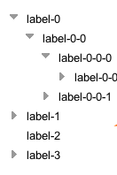
- Arrow to the right: The area is collapsed and can be expanded.
- Arrow downwards: The area is expanded and can be collapsed.
Rationale
- Accordions
- Using no icon would not give the user the indication that the area is expandable. It is not uncommon to use arrow icons also in this case, see e.g. the Typolight/Contao CMS (settings screens).
- Explorer
- Other options are using +/- icons (like currently done in ILIAS) or use +/- icons plus tree lines (like done in the SCORM RTE).
- Using just one type of icon is clearer and less to learn.
- Triangle arrows are also commonly used in these trees (see, e.g. Apple iOS, Moodle 2.0 Navigation)
- The alternatice "+/- icons plus tree lines" is not easy to customize (e.g. ILIAS 4.2 should get a customizable RTE tree). There are too many and to complex style classes involved.
- Especially the YUI2 tree is quite a bad unaccessible implementation. It uses masses of nested tables (each item is one table) and table cells.
- Subforms that are triggered and displayed when checkboxes or radio items are clicked, do not need an additional arrow icon. Rationale: The user already identifies the checkbox/radio item as an interactive element.
2 Status
3 Additional Information
- If you want to know more about this feature, its implementation or funding, please contact: Alex Killing / alex.killing (at) gmx.de
4 Discussion
Matthias Kunkel, 18 APR 2011: Thank you very much for creating and providing this helpful guideline.
I have observed a disadvantage of using +/- icons to display tree structures. If you do not use the 100% scale for page presentation of your browser but a lower scale, the + and - within the little boxes vanish. So you do not see if this node is open or not - except if you analyse the structure ;-). Compared to +/- icons, arrows are always displayed properly - even in very low scales. IMHO this is another important reason for using arrows!
Jayne Fry, from ISN/ETH Zurich, 18 April 2001: Urgent request for 'YUI solution with expandable items which use small arrows that precede the text node'
ISN (on behalf of the ADL WG) is currently financing a feature “styles for the SCORM RTE”. The aim of this feature is to “stylise” the SCORM RTE tree navigation, as well as the top navigational area. The feature MUST be part of ILIAS 4.2.
ISN DEFINITELY wants/requests the YUI solution with expandable items which use small arrows that precede the text node. Visually, this means (i) the use of triangular arrows (ii) with “omitted” tree lines.
Our reasons are:
1) Usability – users only need to learn that arrows = interactivity. In short, users only need to learn one type of icon.
2) Common design practice - triangular arrows are already used by Apple iOS and Moodle 2.0 navigation
3) Accessibility issues – scaling content creates non-visible +/- icons. Triangles in contrast can be easily scaled with no loss of visual representation.
5 Follow-up
Last edited: 17. Apr 2025, 15:13, Kunkel, Matthias [mkunkel]